A - Z Beginner Full Guide Page 3
"Teach Yourself Dark Mod In One Day!" by Fidcal
Beams, Trim, Room Design
As said in the intro, I am not going to help with every architectural detail. In future missions that you make, consider using brushes as trim, decoration; try varying the shape of rooms to give interest and avoid the same old rectangles. Walls can be divided in two horizontally with different textures, panels, paints, wallpapers, stone. Recesses can be added just like we did for the door. Search the internet and other fan missions for inspiration. Here I shall just describe how to make a few very easy beams. Note that as we progress I am giving less and less detail of what we have covered before so just skip back if you need to remind yourself.
- Set grid size to 8
- In the small room, drag out one long brush the long length of the small room
- Make its section dimensions 16 units high and 8 deep
- Place it flush against the ceiling and against a big grid line somewhere in the middle of the room
- Look through the darkmod textures for some suitable wood and texture the entire brush
- Check the alignment of the texture only on the three visible surfaces; remember wood grain should align along the length
What about the surfaces that can't be seen?...
Hidden Surfaces, Caulk Texture
You might find a lot of information on the internet about using caulk texture for hidden surfaces because caulk is not rendered so improving performance. In practice in most cases dmap does a good job of not rendering hidden surfaces anyway. Testing seems to show no detectable change in performance so generally don't worry about caulk. There may be special circumstances, for example the edges of glass panels, but otherwise it is probably not worth the effort. For more information read Caulk
Note: The outside of our mission, the surfaces in the void, will not be rendered. This is taken care of by the game software automatically so no need to worry about caulking any of them.
We have one beam in place; now what?...
adding my 2 cents..Baddcog
There are reasons for using caulk, it's really at the authors discretion. True that caulking hidden surfaces doesn't neccessarily lead to an increase in performance, but my machine is fairly high end. And not caulking faces means extra tris, which can mean extra draw calls, extra lighting info, extra shadows. And on a lower spec machine it just might matter. Unseen faces on world spawn brushes will be culled, so no need to worry about them performance wise. But unseen faces of func_static are not culled, that's where a possible increase in performance will come from. Even if it's unnoticable I believe in optimizing in every possible way so I do it.
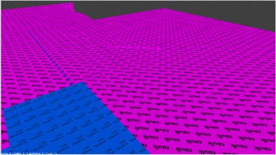
However, there is one really good reason to caulk all unseen faces, especially those outside the map, not for performance but to make editting easier. The outside of a map with caulk.
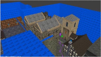
The outside of same map with filter>caulk enabled. Makes it alot easier to see your map. Beware that brushes can be hard to see/select in ortho if they have caulk on a face seen from that ortho view.
Cloning the Beams, Single-plane Shifting
- Set Texture Lock ON (top button bar)
- Select the beam, clone it, and drag the clone 3 grid squares (24 units) to the side. There should be two grid square between it and the first beam.
- These beams are easy to move but while we're here, try instead Alt + the arrow keys to move. This nudges them along with no chance of sideslip. This is more useful when you want to drag something a long way. Another way to do it is LMB THEN Shift THEN drag (not Shift first) and the beam will stay in the first direction you drag. There is a knack to this. Practice it now for the future. You can drag right across a huge mission without any deviation from a line. Yet another way is a mode switch that locks in one plane or another on the
 button on the top button bar. See 'Move (Drag, Translate) in one plane (Mode)' on the Dark Radiant Controls, Keys & Mouse wiki.
 - Repeat until you cannot get another beam in - don't put one right against the wall. Then repeat from the original beam the other side so the whole ceiling has seven beams evenly spaced. There is one space with three grid squares but it's near enough.
- Look at the texture surfaces. Every beam is identical. Consider selecting surfaces and shift them along the length quickly to get a different look on some of them.
Now, clone a beam and drag it into the big room. Here resize it to 16 x 16 cross section and clone and place them in a cross along the ceiling (don't overlap in the middle but have smaller beams either side at the crossover) and rotate one (Texture Lock ON!) and clone it to form four vertical beams down the walls at the end of the ceiling beams. Check texture.
Another 'Room' - an Open Yard
I'm using the term 'room' because we make it in just the same way as the rooms we made before but with a sky ceiling.
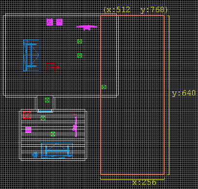
- In TOP view, drag out a brush to the east 256 x 640 and position on the big grid square in line with the north wall of our big room and overlapping the big room by one big grid square as shown in this diagram...
- In a side view, move it if needed so its floor is level with the floor in the big room.
- Drag its top up so the brush is 384 high
- Give it the texture: textures/darkmod/stone/brick/tiling_1d/old_worn_greybrick - suitable for the yard walls of a small dwelling
- Rescale the texture in Surface Inspector to 0.35 (vert and horiz.)
- Use the 'Room' button (LBB, left button bar) to hollow it out
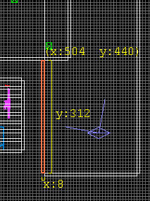
- In the TOP view, reduce the length of the west (left) wall from the north down towards the south so it just touches the external surface of the south wall of the big room. Its length should now be 312 as in this diagram....
- Raise the height of both the south and east walls of the big room to meet the ceiling of the yard.
- The south wall should also be extended a little to the east to be flush with the east edge of the east wall as in the picture below. (NOTE: This picture still shows a wallpaper texture I tried earlier! Yours should show the stone)...
From this...
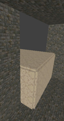 to this...
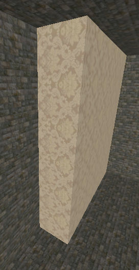
- Texture the visible surfaces of those walls to be the same as the other yard walls
- Texture the floor of the yard with say cobblestones
- Ensure the texture of all the visible surfaces of the house are the same as the stone inside.
Now we need the sky...
Sky
To add the default sky is fairly simple because we shall be using a ready made prefab. A prefab is part of a map saved separately so the whole thing can be imported into another map. Any selection, single or multiple, can be saved as a prefab via the File menu. It can then be imported into another map as a selection and dragged where needed.
Other skies are possible but need more work so we'll stick with what is easy...
Added note: The following describes a sky with moving clouds etc but if your FM has performance problems out of doors then consider one of the static skies which look almost as good and do not need the skybox prefab.
- Set Texture Lock ON
- (Note that in Dark Mod Release 1 the prefabs are in prefab.pk4 which is a zip file. Rename its suffix to zip and extract it into the darkmod folder.)
- RMB menu in grid view and select Insert Prefab OR use File Menu > Import Prefab*
- Select nature > skyboxes > tdm_sky_starry1.pfb from the 'Choose prefab' menu.
- Zoom out if you cannot see the selected prefab.
- Drag the selected prefab well away from our brushes both horizontally and vertically. The player does not enter it so in all your future maps make sure it is well away from any area you are likely to build. You can always move it later but it's easier to put it out of the way now.
- DEselect the prefab
- Select the ceiling surface in the yard
- Texture it with textures > smf > portal_sky. Do NOT use any of the textures under 'skies'.
- The yard walls are too high and we want to see more of the sky so...
- We use the same clone and curtain method as before...
- Select a wall at a time, clone it, size it downwards to a height of 128.
- Select the original wall and reduce its size from the bottom upwards to the top of the wall so it sits on top of the cloned wall we just made with no gap.
- Give the top part of the wall the portal_sky texture
- Repeat for the other two yard walls.
- RMB menu move player start into the yard. Check the side view too that it is not above or below.
- J to select the entity list; select the Ambient and ensure its radius covers the whole yard**.
- Ctrl + S to save. I suggest you then save again with a new name.
Now you can dmap and map and see how the yard looks.
(* If you have only the "Thief's Den" alpha installed, you will likely get an error inserting the Prefab sky. Please see discussion tab of this page on how This can be resolved.)
(** Remember, the position of your actual entity changes as you adjust the radius of your ambient light. Make sure the entity, itself, is safely inside your leak-proof map structure. Although it seems obvious to me now, my ambient light got stretched into the abyss as I was resizing it. This caused a leak which took several minutes for me to understand and correct at the time. See page 2 for original author's first warning about this).
Tip: In game, go back to the console and type and enter noclip. This toggles on and off the ability to fly and even fly through solids. Just look in the direction you want to go, upwards, and use the move forward keys the same way. You can soar up and see the moon to the east. Now fly over your other rooms and look down. You get a different sense of how it is all organized from up here! Take care in noclip mode. It can happen that if you get into the lower brushes you can sink down below the mission and fall into the abyss. Don't know why that is but you have to map again to get back in.
Spot the error in the big room? Our new yard protrudes into it at floor and north wall. We'll deal with that...
The Clipper Tool, Cutting & Splitting Brushes
It is not fatal to make mistakes; it's normal. We just check our work after building and adjust. Our new yard protrudes into the big room so...
- In the top view, select the north wall of the yard and reduce its width from left to right so its left edge is level with the west surface of the yard.
The floor of the yard can be done a similar way by dragging it from west to east and inserting a new brush in the gap but instead let's use this opportunity to explain the clipper tool...
- Select the yard floor in the top view.
- Press X or select the Clipper button (
 on LBB)
 - Zoom in a little to the middle left of the yard and click on the red line where it crosses the wall of the big room. A dot should appear on the line and the zero digit 0.
- Likewise, go straight along that grid line to the east side of the yard and click that red line. A digit 1 should appear and a red line joining the 0 and the 1.
- It should look like in the diagram below. If your line is not on the same grid line on both sides you can place the mouse over either 0 or 1 and a + appears so you can drag it where it should be. If it all goes horribly wrong or a 2 appears as well, just press X twice to clear it and try again.
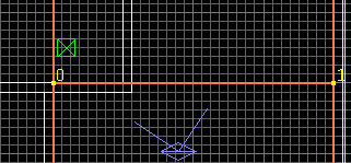
- At this point, pressing Enter would delete the north part of the yard floor but instead...
- Press Shift + Enter to SPLIT the yard floor into two brushes at the middle line we made.
- Press X to DEselect Clipper and go back to drag and resize mode.
- DEselect then select the north part of the floor we just made and reduce its width from the west like we did the north wall.
- REPEAT the whole process with the ceiling of the yard. This is not so critical as it protrudes above the big room and is not visible to the player but it is good practice to keep everything tidy.
For more details of using the Clipper Tool see Dark Radiant Controls and scroll down to Clipper Mode.
Now reduce the height of the north, east, and south walls of the yard to about half***. Ideally, do not make them so low that the player can expect to climb up. You can use clipper but its probably easier in this case to use my 'clone & curtain' method we did earlier. From a side vie you can easily clone and drag down a wall, then drag up the top part which you then retexture on the inside as sky.
(*** I'm thinking we already did this when told (above) to "Select a wall at a time, clone it, size it downwards to a height of 128.")
The yard feels much more open now but maybe retexture the house walls to be different to the yard walls? Or the other way round? Your preference.
You might also add buttresses against the walls if you want; just add solid brushes maybe 16 x 24 3/4 way up the walls. These should have sloping tops so there Clipper is ideal for clipping off angles. Remember, you only have to do one, adjust its texure carefully then clone it and space them out. I would set Texture lock on for this but depends. Try it both ways to see how it works. Remember also Modify menu > Rotate and Scale to turn for the other walls?
Water
Let's make a pool of water. It doesn't make much sense here but I need the opportunity to explain water. Alternatively you might make a water trough or open tank (the tank is easier if you feel lazy!)...
- Drag out a new brush (Oh dear! You forgot to DEselect first? Use Ctrl+Z to undo)
- Make the brush fit the big grid about 24 high and 64 x 128 (two big grid square in grid 8 mode)
- For a pool, place this just below the yard aligned to the big grid so its top is aligned with the underside of the yard floor brush (not the yard floor surface)
- For a tank, place it so it is one small grid unit above the yard surface.
- Give it a metal texture for a tank but for a pool give it the yard floor surface texture.
- Use the Room button to make it hollow then delete the top.
- The tank is now an open metal box but the pool is hidden by the floor. Use Clipper or my Clone and Curtain method on the floor to open out a hole. This is different from before because you need FOUR sides. Clone and drag out the two like parting curtains as before but then clone one side and drag to one of the gaps left and resize it to fit. Then clone that and drag it to the other side. Resize to fit if needed.
- Check for texturing and adjust if needed.
Now we need to fill it with water...
- Drag out a brush and insert it into the pool or tank
- Resize/Move it to fit EXACTLY the inner dimensions of the pool/tank but one small grid unit below the yard floor surface.
- Give it the texture common/nodraw
- With the whole brush still selected, RMB menu in grid view > Create Entity and select darkmod > liquids > atdm:liquid_water from the list. This gives the brush its liquid properties which include extinguishing flames. Don't use func_liquid which doesn't.
- DEselect the water brush and select just its top surface with Ctrl+Shift+LMB in the camera view
- Give it the texture water_source > water_clear
- In Surface Inspector, rescale the horizontal and vertical scale to 0.1. This will set the wave frequency for small pool. Use larger scale for a larger pool.
- Clone the ambient light or create a new one and put it in the water so its radius fits or overlaps but make it fit exactly to the surface.
- Set the ambient colour in Light Inspector to Red, Green, Blue of 0, 25, 25 (= 0.00, 0.1, 0.1 in Entity Inspector) for a dull greeny hue.
- Adjust the main ambient light so its radius just reaches down to touch the surface of the water (and thereby the top of the pool ambient light) from above.
See also Water
Create a light (RMB menu in grid view, place it low at about 40 units high and 40 or 50 units away from the corner of the pool to cast a shadow into it and give it the brightness VALUE of 30.
You can now dmap and map to check out your water. If you get a leak its not necessarily the water! More likely you left a gap when slicing up the yard floor. I did! Just use File Menu > Pointfile in Dark Radiant for the red line that leads to where the leak to the void is then dmap again.
Z-Fighting Errors
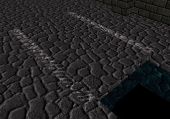
If a brush overlaps another, that is, all or parts occupy the same space as another brush then you get what are called Z-fighting as in the picture below. The game is trying to render both at the same time. Always watch out for this. Just resize or move the brush(es) so they do not overlap...
Doorway from the Yard
We need a door from the yard into the house...
- DEselect and create a new door models/darkmod/architecture/doors/door02.lwo from the model selector.
- Use Modify Menu > Rotate and Scale to rotate the door 90 degrees clockwise. The door should open inwards so if you find it opens outwards later you can just rotate it back the other way no problem.
- Reduce the grid size to say, 2 and move the door so it lays flush against the inside surface of the wall and exactly in the second big grid from the south (see diagram below)
- Check the side view and raise/lower the door so it just touches the floor.
- Select TOP view again.
- DEselect then using Shift + LMB, select the three brushes of the doorframe in between the big and little room so you have all three selected.
- SPACE to clone them all and drag to roughly the middle of the east wall of the big room.
- Use the Modify Menu > Rotate and Scale dialog to turn the selection 90 degrees.
- Move the selection into position around the door until the doorframe aligns as closely as possible with the east wall and juts out into the big room.
- This door is a different size so select the frame pieces one by one and move/resize them to fit snugly round the door and align inside two big grid lines ( see diagram below)
- Remember to adjust the height to in the side view.
- Use Ctrl+G to snap it to the grid. If that changes the shape of any of the brushes then Ctrl+Z to undo and instead reduce the grid to.125 and move it manually more closely to the right position. Then snap to grid. Adjust the door's position if needed. Check it all looks to be in the right position.
Now we need to open out the doorway as we did before by cloning the wall and splitting it either side of the doorframe. Then clone again, resize, and move up over the doorway. Check back in 'Cutting' through walls, Joining Rooms if you can't remember the details.
There's a gap under the door - fill it with a brush and texture it concrete or something. We should really have made the floor of the yard one course of bricks lower and then we could have a step at the door but no matter.
Keep saving your mission as you go along and every 10 or 15 minutes save with a new name. Dmap and play test whenever you feel like it.
Throw in a few models in the yard to decorate it quickly - there's a wishing well, waterpump, wheelbarrow, and so on. Possibly make a static wooden gate from a brush. It does not need to open as the player will be dropping over the wall to start the mission.
When you've put in a few items we'll talk about the weather...
Weather
Weather can add a nice atmosphere to any mission...
Fog
The default fog is made with foglights whose volumes are rectangular blocks. These are OK in isolation or covering an entire mission but there is no obvious way to place these blocks together without the join showing. So a rectangular yard would have been fine but our yard is L shaped and so would need two foglights for each rectangle. If one were used to surround the lot it would show inside the house. Another problem is that sky penetrates right through the fog. This should be fixable with a different sky matching the grey colour of the fog or indeed no real sky just concrete hidden above in the fog! I have read a method for a special fog to be attached to the player but not tried it yet. So this is what I know of so far. It's easy to set up so you can see it...
- Create a light in the normal way in the centre of the yard and drag out its box to fill the yard north to south and from the east wall the wall with the door. It should have the height from floor right up to the sky.
- J for light properties
- Give it a brightness VALUE 25
- On the right is the list showing fogs and lights so choose fogs and select delta1_fog. You can try others but there is not a lot of difference and some do not seem to work.
- J to close light properties.
- In Entity Inspector give it the property shaderParm3 and a value of 600. This is the distance in units beyond which the fog is completely opaque. Our yard is about 640 units long so if you look from one end then the farthest wall is whited out. Take a few steps and it starts to appear.
But note the join between the lightfogs boundaries and also the sky above is black. But it is useable with some inqenuity and I have hopes of better methods in the future.
Rain and Snow, Introducing Patches
- A patch is a one-sided surface only with no depth.
- It is textured only on one side and the other side is totally transparent and the edges have zero height. It's like a big plastic sheet, and like such a sheet it can be warped and twisted into useful shapes and curves far better than brushes. Textures align around those curves whereas they would align in straight lines on a curved brush.
- Multiple patches can be placed together to surround a volume but it is a shell.
- With the same textures, patches are just as solid to the player as a brush and a steel plate just as impenetrable as if it were six feet thick.
- Patches do NOT seal against the void.
- Some example uses are:
- to shape terrain;
- as semi-transparent decals for example to place stains, etc.
- Later we shall use patches with a rain-emitting texture.
- Patches can be created directly or you can first create a brush and convert it.
- Patches are created with their visible surface facing the user out from the editor grid view so select the TOP view for a horizontal patch.
Now for our rain...
Rain and Snow
- Dark Mod rain and snow are particles emitted by a material.
- Only one surface is needed so we apply that to a patch and place it above where we want rain - much like a cloud in the sky except this patch is invisible.
- The rain is emitted at right angles from the surface but falls under gravity (currently - but may be changed) so if tilted it will emit at an angle then curve down unnaturally so don't use this to simulate wind slanting in the rain; place the patch horizontally.
- The patch should be right side up with the rain texture on top. It is set up to emit downwards through the patch.
- Rain falls through everything so avoid overhead overhanging roofs etc.
- There are various textures, eg, light and heavy rain
- Patches can be stacked above one another for torrential rain
- There is some perfomance lag with large areas and stacked patches
To make it rain in our yard...
- In the TOP view, create a brush the length and width of the yard but about 24 units from the house wall (else there is some spill over so a little rain would fall just inside.) Height of brush irrelevant.
- Patch menu > Simple patch mesh > 3 x 3 converts the brush to a patch.
- Rotate it upside down.
- In a side view raise it up to about half way up towards the sky. If too low the player cannot see it falling down when looking up. If too high it affects performance.
- Give it the texture textures/darkmod/weather/rain_downpour
- For extra heavy, clone it and raise up the clone a few units. Repeat for torrential rain.
- Clone and move into the south west corner of the yard and resize to fit that area not covered by the main rain patches
You could try the above with a snow texture (from the weather section) instead but would need to texture the ground with snow from the nature section.
Ctrl + S to save and dmap and map to test it out.
Rainsplash
- Create a brush in the yard.
- Stretch it out to cover the length of the yard and the width of it at the top. Height irrelevant.
- Patches are created with their visible surface facing the user out from the editor grid view so select the TOP view for a horizontal patch. If you use a side view then it will be created on its side (it can always be turned over of course later)
- With the TOP grid view the CURRENT window, select Patch menu > Simple Patch mesh and click OK to accept the default 3 x 3. These values refer to the vertices which can be dragged about in three dimensions to produce different curves - the more vertices, the more curves - but we only need a flat patch so accept the minimum 3 x 3.
- The brush should now have been converted to a flat patch.
- In a side view it should just be a line with no height.
- Drag it down exactly in line with the surface of the floor of the yard.
- Give it the texture textures/darkmod/weather/rain_splash_moderate. Try a different splash if preferred.
- In top view, clone the patch and drag and resize it into the south west corner to fit the floor area not covered by the other patch.
It's that simple. Dmap and map and take a close look at the ground to see the rain splashes.
Performance: Hiding Distant Rain
If you change the rain and splash patches to func_static entities you can add some properties that hide distant rain so improving performance. I used it in the extended released version of Thief's Den but it is not critical in this small yard so I will only mention it here briefly...
- hide_distance n = distance in n units beyond which a rain patch is 'switched off'.
- dist_check_period n = how often in milliseconds the distance is checked. Too-frequent testing reduces performance; too-infrequent will cause a visible delay. For rain I used 0.25.
- dist_check_xy n = if 1 then only horizontal distance is tested not vertical. Set to 1 for rain/snow.
Sound Effects: Rainfall
To add a background sound we could add a global ambient but this would be heard all over the mission, even indoors, so it's not suitable for our rain. Instead we have to use a local ambient which fades as you leave it so we need two with their sound overlapping...
- In the top grid view, RMB menu > Create Speaker (this is also available in the 'Create Entity' list.)
- Give it the following properties. To do this you can..
- Type them in the input boxes at the bottom of Entity Inspector and click the check button OR...
- RMB the top line Classname Speaker and select Add Property from the menu then the + to open the list. You still need to type the values so option 1 is probably the easiest, in fact, copy and paste them from here...
- s_volume 0 = loudness - depends on how heavy your rain - adjust to taste. Use negative values to deduct from 0(max), eg, -6 is quieter, -8 quieter still, -50 is probably inaudible.
- s_mindistance 0 = distance from speaker at which it starts to fade
- s_maxdistance 8 = distance (in metres) from speaker beyond which it cannot be heard (I estimated these units were 40 normal units.)
- s_shader sound/ambient/environmental/weather_rain04_loop.ogg = sound file
- s_looping 1 = plays over and over (if 0 would play sound file only once)
Place this in the yard midway between the door and the wall and almost at the height of the wall so it spreads upwards too. It is unlikely that the player would be able to climb up very high but just in case you change something later...
Clone it and place this one in the south east corner maybe 24 units from either wall. The speakers are the green squares with arrows as shown in the diagram below...
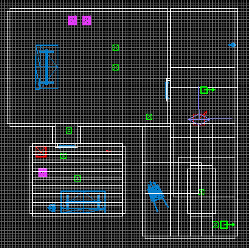
No need to dmap when creating or adjusting speakers just map and listen. Note that the door will not yet block sound when closed - we'll do that later. But the sound should fade nicely as you enter the house.
The sound files are in ogg format in the Dark Mod sound folder so you can create sounds in your missions for all types of things not just rain of course.
More details about sound speakers are in Sounds: Background and Local
Addition: It is worth mentioning that since this tutorial was written, the typical method for handling widespread ambient sounds like rainfall or background sounds now is a system called the Location Settings system, which plays sounds depending on the player's location in the map. (Speakers are still good for local sounds like the buzzing of a machine.) The Location system is a more complicated system, though, so we won't go into detail here. But when you start making a larger map, you will want to learn how to use them. It's much easier to handle the boundaries and transitions of Locations than messing with the radius of speakers.
