Grey Border Around Transparent GUI
posted by Springheel
This problem keeps cropping up, so I'm storing solutions here as I find them.
For some reason, a .tga image with a transparent background will sometimes apply a thin grey border around the object in the center when used in a gui. This doesn't happen all the time, but it's annoying when it does. I haven't been able to track down the cause.
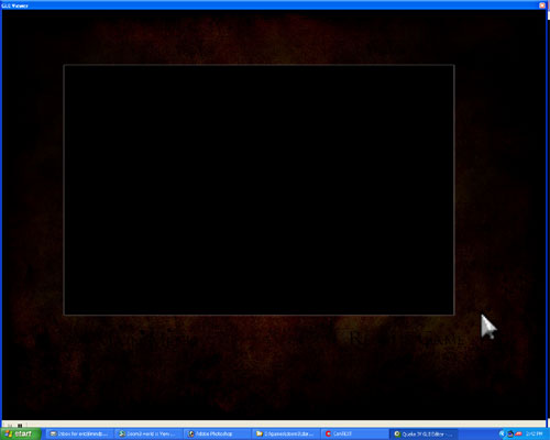
I did some tests and found that even saving a solid black box on a transparent background resulted in a grey border. The edges of the box were hard, however, so there shouldn't have been any bleeding into the transparent background (which was one thing I thought was a possible cause).

Oddly, when I change the colour of the box above from black to blue, the grey border didn't appear.
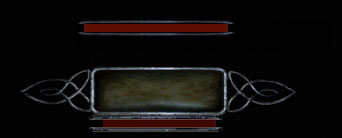
In the image below, the bar above the lightgem is what the photoshop image looks like (and what it should look like in game), and the bar below is what it actually looks like in game. It's small, so you have to look closely, but there's clearly a grey line around the bars and it looks like crap.

It might have something to do with soft edges around the object, although sometimes it seems to happen with solid edges as well. And the inventory icons, which all have a soft feathered edge to them, don't have this problem. It's very perplexing.
I'm working on this issue right now so I'll post some more shortly.