Turning Shadows Off: Difference between revisions
Springheel (talk | contribs) No edit summary |
Springheel (talk | contribs) No edit summary |
||
| Line 14: | Line 14: | ||
=== Increasing Performance === | === Increasing Performance === | ||
In general, very complex objects create very complex shadows, requiring more rendering power. If objects are going to be placed somewhere that a shadow wouldn't really be seen, it | In general, very complex objects create very complex shadows, requiring more rendering power. If objects are going to be placed somewhere that a shadow wouldn't really be seen, it is generally worth turning them off. You may want to use a pre-rendered decal to fake it the shadow instead. Another option (for basically cube-shaped objects like bookshelves) is to turn off the model shadow and create a simple brush encompassing the model. Texture the brush with the common/shadow texture, and you will have a dynamic, squarish shadow. | ||
Turning off shadows this way shouldn't be done by altering the material entry, but by adding the spawnarg "noshadows" to the entity in the editor. | |||
Turning off shadows this way shouldn't be done by altering the material entry, but by adding the spawnarg "noshadows" "1" to the entity in the editor. | |||
If you have a model of a bookcase or desk, anything square which you can sacrifice shadow detail on easily, put in the entity box "noshadows" to 1 to stop it casting shadows and then | |||
=== Transparent Textures === | === Transparent Textures === | ||
Revision as of 18:19, 15 June 2007
There are two basic kinds of shadows when dealing with models--"shadows" and "self-shadows".
Self Shadows
Self shadows are shadows that a model casts upon itself. For example, If a light is above a table, the top of the table will cast a shadow down onto the legs.
Normally, self shadows are good. On some models, however, especially rounded ones like vases or AI, the shadows create ugly jagged triangles of black. For a good explanation of why this happens, see here: http://www.geocities.com/vi_pr/self_shadowing_problem/self_shadowing_problem.htm
In these cases, you should add "noselfshadows" to the material entry for the object's texture.
Adding this means that the object will no longer cast shadows on itself. It also won't cast shadows on OTHER objects with "noselfshadow" on, so use it only when necessary. If you make a table "noselfshadow" and put a vase with "noselfshadow" on top, then the vase will not cast a shadow on the table, which would look odd.
Shadows
Shadows are what objects cast onto the world around them. Normally shadows are good, and you wouldn't want them off by default. There are two cases where you might want to add "noshadows" to an object: One is to increase performance (rendering shadows takes processing time, so turning them off can significantly increase the FPS of your map), and the other is if your object has transparent textures.
Increasing Performance
In general, very complex objects create very complex shadows, requiring more rendering power. If objects are going to be placed somewhere that a shadow wouldn't really be seen, it is generally worth turning them off. You may want to use a pre-rendered decal to fake it the shadow instead. Another option (for basically cube-shaped objects like bookshelves) is to turn off the model shadow and create a simple brush encompassing the model. Texture the brush with the common/shadow texture, and you will have a dynamic, squarish shadow.
Turning off shadows this way shouldn't be done by altering the material entry, but by adding the spawnarg "noshadows" "1" to the entity in the editor.
If you have a model of a bookcase or desk, anything square which you can sacrifice shadow detail on easily, put in the entity box "noshadows" to 1 to stop it casting shadows and then
Transparent Textures
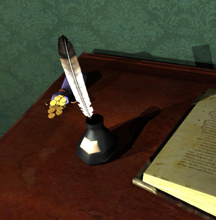
D3 does not calculate transparencies when rendering shadows. If you have a rectangular model with the image of a feather on a transparent background, the engine will make a rectangular shadow (see the feather's shadow on the wall is actually a rectangle)

In cases like this, it might look better if there were no shadow at all, rather than an awkward blocky one. Adding "noshadows" to the material entry would be appropriate in these cases.