Grey Border Around Transparent GUI: Difference between revisions
Springheel (talk | contribs) New page: ''posted by Springheel'' This problem keeps cropping up, so I'm storing solutions here as I find them. For some reason, a .tga image with a transparent background will sometimes apply a ... |
Springheel (talk | contribs) |
||
| (7 intermediate revisions by the same user not shown) | |||
| Line 3: | Line 3: | ||
This problem keeps cropping up, so I'm storing solutions here as I find them. | This problem keeps cropping up, so I'm storing solutions here as I find them. | ||
For some reason, a .tga image with a transparent background will sometimes apply a thin grey border around the object in the center. This doesn't happen all the time, but it's annoying when it does. I haven't been able to track down the cause. | For some reason, a .tga image with a transparent background will sometimes apply a thin grey border around the object in the center when used in a gui. This doesn't happen all the time, but it's annoying when it does. I haven't been able to track down the cause. | ||
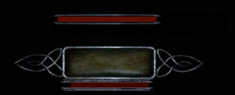
In the image below, the bar above the lightgem is what the photoshop image looks like (and what it should look like in game), and the bar below is what it actually looks like in game. It's small, so you have to look closely, but there's clearly a grey line around the bars and it looks like crap. | |||
It might have something to do with soft edges around the object, although sometimes it seems to happen with solid edges as well. I'm | http://www.mindplaces.com/save/healthbar2.jpg | ||
It might have something to do with soft edges around the object, although sometimes it seems to happen with solid edges as well. And the inventory icons, which all have a soft feathered edge to them, don't have this problem. It's very perplexing. | |||
I did some tests and found that even saving a solid black box on a transparent background resulted in a grey border. The edges of the box were hard, however, so there shouldn't have been any bleeding into the transparent background. | |||
http://www.mindplaces.com/save/gui.jpg | |||
Oddly, when I change the colour of the box above from black to blue, the grey border didn't appear. | |||
=== Adding an Outer Glow === | |||
I fixed an occurance of this recently by adding a black outer glow to the image through the layer effects window in Photoshop. I'm not sure why that would make the grey border go away, but it did. Not an ideal solution but it worked in this case. | |||
'''One possible tool to deal with this problem was posted on D3W:''' | |||
== Clamp Keyword == | |||
The clamp keywords are used to combat the effects of filtering on an images bordering pixels. A lot of times you don't want the bordering edges to be interpolated with each other. So you clamp. | |||
Normal clamp makes the pixels interpolate on their bordering side with themselves instead of their neighbors. | |||
zeroClamp makes the RGB pixels interpolate with black. | |||
AlphaZeroClamp makes the Alpha pixels interpolate with black. | |||
Go into your decals directory, find some textures that use clamps, make a copy and remove the clamps, then put them side by side. You'll see the difference. | |||
[[Category:Tutorial]] | |||
[[Category:Textures]] | |||
Latest revision as of 16:58, 25 June 2007
posted by Springheel
This problem keeps cropping up, so I'm storing solutions here as I find them.
For some reason, a .tga image with a transparent background will sometimes apply a thin grey border around the object in the center when used in a gui. This doesn't happen all the time, but it's annoying when it does. I haven't been able to track down the cause.
In the image below, the bar above the lightgem is what the photoshop image looks like (and what it should look like in game), and the bar below is what it actually looks like in game. It's small, so you have to look closely, but there's clearly a grey line around the bars and it looks like crap.

It might have something to do with soft edges around the object, although sometimes it seems to happen with solid edges as well. And the inventory icons, which all have a soft feathered edge to them, don't have this problem. It's very perplexing.
I did some tests and found that even saving a solid black box on a transparent background resulted in a grey border. The edges of the box were hard, however, so there shouldn't have been any bleeding into the transparent background.

Oddly, when I change the colour of the box above from black to blue, the grey border didn't appear.
Adding an Outer Glow
I fixed an occurance of this recently by adding a black outer glow to the image through the layer effects window in Photoshop. I'm not sure why that would make the grey border go away, but it did. Not an ideal solution but it worked in this case.
One possible tool to deal with this problem was posted on D3W:
Clamp Keyword
The clamp keywords are used to combat the effects of filtering on an images bordering pixels. A lot of times you don't want the bordering edges to be interpolated with each other. So you clamp.
Normal clamp makes the pixels interpolate on their bordering side with themselves instead of their neighbors.
zeroClamp makes the RGB pixels interpolate with black.
AlphaZeroClamp makes the Alpha pixels interpolate with black.
Go into your decals directory, find some textures that use clamps, make a copy and remove the clamps, then put them side by side. You'll see the difference.