Design & Build Methods: Getting Started: Difference between revisions
Nbohr1more (talk | contribs) No edit summary |
m adding category tag |
||
| (2 intermediate revisions by one other user not shown) | |||
| Line 116: | Line 116: | ||
[[Category:Editing]] | [[Category:Editing]] | ||
[[Category:Tutorial]] | |||
[[Category:Mapping Tutorials]] | |||
Latest revision as of 13:38, 21 November 2018
written by Fidcal
Introduction
Once you have some ideas for a Dark Mod mission how do you get started with a map? Design methods have been discussed at length in various forums and it is generally agreed there is no one 'correct' method. Some mappers first make detailed plans on graph paper while others just begin mapping the first area and keep adding to it as more ideas flow. Many build the entire terrain without textures, lights, models, AI, etc. and add it later while some put in all or most detail as they go along. Yet others will build anywhere in between the above two extremes either continuously or in part, even vary their approach depending on the type of mission: city, mansion, undead, caves, sewers, whatever.
Naturally, the more planning put in at the beginning the more integrated, sensible, and meaningful the layout will be and the less chance of errors, misalignments, dead ends, etc. later. Yet many excellent missions are made by all these approaches and each mapper should play to their strengths and interests. No point spending a month taking precise measurements and plotting them in a bookful of notes if you get bored and never start actually building a mission. The impulsive type of person can jump straight in with some basic concept and start building and some good missions have been made that way.
Nevertheless, it helps if certain principles are kept in mind before starting but perhaps nothing more important than preparing for good texture alignment. Use a big grid size in Dark Radiant and ensure walls, corridors, and rooms snap nicely to that grid. Fine adjustments can be made in specific places later as needed. With this in mind, this tutorial describes a method I used to begin a simple manor heist mission. Just remember, I don't claim it to be the only or 'correct' method of building.
It is also worth adding that not all missions need be the ultimate lifework greatest ever made project. If, like me, you are not good at architecture, then concentrate on a good story or devious plot and puzzles. Don't worry if you cannot equal the fantastic eye candy that you have seen in some of the great missions. Nor concern yourself if you do not feel you can maintain the effort needed to produce a huge city mission. A small mission may earn big praise, indeed, it is recommended that the beginner does not be too ambitious: better to complete a tiny mission than shelve an over-extended plan to map the world.
Getting Started
My plan was the simplest of missions that I could complete in the shortest time. I considered just a manor interior. This would also avoid the problems of performance lag in large outer areas. But inspired by some of the exterior images I found while looking for interiors I thought I would at least plot out a full manor with grounds. I can abandon the outside later before any lengthy detailed work is done on it and only build the interior with maybe access to a small yard for ingress/exit.
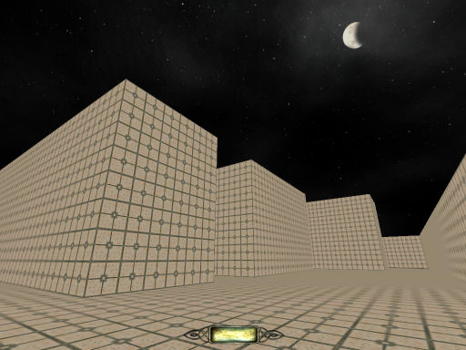
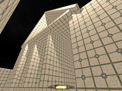
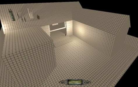
I've built a map lego style from large solid blocks using textures/darkmod/stone/flat/smooth/ceramic_tile_tan03 which gives a great grid pattern in-game almost like 3D graph paper (and more fun than graph paper!) The house is currently roofless and solid blocks only. It is therefore easy to resize and drag the components around to get the layout I want...
Things to consider
When I hollow out the interior I have to think of wall thickness. I shall probably expand the walls out so I need to keep in mind that the exterior will be smaller. Alternatively I might hollow it out from its present exterior. It's likely the walls will be half the size of those tiles. Texture tiling needs thinking about but these are nice big grid sizes so far. My intention is to have a corridor running through the centre of the spine of the basic E plan view with rooms either side and a corridor through the side arms with one room on one side. We shall see.
It is likely that the ground floor of a manor of this size be higher than the surrounding grounds with exterior steps leading up the main door. A cellar I can add later. If I first add too much detail outside I might compromise the interior and make it difficult to expand later. But if I add too much detail inside first I might later find it impossible to visportal the exterior and have to make adjustments. I have to get development balance right.
When I settle on the basic layout and add any large exterior structural extras I need to consider visportalling early. If this layout is too ambitious in that respect then I do not want to waste valuable time on it. So I shall probably add a certain amount of external structural detail put in a dozen test guards and a maybe a dozen test lights or so then try to visportal the external area only and check frame rates. That should give me some idea of what complexity of light and detail I can include. At worst I can put no guards outside, one ambient light plus a single parallel moonlight. Mmm... probably have to illuminate some/many windows. Note to self: if switchable lights inside, consider linking to external side of windows in case player switches out the library lights but they still show as lit up from outside.
I think my next step will be to hollow out a couple of test rooms and a corridor to gauge size and layout inside.
Hollowing out the building, adding a few inner walls
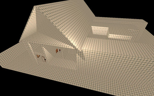
OK, I hollowed out the main house at the back and peeled back the side wall like a doll's house so I could see inside and get an idea of room/corridor size. I decided to expand the walls out so the internals would have the large tile size for texturing. I raised the ground floor one tile size but the walls are half a tile thick. I added a half tile thick sloping roof to give me an idea of roof space. Lucky me, it just fits in my sky box! I added one temporary light to give perspective.
A sense of scale
Now I have the basic manor layout I have adjusted inner walls and ceiling for just a couple of rooms and one corridor. I put in a few pieces of furniture and an AI to get a sense of scale. I left part of the side of the house open for access. This Lego block building method coupled with Peter Pan mode both in-game and in DR gives terrific control and flexibility. It is very easy to see errors and I soon found I had not allowed quite enough space to make the rooms sensibly large enough for a manor like this but it was an easy matter at this stage to extend the back of the house and the skybox backwards.
Main Room Layout
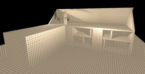
Today I hollowed out and built in the main room layout of the main building and one wing. I have ripped away the front of the roof and two of the E-plan wings so I had room to work. The right wing I will clone and mirror the left wing. The centre wing, when restored, will be the main entrance. All rooms have walls I can slide about with ease to resize later. (note to self: do upper internal walls need to align with lower level walls for structural support?) I have put in simple doorways for each which again I can easily resize. Just discovered DR's region filter which helps enormously to differentiate different layers both vertically and horizontally in the orthographic view. Good progress inside and I can run around a real house. The 'graph paper' texture works great to draw attention to oversights, gaps, etc.
I have put in odd chimney stacks, etc. just to remind me that chimneys will need to run from chimneys stacks down to fireplaces.
The next main structural consideration will be the stair(s). It is likely the main stairway will be central. I am not concerned about cellars at this point as they will not affect the external structure. I just want to do enough inside to shape the external and when I do external detail it will not lead me into a design trap inside.
Main Doorway and Entrance Hall
Basic internal room layout now in place and opened up the front where the main door will be and put in some temporary front steps and a noble to give a sense of size. I next have to consider the main entrance hall and stairway. I have reduced the length of the west wing and increased the east wing to give a little asymmetry. I may extend one or two rooms outwards and pinch others in at back and sides to give further interesting variation.
External Visportalling
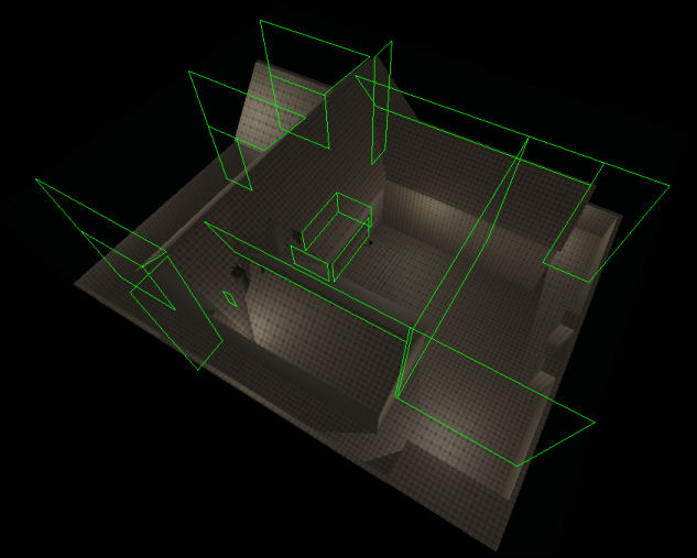
Having finished the basic layout and main structures I added several lights outside and set up the external visportals to test for frame rates outside. (Study Visportals for details.) This will give me some idea how much complexity I can add externally - and where. I left the front entrance wide open and visportaled just inside to simulate the worst case of the front door being open. Naturally, with so little detail I am getting good framerates even on my old graphics card. But now I can proceed to add detail slowly checking as I go.
A couple of interesting points emerged with visportalling:
- An avenue through visportal(s) reaches a final visportal that is correctly closed.
- From a different player position there is another visportal(s) avenue to that same final closed visportal but from the other side
- If the player can find a position to look down both avenues at the same time then the visportal will show open even though it 'seals' the end of each rendering avenue. So a visportal that you might expect to be closed from either view separately shows as open when both views are possible at the same time. I would expect if you replaced that visportal with two visportals only one inch apart that each would be red as they 'seal' off from opposite directions though it would serve no purpose of course.
Another thing that emerged was if you look in the picture you see three visportals at the back angling over the roof. In all three cases the top angled brush was made from a rectangle with a corner clipped off. They all work fine but initially the one on the left would not work. No matter what I did it failed even though its edges were against or in solid brushes. I tried many ways to get it to work. Finally I thought I would try something silly. I deleted the top angled brush, created a new rectangle and instead of clipping one corner I rotated the rectangle first over the roof, enlarged it to extend beyond all faces, then clipped its three other corners to be flush with the sky ceiling, far wall, and the top of the rectangular brush below. Essentially it looked how it did the first time only made a different way but this time it worked. Go figure. The angled edge penetrates halfway into the roof brush just like the first one.
Rough First External Texturing: Get the Look and Feel
With the basic layout and external visportals in place I expected next to look at shape of the hall and stairs but have decided to leave that for now. I am reasonably confident there is enough flexibility inside to have choices. So I'm continuing with the externals. I considering adding more architectural detail and then texturing but decided to do it the other way round: set some rough texturing first to give me an idea of look and feel. I hope from this to have a better concept of what architectural detail will fit that vision.
I do not yet know if the player will have a high view, perhaps from the roof. I have to assume the possibility. So when looking at large open areas many textures that look good close to will show hideous repetitive patterning: a lawn might finish up as a patchwork quilt and a stone wall be endless copies of the same irregularities. I need to choose these textures well.
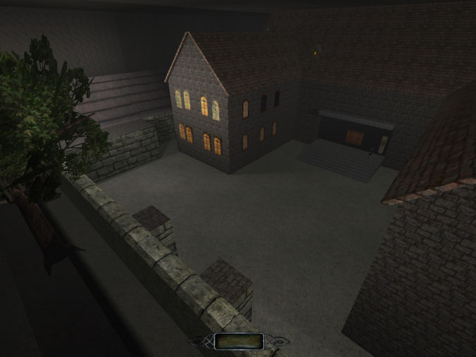
I have laid down some rough ground texture that tiles fairly well big scale. This might not even be in the final version but gives a background impression and I am certainly going to break up the ground areas so it will only appear here and there.
Chose reasonable stonework for outer perimeter wall and main house and roof tiles that work large scale. Tested with various thicknesses of fog to help hide flaws so may use that later. Added a few trees and roofs and buildings outside the perimeter wall to give a sense that the entire universe is not this one little box. That led me to extending the sky box and I might consider starting the player outside the walls.
Stuck a choice of windows very roughly on a couple of walls. When I make my final choice I will fit them properly. I have an idea of an easy way to link their lights to match their respective internal room lights which I'll explore some other time. Added a few more temporary lights outside.
This phase is experimental and I'll just try different things quickly and whatever works I will do a more thorough job later. I have no archictectural skills so have to accept that results in this respect will be modest. Mappers need not be concerned if their map lacks eye candy; many a good Thief mission has been produced without a visual wow factor. I have a few tricks up my sleeve and this will look good enough by the time I'm finished even though it looks plain and clumsy at the moment...
Final style choice - Basic concept complete
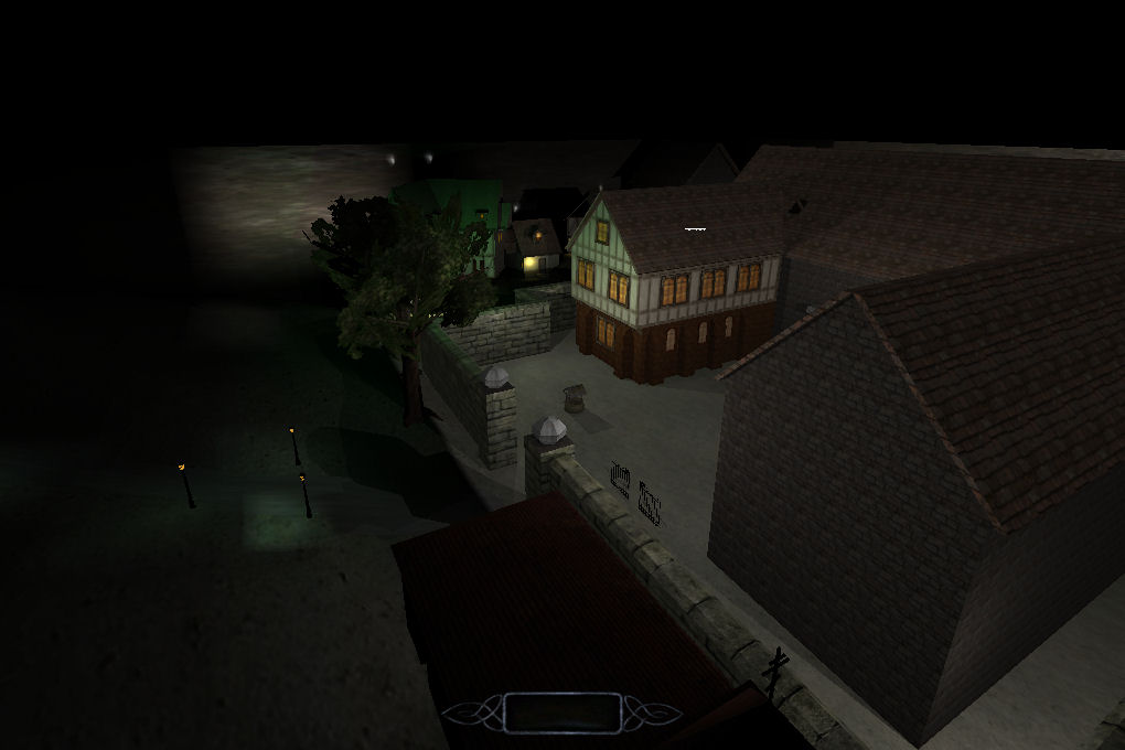
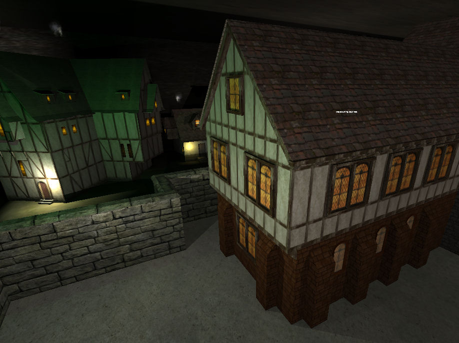
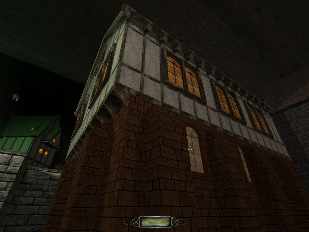
I've now settled on a tudor style for my manor map and have fleshed out most of the details of the west wing which I'll later clone to the east wing and modify. The main house is of a different scale but will be in the same style. I've extended the sky box on two sides only. At the front a simple road winds into the dark from the front gate which will be a permanently locked wrought iron gate. The gateway itself needs more work and the main grounds are still a plain flat texture that will be filled with interest later. To the west a few of Squill's buildings create a sense of community but game play might not extend to them and they are purely backdrop decoration.
I've temporarily replaced the sky with a dark colour while I test fog (sky pierces right through fog) but am undecided yet (fog removed for these shots.) I have sealed where the main front door will be. Eventually it will probably be a permanently locked door to keep frame rates low. Most thiefs don't waltz in the front door anyway. The short white fuzzy line you might see around the house is a floating comment that marks a misalignment I don't want to overlook. (See Comments.)
You can see the low quality high scale (to avoid tiling) of the texture outside the gate in the last shot but this will be lost in darkness and the player will not see it. If I do let the player get out there I might rethink it. Yes - and all the lighting is still very temporary!
That completes the start phase. I now have a basic plan and design style and the rest will be detailed design of each room and area knowing that the overall layout is sound. I got started!
