A - Z Beginner Full Guide Page 2
written by Fidcal
Adding Objects, AI
Later we are going to extend our room to one or two more but first let's add a few objects to our room. There are static objects like tables and beds under RMB menu 'Create Model' and functioning objects like moveable crates and AI under RMB menu 'Create Entity'. For a list of where to find any object in Dark Radiant see Objects Index. For more info about objects in general, read Objects, General Info for Mission Designers.
Static Models...
- Press Esc to DEselect everything
- RMB menu > Create Model > darkmod > furniture > tables > wtable1
- Put it where you like in the room and remember Ctrl + TAB to get a side view to place it on the ground in the room. Moving brushes or objects always snaps to the current grid so if you can't quite get an object in line with the floor or whatever then decrease the grid size temporarily in the grid menu or you can use the + and - keys. But remember to restore later back to 8 just for consistency with this tutorial.
- Add a few more items of furniture of your choice. Not too many. Later we can shuffle them around when we add a doorway to another room then add more objects. I see this as a rough peasant's house not a grand mansion but choose what you like; put a picture on the wall if you like or a pot on the table. This learning process does not need to make design sense.
- To turn any object you can experiment with the rotate tool button but for simplicity I will only cover the Resize and Rotate dialog (called the Transform Dialog.) This can be opened via the modify menu > Rotate and Scale. I recommend you assign a shortcut key in the help menu if you use it a lot or keep it open. It is fairly self-explanatory. You will mostly rotate around the vertical Z axis as you will more often be turning furniture around rather than turning it over. Use it to turn your furniture if you wish.
Functioning Entities are not all visible objects so don't worry too much about all the strange items in this list. We'll just pick out a few starting with an AI character...
- Press Esc to DEselect everything
- RMB menu > Create Entity > darkmod > AI. (shortcut is darkmod then type b to goto banners and AI is just above it) Non-combat > atdm:ai_townsfolk_male1
- Put it where you like in the room and remember Ctrl + TAB to get a side view to place it on the ground.
- Turn him around to face whichever way you like.
- Likewise add a atdm_moveable_crate01_1, a atdm:moveable_small_spoon_ornamental, and a atdm:moveable_dining_chair2.
Let's make the man friendly so he doesn't hamper our testing...
- Select the AI by pointing at it and Shift + Alt LMB. This is an exclusive select and automatically deselects everything else.
- In the Entity Inspector on the panel check the 'Show inherited properties' at the top.
- Scroll down to see the word 'team' and select it to highlight it.
- In the box at the bottom change the team from 3 to 0 which is the player's 'team' and click the check button at its right.
- Alternatively you can add/change properties by just typing the name and value in directly - just clear the box and type in team and the value below and click the check button. Yet another way is to right click the classname at the top and select Add property.
That's a beginning of furnishing our room with objects. In a real mission you would take a lot more and give it a lot more thought.
Ctrl + S to save and feel free to play it in game to see how it's looking. No need to dmap after adding objects - just use the map command as described before.
Adjusting the Light
if you entered the game again with the map command through Dark Mod then you may have noticed the light was a bit too bright - too harsh. This is how to adjust it...
- Esc to DEselect everything
- Select the light
- You can just use J to call up the Light Inspector or...
- In Entity Inspector select '_color'
- At the bottom of Entity Inspector is a coloured panel - off-white in this case showing the brightness and colour of the light currently. Click it and the light inspector will appear.
- Reduce the 'Value' (brightness) to about 40 and click OK. Note that this is shown as 0.40 0.40 0.40 in the properties of the light in the entity inspector. The three values are the red, green, and blue components of white and are to adjust the colour. You can tweak that. For example, gaslight might be slightly blue and torch light slightly orange but it's easier to do it in the light inspector in the colour selector.
- With these temporary lights you can also extend the radius beyond the walls to brighten them up (but more on this later when we place wall torches as it can give problems.)
- At the end of the day, just use your judgement to adjust the lights how you want them to help you navigate and test your game.
Ctrl + S to save and just use 'map' again in DM(Dark Mod) to enter the game - no need to dmap for light changes as they are dynamic in-game. So you can quickly tweak a light value in DR, Ctrl+S to save, then map in DM to immediately see the result.
We'll adjust this room a little later when we have added some more rooms but for now it is done. Save the mission yet again with a NEW name (unless you have snapshot set in the Preferences.) When saving with a new name always first save it in the old name again then the new so both are uptodate. This is a bit over the top for this simple mission but later you will judge when to save - simply estimate how much work you are willing to lose: the last ten minutes? the last hour?
New Rooms: Extending the Mission
Regard the room we've done as a 'back room'. We'll now make a larger front room.
- Esc to DEselect everything
- Ensure the grid size is 8. It shows in the grid menu or in the status bar.
- Ctrl + TAB to the top grid view
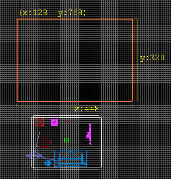
- Drag out a rectangle starting on the big grid square to the north (upwards on screen) of the first room 448 x 320. The big grids vary with zoom so here's an image. Don't worry if yours mission varies from this as so long as you follow the principles it should work...
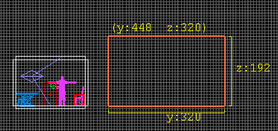
- Ctrl + TAB to a side view and outside drag the floor down to the same internal floor level as the first room and drag the ceiling up one big grid size above the first so it should be 192 high and look something like this....
- Esc to DEselect everything
- First go back to your small room and point at ONE surface of a wall in the camera view then select that surface with Ctrl+Shift+LMB
- In the Edit menu are two forms of copy and paste - the normal Windows one and a Dark Radiant exclusive called Copy Shader. Use this to copy the texture and this will include its scale and other adjustments.
- Set Texture Lock OFF (Shift+T or on S>Surface Inspector or
 on the top button bar.) This will let the texture align correctly in the new place. (more on this a little later under #Texture adjustment
 - Esc to DEselect the surface
- As before, the new brush is a solid block. Select it again with Shift + Alt + LMB
- With the new block selected, paste in the texture we just copied. An alternative is to just select it from the Texture Browser but remember to set its scale to 0.3.
- By applying this to the whole block it's quicker than doing the walls one by one after it is hollowed out.
- Use the Room button on the left button bar as before to hollow it out then texture the floor and ceiling. Look back to #Making Your First Room if in doubt what to do.
- Put in a temporary light as before.
- Put a little furniture in as a living room and/or kitchen combo whatever just for quickness and we'll review it later. You can clone (duplicate) any selection, brush or object or combinations by hitting the SPACE bar then drag it away. When you clone ALWAYS immediately move the new selection. If you get distracted for a moment and forget it then it is not obvious it is there and you may forget and leave a table inside a table or a brush inside a brush.
- RMB inside the new room and select 'Move Player Start here' (check height in a side view.)
- Ctrl + S to save and take a look at it in-game. You will need to dmap first to compile the new terrain and then map. You should be in the new room.
How'd it go? You probably found it too dim. Increase the brightness of the light probably to the full 100 100 100. Then SPACE to clone the light and drag the light to one side somewhere in the room. Make three if you like - one high and one low. We are going to completely review and redo the lights later so just make it reasonable for now.
Well now we have two rooms separated by the void so the next step is a doorway between them...
Doorways
There are many approaches to this. This is just one way.
First we need to know the size of our door (an alternate way is guesstimate the doorframe etc. then adjust after if needed.)
- DEselect everything
- RMB in grid view and select Create Model
- Select darkmod/architecture/doors/old_door_01.lwo
- By default, the door will be aligned with the south wall which is what we want.
- Place it in the small room touching the north wall centred in the second big grid from the right. Drag it down to just touch the ground in a side view, decreasing grid size if needed as shown below...
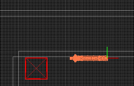
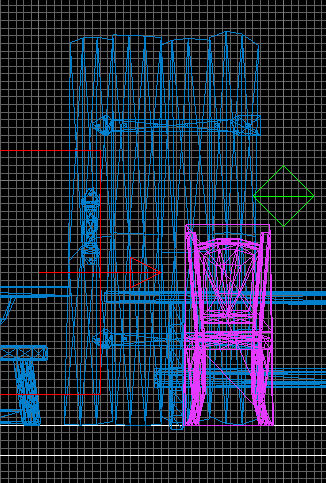
This door is static, non-functioning so the next step is to get it to open and close....
Making the Door Open
To make it possible for the player to open the door, this is what you need to do...
- Esc to DEselect everything else
- Select the door
- In the Entity Inspector select the top line 'Class Name' so it highlights
- In the input box at the bottom of the Entity Inspector, delete func_static and type in atdm:mover_door then click the check button.
- The door can now be opened and closed.
- The door will rotate by default anti-clockwise (viewed from above) by 90 degrees. Because this door is near a corner one might normally change it to rotate the other way into the corner by changing the rotate property from 0 90 0 to 0 -90 0 but in this case I want to put an elevator in that corner later so instead, make the door rotate more widely then people can get in the room more easily. Add/set the property rotate (not rotation) with a value of 0 150 0.
- This old door has its own pull handle so no need for anything else
- This door will not block sound yet - we'll deal with that later.
- For full details about doors see Doors
Doorframe
In a rough hovel, wooden hut, cave, or cellar you might just hang an old door without a frame but mostly in even modest houses it looks better with a frame and definitely in a grander place. This house just about qualifies for a frame and anyway, you need to know how!
- Ctrl + TAB for front view and RMB drag scroll zoom to get the front view of the door clearly in the grid view
- DEselect the door
- Make the grid size to 2 (grid menu or +- keys)
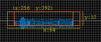
- Drag out a brush units = 64 wide x 12 deep x 8 high and place it over the door as the top of the doorframe aligned to the grid as shown in the image below. Drag out two other vertical brushes each 6 wide x 12 deep x 104 high and place them at the side of the door as shown to form the doorframe sides. They penetrate the wall for now but later we shall open out a corridor. Give all three of those entire brushes the texture darkmod/wood/boards/scratched temporarily (we'll adjust later.)
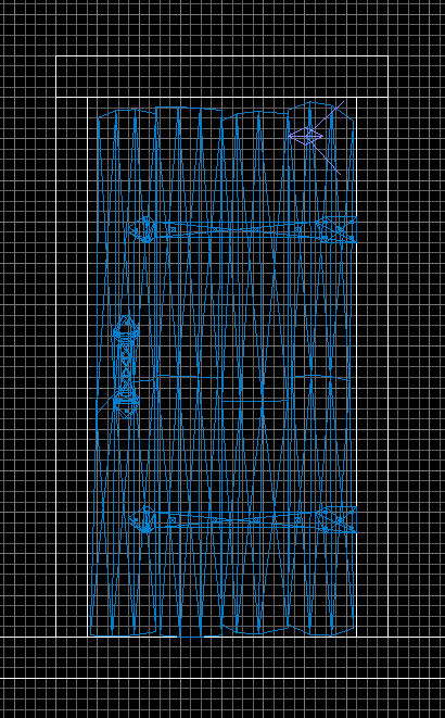
- Depth-wise it should be exactly over the centre of the door exactly against the face of the wall...
Because the outer edges of the doorframe align to the big grid it aligns reasonably well with the stonework around see below. Note it just fits under the course of bricks above which is good. (You might have a different wall texture.) Try to avoid cutting half way into bricks like that or worse, leaving a thin sliver of bricks or stone. Think structurally.
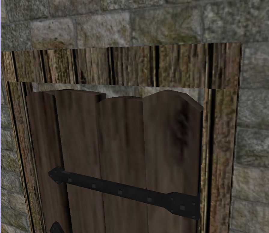
But you can see the wood texture alignment is pretty bad and we'll fix that next.
Texture adjustment
The horizontal top of the doorframe in the picture above is aligned wrongly; the grain of wood should be aligned to the length of a beam. Also, this texture is boards (planking) so will show the gaps between which must be aligned out of sight. Wood never really comes in an endless sheet anyway - it comes from trees! With experience we could have made one vertical of the doorframe (whose texture is aligned vertically) aligned it better, cloned it for the other side, cloned it again, rotated it, and resized it for the horizontal piece.
Texture Lock
Texture lock is most important. It is a mode toggle (Shift+T or on S>Surface Inspector or ![]() on the top button bar.)
on the top button bar.)
- When ENABLED it keeps a texture aligned to its surface even when moved or rotated. This means a wooden beam will look just like it would in the real world if you moved or turned it - it would not change relative to the beam.
- When NOT ENABLED then the texture aligns to the world. This means different surfaces will align together when placed together. So if you cloned a wall and moved the duplicate to one side and a little higher, its stonework would align perfectly with the first wall.
I mostly keep Texture Lock enabled but you need to keep it in mind whenever moving textured brushes: do you wish the brush's surface textures to align with the world or the brush?
Texture Alignment with Surface Inspector
This assumes you used the same texture and constructed the doorframe as I described above. If your alignment is different then use your own judgement where to apply the following.....
Rotation...
- Esc to DEselect everything
- Move the camera so you can see the front and top of the doorway in the camera view
- In the camera view use Ctrl+Shift+LMB to select the front surface of the top horizontal of the doorframe. Make sure you do not select the whole brush with Shift LMB or Shift+Alt LMB.
- Press S to get Surface Inspector to show/hide or View menu. Tip: Hot keys might not work if you are focused in an input field. Just click somewhere else.
- In the step input to the right of rotation type in 90 if it is not already there.
- Click the righthand little arrow button to rotate the texture 90 degrees else you can just type 90 right in the rotation input.
Shifting (scrolling)...
- Set the step input for Horiz and Vert Shift to about 4.
- Use the arrows for Horiz and Vert to scroll the texture about.
- Note that Vert moves the texture horizontally now because we rotated it.
- Note that the dark lines of the edges of the boards texture scroll in and out.
- Scroll the texture so the dark lines are not showing and the beam looks OK.
- Note for the future: When cloning many beams in a row don't have them all identically aligned but shift for variety.
OK, now in the same way you have to inspect ALL of the visible surfaces of that brush one by one and see how they look. Yes, even on top where the player might never look! (someone will!) Rotate/Shift where needed (small end pieces might be vertical or horizontal grain or even 45 degrees - use your judgement.) The far side of the brushes will also be visible eventually so do that too (see next para!)
Tip: When inspecting, if any model or brush gets in the way of the view just select it with Shift+Alt+LMB and press H to hide it. So you can rise above the ceiling then 'Hide' it below you to look down into the room. Hide the wall so you can get at the back of the doorframe. You can keep hiding more stuff as you go along and use Shift H to reveal them again. Don't forget them! Another way might be Filter menu > Hide all entities to hide all the furniture in one go.
Likewise do the side brushes of the doorframe.
Finally, Shift H to unHide and give the whole doorframe and door one last inspection. Looking good?
Corridors, Recesses
This will be a small recess rather than a corridor but the principle is the same : you just make a corridor like a small room except you won't need the ends wich will be open to the rooms either end. You could make a solid and hollow it out and then delete the ends or make walls, floor, ceiling as separate brushes yourself. In this case the recess will be the same textures as the big room so another option is to clone the sides from it and reduce them so let's do that...
- Esc to DEselect everything
- Check grid size is 8
- Set Texture Lock OFF. This will ensure the texture will align to the world not the original brush. In this case it probably would be alright and the worst that can happen is you have to re-align the texture (but you wouldn't want to do that with an entire house.)
- Shift+Alt+LMB to select the left wall of the big room. You may find it easier to make these selections in the camera view. Repeated Shift+Alt+LMB will cycle down through different items if they overlap in the grid view.
- SPACE to clone it. Don't wait... drag it away immediately so you never forget it's there.
- Drag it in the space between the two rooms near the door
- Resize it to 48 x 8 and position it so it fits exactly as shown below between the two walls. It should be just to the left of the doorframe and touching it. The height is OK as it is.
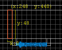
- Repeat the above with the other wall and put it to the other side of the door
- Similarly do the same with floor and ceiling. These should become 64 x 56 and fit between the recess side walls touching the south wall, but intruding into the north wall (this will make more sense later.) I have 'deliberately' made a mistake with the floor which we'll correct later so you can see it's no biggy if you get things wrong - you just adjust later. See the red outline of the floor and ceiling in the image below....
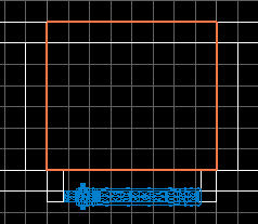
Ctrl+S to resave the mission.
'Cutting' through walls, Joining Rooms
First, a tip: when you are resizing a narrow brush like a wall it sometimes happens that you accidentally move sideways and reduce its narrow width to zero - nothing at all. DON'T LET GO! If you release the mouse at that point it will be deleted! Instead move your mouse to that side so it re-appears. If you are in doubt as to its dimension you might need to Ctrl+Z undo. Get into the habit when resizing to keep your mouse button held down and only release when you know you can see the brush. I personally wish a brush could not be reduced below one grid unit. Later I will describe methods of moving and resizing which stop accidental side movements.
Now, you cannot actually cut holes in brushes you just surround a space with smaller brushes. The following is easy but it might sound complicated so just try it and the worst that can happen is you have some undoing or reload your last save. So to cut out our doorway do the following...
- In the small south room face north in camera view looking at your door (this can be done in grid view but it's easier to be sure what you're doing.)
- Shift + H if you have hidden the wall to UNhide it so you can see both door and wall.
- Esc to DEselect everything (wish someone had nagged me with this when I started and maybe I would not have lost so much.)
- Select the door and H to hide it.
- Select the wall.
- In the grid view, press SPACE to clone the wall
- Immediately LMB drag towards the right from outside' the left edge of the wall to reduce its length to just past the right doorframe and touching it.
- I'll clarify that - you are cloning the wall then moving its left side along past the doorframe like opening a curtain from the left.
- In camera view you should now see the original wall to the left of the doorframe and also inside the doorway. To the right of the doorway are both walls occupying the same space with just the new clone still highlighted
- Shift+Alt+LMB select the original wall to the left of the door.
- You are going to reduce this starting from the opposite' end on the right...
- LMB drag towards the left from outside the right' edge of this wall to reduce it past the left edge of the doorway. Again, like opening the other curtain.
- You should now have two walls; one each side of the doorframe and exactly up to it.
Now we need to repeat the above for the south wall of the big room. I'll just summarise: you need to clone the south wall and reduce it to one side of the gap between the short connecting walls of the recess and the same for the original wall. Remember - like dragging curtains aside.
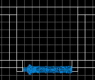
If you look south in the camera view from the big north room you will see that all that remains is the gap over the door frame...
- Clone one of the north walls of the little south room
- reduce its width to 64 and height to 80 and move it up to fit over the door exactly. It's top corner should just meet the corner edge of the little piece of ceiling we put in the recess. Here is a side view...
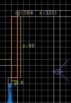
- Esc to DEselect the section we just put over the doorway.
- From the north you should see it is the wrong texture for that recess and that big room.
- Shift+Ctrl+LMB to select its north face in the recess and re-texture it to the same as the other walls in the recess (same as the big room.) You can copy and paste the texture or get it from the Texture Browser by just clicking it there.
- You will also need to re-align/rotate the texture on the doorframe if you didn't do that side before
If you examine what has been done by moving about in the camera view you will see the 'deliberate' mistake in the little piece of floor in the recess. Hide the door and you can see there is a gap. Here is a side view.
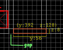
Just select that side view in the grid view and resize it to close the gap. The doorway should be complete. Zoom around in camera view and check it out.
I suggest you clone a light in that big room and drag it near the recess for now.
Ctrl + S to save and then Save As with a new name.
You can now dmap (the new name.) If you get a leak error then use File Menu > Pointfile in Dark Radiant to see a red line pointing the track of the leak. Did you leave a gap?
Map to play through. BUT the door will not yet open so move the player start in one room then the other (RMB menu) then map again to see the door from both sides (no need to dmap.)
Ambient Light: Gloom not Doom
Notice how harsh and black the shadows are in this mission? You need shadows for atmosphere and to hide in a stealth game but seeing nothing at all but blackness is not popular among players so we are going to add ambient light.
Ambient light is a steady background low light casting no shadows. The light has a radius but it does not fade from its centre; it's brightness is constant throughout its radius. Except for very special cases the ambient light should be present throughout a mission as the minimum light when no other light is present. The ambient can also add a little colour so different ambient lights might illuminate a crystal grotto as pale blue; a lava cave with a ruddy glow, and so on. But unless you have special needs like that then one ambient is sufficient for the whole mission.
- Press Esc to DEselect everything (from now on I'll not mention this. Take care!)
- From the grid view RMB menu, create a light in the centre of the mission. This might be just below the bottom right corner of the big room by the time we are finished but we cannot put an entity or a light in the void; it will cause a leak error. One might create a tiny room there in isolation just for the light but it does not need to be exactly centred so stick it in the bottom right corner of the big room.
- Increase its radius to cover both rooms completely either by dragging or adjusting its radius in the Entity Inspector. Keep its centre roughly in the bottom right corner of that room. It only needs to roughly cover the rooms and can stick out on all sides.
- Check the side view for height.
You might need to return to this light and in a big mission it helps to name it...
- In the Entity Inspector select the 'Name' line
- In the input at the bottom change it to Ambient1. Click the check button
- Esc to DEselect it
- Press L to list entities.
- Click the map in the list and the whole list will open up
- You should see Ambient1 at the top
- Click it and your light is selected and its radius reveals it clearly
In this way you can name anything you want for your own convenience both so you can identify and find them easily. The list is in alphabetical order.
- with the light selected, press J for the Light Inspector
- Click the white rectangle Colour button and reduce the brightness (Value) to 8 or 10 and click OK.
- Also in the Light Inspector you will see a list headed 'Texture' with 'fog' and 'lights' in the list; click the + sign against 'lights' to open up its list
- In the 'lights' list select 'lights/ambientLightnfo'; this immediately goes in the properties of the light.
- J to close the Light Inspector
The actual brightness is a matter of taste. Players should be able to dimly see texture even in the darkest corners. But don't make the ambient too bright or you get flat, washed out, missions with poor atmosphere and it will be hard for the player to hide if there are no good shadows. Judge your mission over a few days sometimes on a bright day; sometimes at night before you decide on the best compromise that you like. The player's in-game brightness setting and personal preferences will also affect how the game appears so it is not an easy thing to judge. Review the guidelines at Gamma & Ambient Light
Generally speaking, an ambient light of below 3 is going to be too dark; 16 or above rather too light. Also consider does your mission have lots of dark textures? You might raise the ambient a little if so. Your choice. I shall use 5 for this mission because our main stone walls are quite light. Whatever you choose, reconsider when finished and all the other lights have been placed. Also consider a bright ambient in these earlier stages while testing but remember to turn it down when you do the final lighting later!
Check out your mission now in-game. That ambient lifts it tremendously right? You might even want to remove or reduce some of the other lights. Remember, they are all temporary still (except for the ambient) and we shall do proper lighting later on.