City Street Visportal Tutorial
Introduction
TDM Street Visportal Tutorial (by Baddcog & nbohr1more):
The purpose of this tutorial is to help TDM mappers learn how to build a well optimized medieval street in Dark Radiant for The Dark Mod using vis-portals.
It is assuming you have basic editor knowledge to do things like create brushes and add entities and models. I will touch on this stuff quickly, but will not get into shortcuts, etc...
A vis-portal is basically an invisible wall in your geometry that breaks up the level into 'rooms' or 'areas'. It forces the engine to cull polygons that can't be seen through it to improve performance.
Vis-portals are also used for sound propogation and keep sound from traveling through walls, instead the sound must travel through the portal.
Vis-portals always work best when cleanly butted to geometry and when in a square hole and grid snapped. However a good looking medieval map rarely has nice clean square holes to place them in (an exception is doorways).
This tutorial will show simple techniques to overcome that issue. It will also show 'tricks' that can be used for distant views and LOD of terrain in the distance.
Each stage of construction will be based on the techniques described within, so stage 1 (start area) will be boring and ugly, stage 2 will look better and so on.
You can read the tut and look at the maps, or you can mimick the techniques and build your own map. I suggest doing the latter for best understanding of the techniques. But this is not a step by step on how to create that terrain, you just need to look at pics and do it (ie: needing to understand basic usage of editor). This will NOT teach you anything beyond vis-portalling properly and tricks to make your map look nicer (ie: no AI tuts, no texturing tips, no scripting)
It will cover the following techniques.
Stage 1: Building a very simple 'base' terrain
to seal from the void and have quick and easy
working vis-portals.

This will speed up work flow and will make sure your map
is properly optimized from day one, avoiding
the hassles of reverse engineering complex terrain for
good performance. It will be flat, it will be ugly,
in fact it won't even be fully textured
(and there is a reason for that later on, so do not fully texture)

It should only take 20 minutes or so.
Stage 2: Detailing to hide the ugly square holes
we just stuck a square peg in (ie: vis-portal)
using func_statics and patches.

Again, this tut is not about detailing,
so this section will be ugly too, but not as ugly.
It will have a hill, enter-able location or two,
and we will build some details on top of a vis-portal.
Stage 3: Will be much the same as stage 2,
but we will make a horizontal vis-portal or two.
Possibly a sewer and a 'courtyard' that we have
to climb over a roof to access. It will also add the 'final area',
a city square. This will be in the far side of the U from the start,
but will only be behind a wall to seal it apart.
The tower that we add here in Stage 4 will be viewable
from the start area.
Stage 4: Will be 'complex' vis-portal interaction
(ie: the trick stage).
Basically showing how you can render terrain
from the start area, that is actually in a sealed of
and closed portal area across the map.
This is good for towers, backdrops, skyboxes, etc...
It will also show you how to use
LOD's (Level of Detail) for those details.
(After building Stage 2 I realize I may have overscaled everyhting a bit. Mainly it would just take a lot of time and details to fill everything in nicely at this scale. Not to worried though, it helps illustrate that you can still build pretty large areas and still portal well. If I was really serious about making this a map I'd probably use more door frame props along the way just to give myself a better sense of scale as I went.)
Preparation:
I suggest drawing out at least a quick reference of what you want. I skipped it because I was basically shooting for a U shape and am not too concerned about the overall result,just that it shows techniques I am describing.
I'm not worried about details, ie: how a shop face looks, just mainly things like skinny street, T intersection, plaza area... I typically get a rough idea and hack it out as I go in the editor.
This tut is a large U bending to the left. The purpose of that is that I want the player to see a tower at the end of the map from the start point. But we will get to that in Stage 4. So you can make your own layout, but for the purpose of this tut a large U shape is best.
Stage 1:
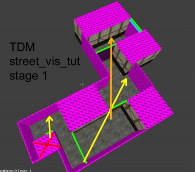
Starting simple we are going to create a 'street' that has a spawn room on one end (red X) and a few corners with vis-portals properly placed and spaced.
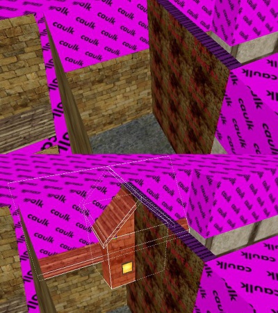
I start my brushes off with caulk. This helps optimize as the caulked faces will never render in game. It also helps you see what you are working on in the map, bright pink is hard to miss.
The most important benefit though is being able to filter caulk in editor so you can see more of the map (instead of it being blocked by walls).
I created a small room, using a doorframe ( ![]() > add model...) to size the hole properly. Grid 8 works great for the door frame sizes, grid 16 works great for everything else.
> add model...) to size the hole properly. Grid 8 works great for the door frame sizes, grid 16 works great for everything else.
Right now we want to keep it all big, blocky, and snapped to grid (-,+ to adjust grid size)
Add a player start ( ![]() > player start) and an ambient light so we can see in game (
> player start) and an ambient light so we can see in game ( ![]() >create entity > lights >ambient > ambient world ) and drag it out, it will need to cover all the terrain you make so it can be adjusted later).
>create entity > lights >ambient > ambient world ) and drag it out, it will need to cover all the terrain you make so it can be adjusted later).
I placed a vis-portal in the doorway. (Make brush that fits gap, select it, ![]() > make vis-portal)
> make vis-portal)
Then I built a simple boxy street leading away from it. At corners I placed more vis-portals to fill the gaps. Keep in mind that smaller is always better, so skinnier portals are easier to close, and we can always come back later and make the skinnier, but at the moment the biggest thing is to give yourself a little room to work.
I used a few textures and light posts just so it's easier to find our way around in game.
Vis-portals cut geometry into more tris, so notice how I placed them. The portal texture is on the side of the brush that leads off from a corner.
This just keeps it from cutting the wall again a few units in.
Looking at the pic we have some green lines. These are the portals. The blue line WILL be a portal for stage 2, right now it is just a caulk wall to seal the void.
The arrows show the extreme angles that the player could look through the portals. The main thing to notice is how the player can never look through more than 2 portals at a time. This keeps the area beyond closed, and is the main purpose of the vis-portals.
The placement of them also makes the sound follow the street and not go straight through the buildings.
Now we will customize the editor really quick. We need to cap off the map with portal_sky texture, but there is no filter for that.
So go to menu > Filter > add and make one called "Sky"
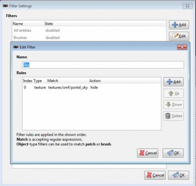
Now you can add a sky texture ceiling to your map that will have stars/moon on it. Another effect this will have is that any caulk walls in your map will now also show sky. A 'custom sky' can be pulled from the 'start map' that should be in your maps folder. For now we will have no custom sky, you will notice the sky_portal texture has some kind of sky on it but the caulk is black. In Stage 2 we will have a custom sky (pulled from the TDM start map), so the skyportal and caulk will have sky on them and look proper.
Now is a good time to compile and go in game to make sure it is sealed.
You can use the console and type r_show_portals 1 and it will show the portals with a green outline if they are open and red outline when closed. This is a simple set-up to watch them open and close to see how they work.
Walk around and try to look at more than one in a row. If they overlap they will be open, if not they will close.
Also note that if you look back at the start room doorway portal it is almost always closed, because once you turn the corner you are looking at the 'backside' of it. You can 'see it' through a wall, but you can't actually look into it. This is why a lot of twists and turns can be a good thing.
Stage 2:
For Stage 2 we will simply use stage 1, turn the last caulk wall into a vis-portal and build more street.
I want it to go uphill and turn left.
Select the last wall in the map (Blue line in Stage 1 pic) and make it a vis-portal. Now for easy of use 'filter' vis-portals.
Ok, the street leads to the void, we will build a street that goes up and to the left, as at this point the main change is that the roof needs to be higher.
I will use a patch for the hill so we just need a caulk box under the floor to seal the void. (AI can only 'walk' on patches that are about 48 units above solid terrain, I made a big hill so I will put a caulk wedge under it to fill the gap).
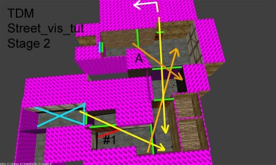
It seems I'm being a bit sloppy here and I let my site line get a bit long. That's OK though, when detailing the map it might be a good spot to not put quite as much detail as other spots.
Either way it's a pretty narrow street, so there just isn't a lot of room for detail anyway. And adjustments can be made before we detail, another good reason to build a base terrain first and give it a quick test in game.
Also this base terrain takes only a few seconds to compile.
So the blue X is where we left off in Stage 1. We turned a wall into a visportal and added terrain.
In this case a hill made from a patch.
I added a 90 degree vis-portal (#1) right away, you'll notice the bottom of it isn't square.
Actually it is but it cuts through a patch mesh. This is OK, and if you hide patches you'll see that it does actually butt up square to world brushes.
So patches are a great way to hide a square hole. Very useful when making caves and pipes which are very round, contorted shapes. Just put a square of caulk world brushed behind it.
The next few arrows go through 3 portals each, this is OK but not the best. So I decided to fix it a bit, it'll just make our currently boring street more interesting anyway. I made the middle portals skinnier and arranged it so the 3 in a row are more of a v shape then a straight line.
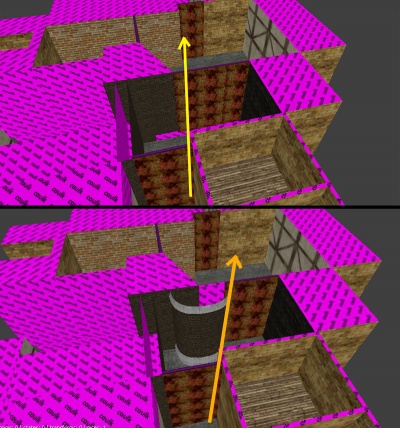
- Now for the main purpose of this stage, some details.
As you can see in the above pic I just used a caulk wall to but up to the middle portal, so we need to hide that. I decided to go with a round tower made from a few patches. Patches can cut through visportals and not cause problems so they are a great solution. Of course we won't be able to go into this tower, but it's just for looks.
Another spot I decided to detail was at the top of the hill.
