Photoshop 6: Stone Wall Phase 4
[file:Title_Card.jpg]
Making A Normalmap
Introduction
And now we come to what's possibly the most important part for anyone doing textures for TDM: The normalmaps. I'll be making two tutorials for this subject. This one, which will cover the process of making a heightmap, rendering said heightmap out to a normalmap, and the creation of a few detail normals you'll use to add some noise and variety to your texture. This will be the end of the Rough Stone Wall series. The next tutorial will cover the various techniques you can use to prep and convert diffuse images to a heightmap.
Enough talk. I know you're all anxious with anticipation, so lets get down to it!
Preparing The Heightmap
If you've followed the tutorial from home, then really truthfully honestly, you've already made your heightmap. Remember your brick alpha and shadow layers? That's it. Your base ingredients. All we're really doing here is tweaking the details so it'll render to a decent normal.
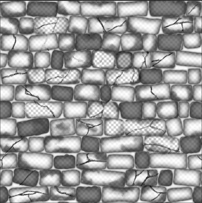
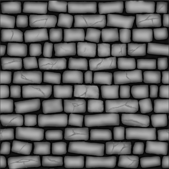
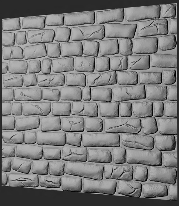
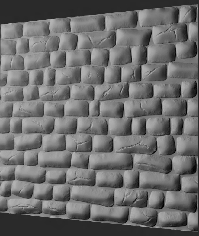
First, we're going to save our texture to a new .psd file. Name it whatever you want (though for reference, any texture I intend on becoming a heightmap I slap a _b to the end of). Once you've done that, delete any texturing details.Leave the cracks, since they're a part of the structure of your individual stones. Since I don't plan for the moss to stick out beyond the surface of the bricks, go ahead and delete it out, too. By the time you're done, you should have a texture that looks like this....
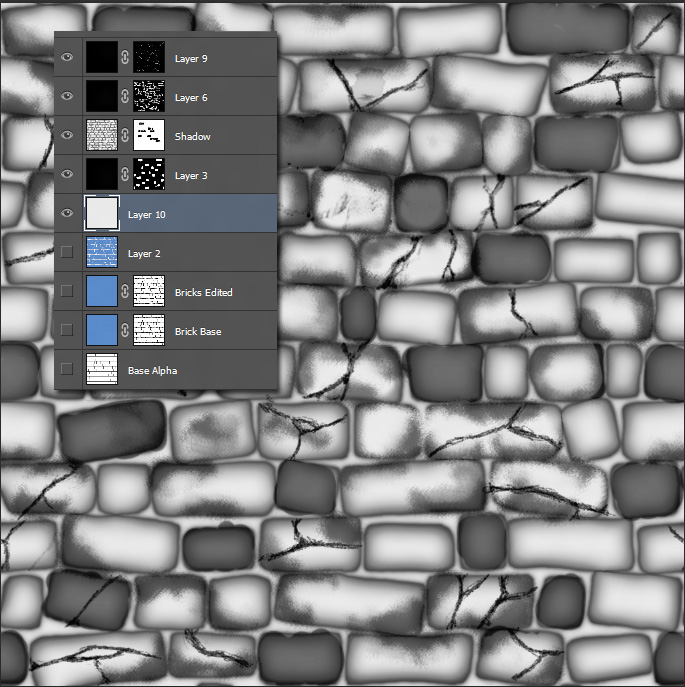
Oooh. Fancy. A little too transparent, though. It's all shadow information you've been overlaying on your base texture, so it's bound to be. To fix it, add a new layer in below all your shadowmaps, but above your alpha bases, and fill it with a light grey color.
...hmm. Better. Problem is, your mortar is flush with the height of your bricks. You render that out as is, and you'll end up getting a dip where the shadows are. It'll be ugly. Guess this means we'll have to do something with the space between the bricks. Make it darker than the surroundings.
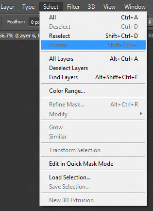
Well hey, you've already done this a thousand times before, so you know it's easy. First, make a layer above your new light grey backdrop, then go down to your blue bricks layer, and CTRL+![]() the icon on the tab to select your individual bricks. Now, go to Select/Inverse, and invert your select (I love how everything is labeled so appropriately).
the icon on the tab to select your individual bricks. Now, go to Select/Inverse, and invert your select (I love how everything is labeled so appropriately).
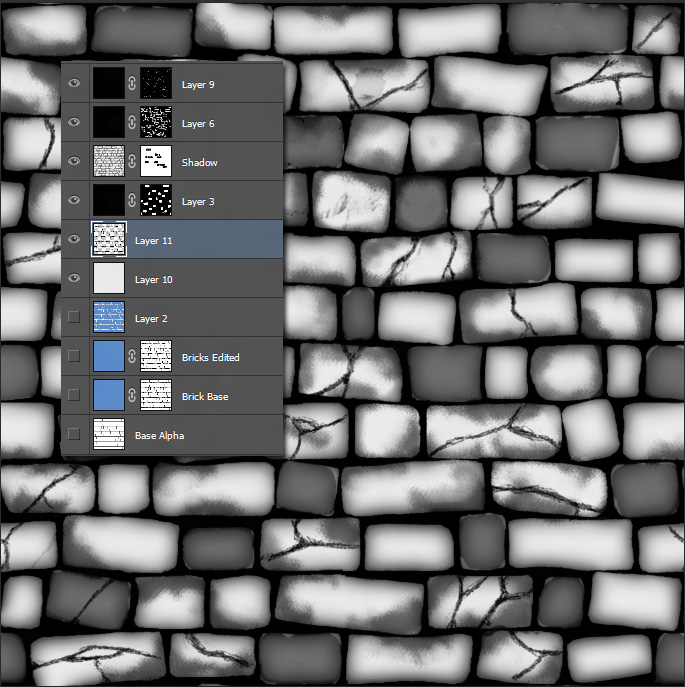
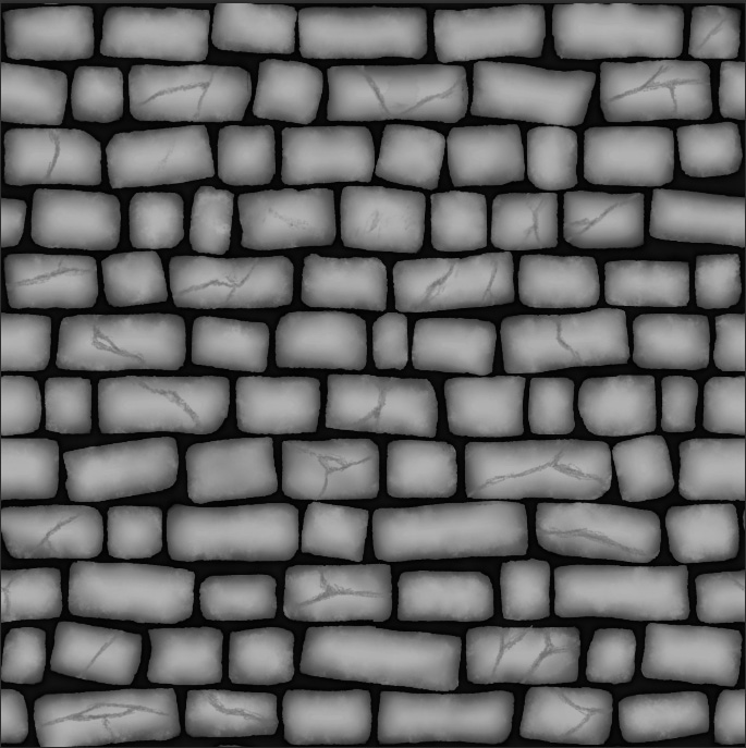
You have now selected the spaces between your bricks. Next, go to the color swapper, turn your active color to a darkish grey (not completely black, so we can tweak it later), go to your new layer, select the paintbucket, and fill your spaces in with black. Your texture should now look something like...
Little Addendum: Go ahead and run a light-middling gaussian blur on your rounded shadows layer. The divisions are a little too stark on the heightmap. Also, delete your darkened bricks layer. All it'll do is make the normals slightly softer when you drop it into Njob.
Now that's some heightmappy goodness right there! But now I bet you're wondering why we just didn't go down to your standalone brick shape layer, desaturate it to something white, and fill in the cracks there, right? Seems I've led you through a bit of extra work just to achieve the same results. There's a method to this madness. With your background and foreground on seperate layers, you can now edit them individually. If you want your foreground to be a little darker, and your background a little lighter, you can now edit them more to taste, rather than in one big lump. This allows for more control of your texture, and more control is always a good thing to have.
Basically, you're separating the components of your heightmaps into individual parts. This is how I do all my normalmaps these days. If I want one part to be darker than the rest, I'll put it on another layer, so I can tweak it without disturbing everything else. You're layering according to the height of your standout detail. Your mortar is behind your bricks, so it should be on a seperate layer, and your shadows are a detail you need to edit by hand to get it all to play well together. This is what we're going to be doing next.
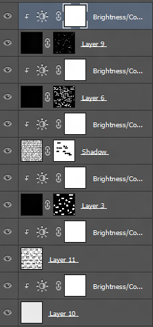
We'll start this process by throwing a Brightness/Contrast adjustment layer on top of each of our layers and attaching them to each part by moving the cursor between the two layers and clicking ALT+![]() (just in case you forgot).
(just in case you forgot).
Then, starting from the bottom, we tweak, we tweak, and we tweak some more. You're going to be moving sliders like a mofo here.
One thing to keep in mind is that if you find your sliders aren't working, then fill the layer with a dark grey color, much like you did with your mortar layer earlier. Brightness/Contrast can make a dark grey color near white or black just by tweaking, but can't do a thing with complete black in and of itself.
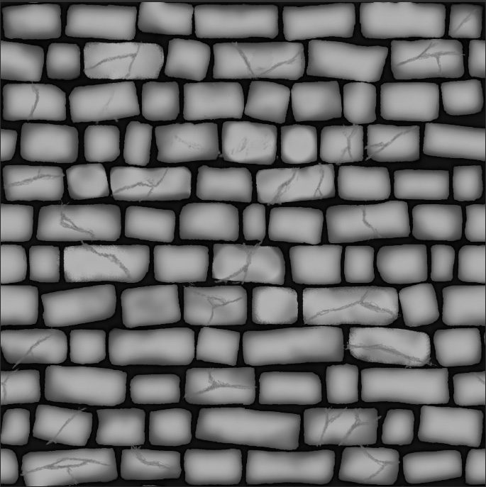
When you're doing with your slider adventure, you should have a texture that looks like...
Oooh. Fancier. Cept for the fact my cracks spread out into my mortar section. I'll fix this by marqueeing my mortar layer with a {{key-ctrl}+![]() , selecting my cracks alpha, and using a large hard edged brush to scribble them away. With the mortar selected, I won't have to worry about painting on the bricks themselves. 10 seconds later, my problem is fixed.
, selecting my cracks alpha, and using a large hard edged brush to scribble them away. With the mortar selected, I won't have to worry about painting on the bricks themselves. 10 seconds later, my problem is fixed.
So now we've got a heightmap. Still got some work to do to bring the most out of it, but lets have some fun first. Run it through Njob, and see how it turns out. This'll help us spot any errors, and give us an idea of what we need to work towards.
Playing with the sliders a bit, I get this...
Hmm. S'alright. It's not as rounded as I'd like, and I've got a few rough divisions in there that need fixing. Back to Photoshop we go!
My problem lies in my original shadows layer, which came about when I was roughing up the shadows back during the diffuse stage. It's an easy fix, though. I'll take a soft, mushy brush that's almost completely grey, go into my alpha, and soften it up to taste. Do this for any hard divisions you find. Since I want a little more roundness to my bricks, I'm gonna go into the brightness/contrast adjustment attached to the same shadow layer, darken it up a bit more. I'll also go into my rounded shadow layer and adjust the opacity a bit so it blends in a little better.
And the Njob results...
Much better. I like how my edits made the rocks chewed up along the edges, less smooth (ahh serendipity), so now I'm going to use that same brush, and go over all the bricks this way. Make it all look a little rougher.
I'll take the alpha on my main shadow layer, select the same mushy grey brush, and dash, dip, dot, and swiggle my way to my desired results. Make sure you keep the edges along the brick darker so you don't get any weird errors on your normal. Eventually, you should end up with a texture like...
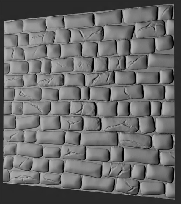
OWWW MY HAND! Think I just gained 3 years worth of carpal tunnel damage in one go with that one. Anyways, the resulting normalmap looks like...
Now that's more like it! Once you're satisfied with the results, then it's time to move on to the next stage
Strengthening and Detailing Your Normalmap
(Little Side Note. This is the part where Crazybump shines. All the stacking, tiling, bluring, and overlaying we're about to do is compresed to playing with a few sliders and the add normalmap button. It's literally the difference between 3 minutes and half an hour. If you've got the cash and inclination, I suggest buying it. Okay, I'll stop shilling now)
To start with, we're going to make two textures. One with the cracks, and one without. I'm doing this so I can round and strengthen the base shape of my bricks without affecting the cracks themselves.
Run your two bumps through Njob. The cracked bump, keep your scale and blur settings lowish. The crackless? We're going to make two new normals with it. One with the sliders set middlish, and one towards the higher, heavier end. Once this is done, go into Photoshop, and make a new document. This doucment needs to be 3x the size of your original texture so you can tile it 3x3. Since we made a 1024x texture, our new document needs to be 3072x3072.
Why are we doing this? Simple. It's so your future gaussian bluring (which we're about to be doing plenty of) doesn't have any odd terminations along the edges that messes up your tiling. Try doing it by itself, and you'll end up with a very sharp edge because it couldn't smooth contiguously.
Once you've made your new document, paste your the crackless normal with the heavy scaling into the scene 9 times. Tile it 3x3, then collapse them all together by selecting the topmost layer, and hitting CTRL+e
BUT WAIT
Leave the centermost tile separate at first. Like so...
Next, duplicate the layer with your centermost tile by rightclicking on the tab, and selecting Duplicate Layer (appropriateness strikes again). Once that's done, collapse it together with your other tiles. You're doing this so you can have a reference to grab with CTRL+![]() when you're finished with the normal. Otherwise, you'll have to marquee select the exact 1024x1024 portion in the center. Chances are good you won't be lucky enough to grab exactly what you need.
when you're finished with the normal. Otherwise, you'll have to marquee select the exact 1024x1024 portion in the center. Chances are good you won't be lucky enough to grab exactly what you need.
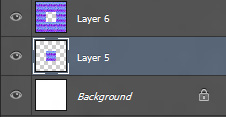
Your layer stack should now look like (With optional deletion of the background layer)...
Now, we're going to make a group folder to store all these textures in. Do this by clicking the folder button at the bottom of your layer stack window...
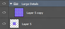
Double![]() the name and change it to "Large Details", then drag your your tiled up layer into it. You'll know it's situated inside the folder when the thumbnail offsets itself....
the name and change it to "Large Details", then drag your your tiled up layer into it. You'll know it's situated inside the folder when the thumbnail offsets itself....
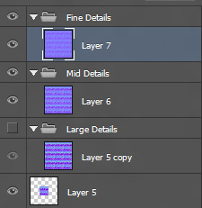
Now, Take your lighter crackless bricks and do the same as before. Tile them 3x3, then collapse them all into one layer. Don't worry about the middle tile. We've already got it. Make another folder, call it Mid Details, and drag your image into it. Repeat the process for the light cracked wall. Your layer stack should look like this when you're done
What I've done is separated them into categories of what I want the texture to show. Large Details is the shape, roundness, and depth of your bricks. Fine details, your cracks and bumps. Mid Details? The inbetween.
...and now the fun begins.
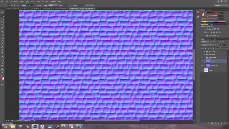
First, hide the mid and fine details groups by clicking the eyeball next to their tab. Next, take the large detail texture, drag a marquee around it, copy with CTRL+c, and paste it three times with CTRL+v. You should now have 4 layers under Large Details. Now, we're going to gaussian blur each one of them. Take the bottommost one, and give it a slight gaussian, around 3 pixels. Next layer up, give it a gaussian blur of 6. Once you're done, go into your 3 top layers, and set them to Overlay on the blending mode dropdown.
Sound familiar? Yup. It's exactly what we did with our shadows earlier in the tutorial. It works exactly the same here, too. Each gaussian blur adds more slope, and strengthens the layer below it.
Hmm, looking at the end results, I'm finding it a little too strong. I'll go ahead and delete the top two layers, and play with the opacity slider on the layer above my base. See how that looks...
Betterish. Next, go to your other layer groups, and set the images there to overlay.
Hmm. With the other layers added, it made it a little too strong again. From a glance, I'm gonna say the stones will be a little too pointy. I'm going to test out the results right fast, see how it looks..
Yup. Too strong, and too pointy. I'll delete the second layer on my large details, and gaussian blur the base texture a little more.
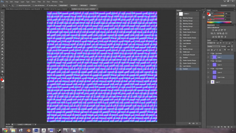
Hell, since I have a pretty decent heightmap to work off of, I'm coming to realize I don't need to stack on too many layers. It'll bring out too much curvature. So what I'm going to do is blur the single large details image by 10px, blur the mid detais layer slighty, 2px should do it, set the opacity slider to 35%, then copy/paste two more images in the file details folder, and only blur the top one slightly, 2.5 or so. Lets see how that looks...
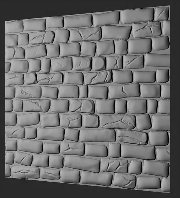
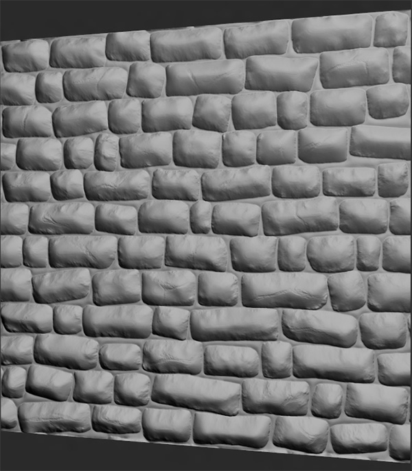
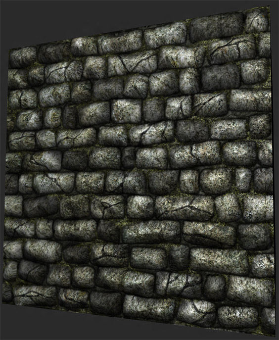
Better. Lets see how it looks in glorious realtime 3D...
Yeah. It's getting there. Might need to lessen things up a bit, and it needs more noise.
Alright, we can pretty much say we're done with the gaussian blurs by this point, so lets convert our texture to it's old 1024x1024 self. To do this, select your top layer, hold down SHIFT, and ![]() the bottomost foldered image. Basically highlight everything except your freefloating center tile at the very bottom. Once you've done that, rightclick on any one of your selected layer tabs, and choose Merge Layers. It'll collapse down all your selected layers into a single image, leaving your freefloater floating free. Then, CTRL+
the bottomost foldered image. Basically highlight everything except your freefloating center tile at the very bottom. Once you've done that, rightclick on any one of your selected layer tabs, and choose Merge Layers. It'll collapse down all your selected layers into a single image, leaving your freefloater floating free. Then, CTRL+![]() said freefloater to marquee it, go to your recently collapsed layer, and CTRL+c to copy out that secton, CTRL+n to make a new document, and CTRL+v to paste your image in. If you did it right, you should have your tweaked up 1024x1024 normalmap sitting right in front of you. Once you do, undo the merge, and save it. You might want to come back to it later.
said freefloater to marquee it, go to your recently collapsed layer, and CTRL+c to copy out that secton, CTRL+n to make a new document, and CTRL+v to paste your image in. If you did it right, you should have your tweaked up 1024x1024 normalmap sitting right in front of you. Once you do, undo the merge, and save it. You might want to come back to it later.
Now, we're going to add some random noise to the mix, but we're not going to be using any of our base stone wall textures to do so. A normalmap doesn't always have to follow your diffuse completely. Sometimes it's actually detrimental to the outcome. Like, for instance, a stained plaster wall. On the actual wall, the stains will be overlayed on the surface of the plaster, but isn't actually deforming the plaster itself. If you base the normalmap straight off the diffuse, you'll get that indention there, and it'll look stupid. It's better to use another plastery surface completely.
Okay. Nice lecture, I know, but what does this have to do with our rough stone wall? It ain't plaster at all! Well, I'm pretty much using it as an excuse to say you can throw whatever noise you want onto the texture (within reason), and it won't mess up your normalmap base. You've got the foundation done. Anything you add on from here is all flavoring.
Lets make our stone wall look even more rough and gritty. We're going to do this with good ole fashioned Render Clouds.
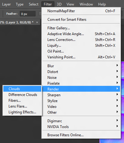
Make a new 1024x document, and go to your color swapper. Select a light grey, and oh so slightly darker light grey. You don't want too much contrast, otherwise your pits and peaks will be too extreme. Afterwards, go to Flter/Render/Clouds
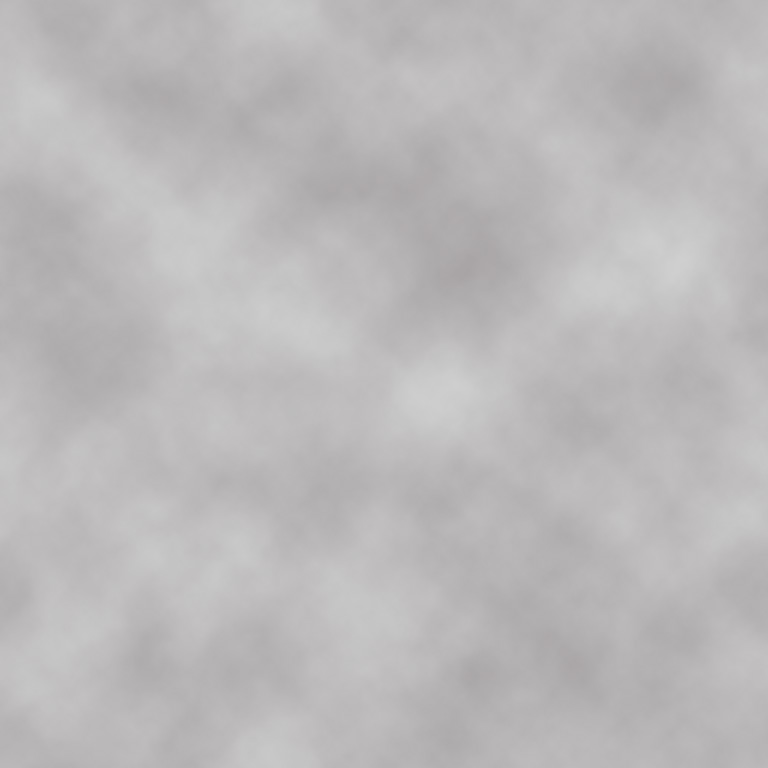
You should end up with something similar to this...
If you're worried about tiling, don't be. As long as you're using a power of 2 texture, a render cloud will automatically tile.
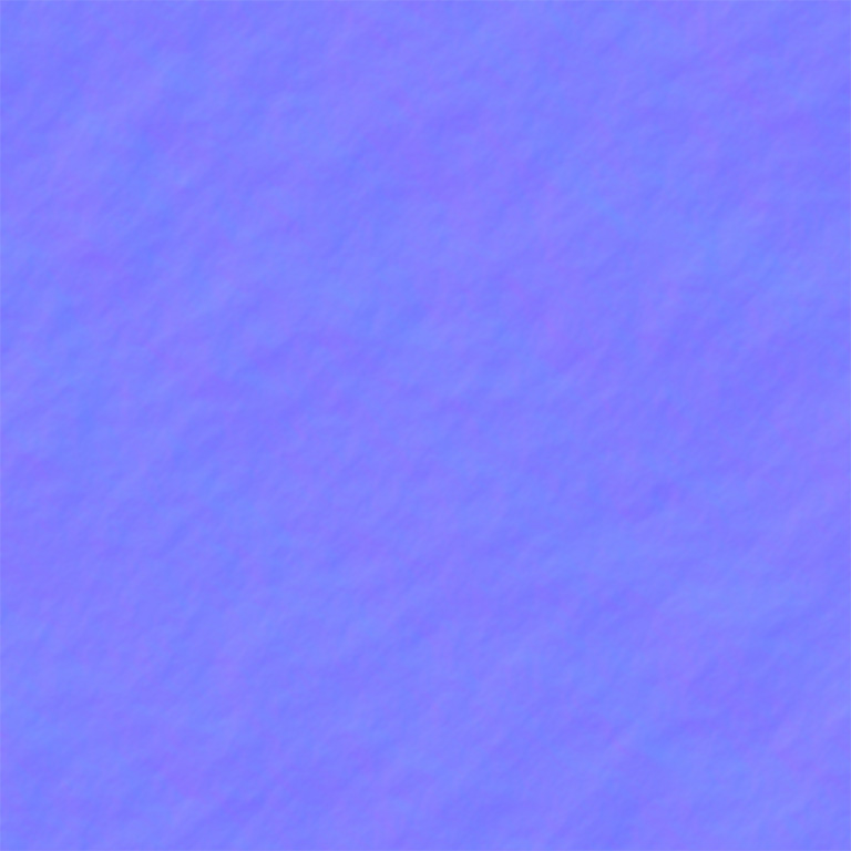
Once you've got your new cloud texture, save it out, and run it through Njob (that sounds dirty). Run both sliders all the way to the right, and you should end up with a gritty, nonspecific noisy texture.
Alright! You've just made your first detail normal! Don't ever throw it away, because it can be used again and again and again for any variety of textural situations. I've got about a dozen normalmapped cracks, dips, bobs, weaves, and wingbats doohickeys I throw on my textures to spice things up a bit. I'll cover their creation more in the general normalmapping tutorial, because they do come in quite handy.
Okay, now that you have your detail normal, lets throw it into our texture. Once it's there, we're going to build up the detail on it much like we did with our stones previously. Do a marquee select, copy/paste it about 3-4 times, and set the blends on all of them to Overlay. If everything looks decent enough, go ahead and collapse them down into one layer. If you still think it needs some more detailing, then hey, go ahead and add a few more to the mix. Play with it until you're happy with the bumpiness.
Beyond that, if you want to bring out or strengthen anything else, you can always return to your original 3072x3072 texture, and tweak and cull specific details to reimport to your 1024x normal. Normalmapping is as much experimentation and goofing around as it is good planning and detailing, specially when it comes to something as loose and undefined as rough stone. So keep poking and prodding it until you've got something you're happy with
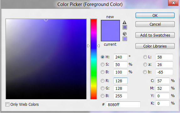
If you find your texture is way too strong after all that layering, there's a very simple trick to fix that. Make a new layer, and fill it with the default normalmap blue of R-128 G-128 B-255...
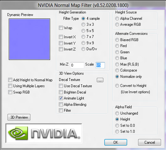
...then play with the opacity until it looks smooth without being too garish. Afterwards, all you have to do is collapse your image into a single layer, run the Nvidia Normalmap Filter (yup, the ole NV Filter still has it's uses), and select Normalize Only.
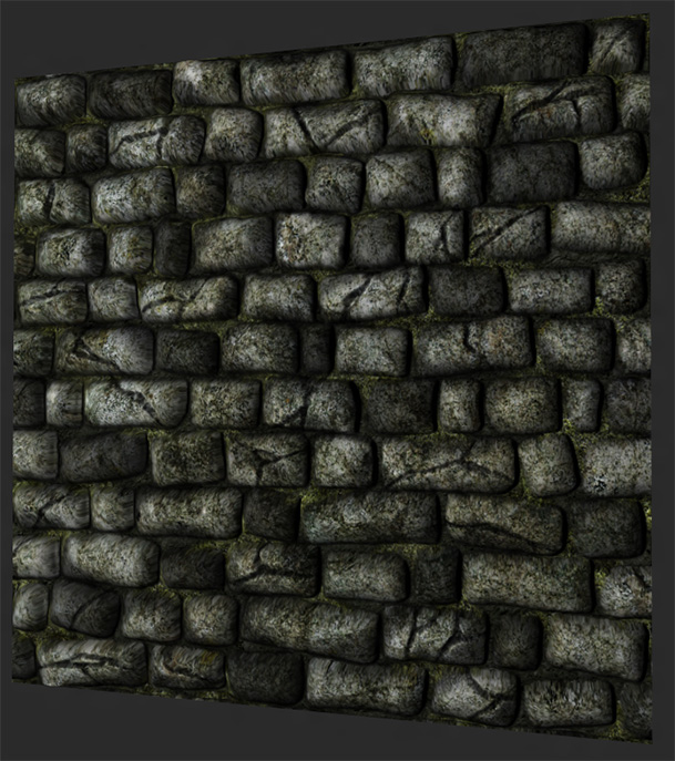
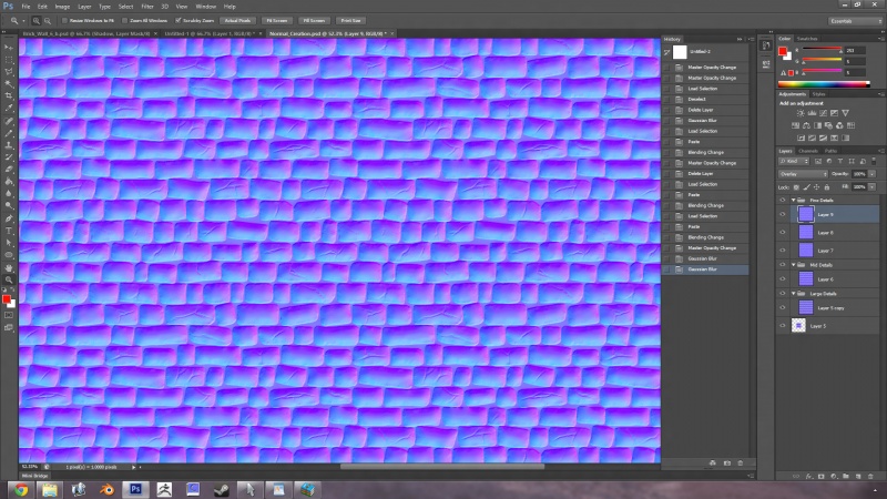
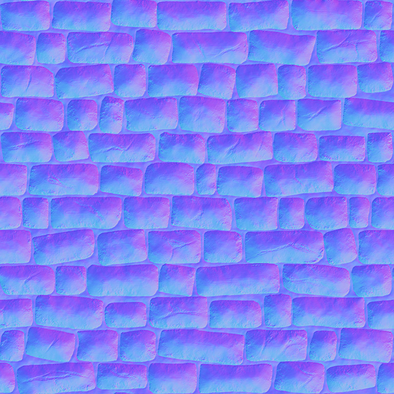
If you like it, then here you are! You've arrive! Yourfinal texture...
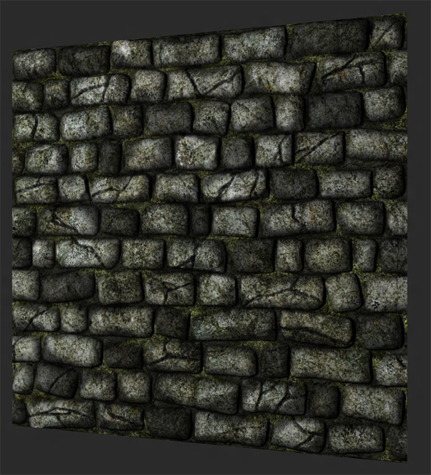
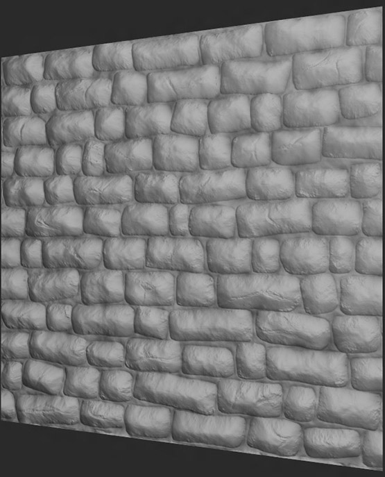
Let's see how it looks in realtime...
Think I went a little too shallow on my cracks, but other than that? Oooh. Quite nice! Overall, I'm pretty happy with it. If I want to go back and change anything later, well, hopefully I did a good job illustrating how to do just that.
Thus concludes our Rough Stone Wall tutorial! If you have any questions at all, just hit me up on the TDM forums, and I'll try my best to answer them.
Hope you had as much fun reading it as I did making it. :D
