Photoshop 2: Tweaking With Adjustment Layers
Tweaking Your Colors With Levels
This tutorial is going to cover tweaking your colors, the wonders of Adjustment Layers, and bringing out and sharpening up the details in your texture.
For the sake of demonstration, I used a texture kindly provided to me by Scarykitties over at the TTLG forums. Since this tutorial is more a show and tell, less a precise hands-on exercise, you can use any texture you want to follow along.
First, we'll cover the verymost basic tweak you'll apply to all your textures: Levels.
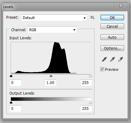
The best way to explain levels is to say that it's a way to optimize the colors in your textures. When you first fire it up, you'll have a graph showing where the colors in your texture strongest, and where they go weak. Any high point on the graph represents colors that are bolder and more solid. Anything low is erring more towards grey. Scarykitties' texture has a narrow range of strong color, mostly along the red channel, and a lot of weaker color space dragging down the vividness of the texture as a whole. If you go to image/adjustments/levels, you'll get this graph here...
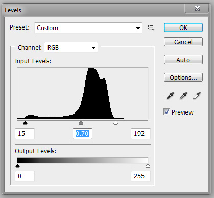
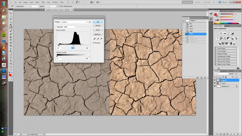
See those 3 little arrows along the bottom? That's what you use to determine the range used by your texture. The leftmost one tends to make the colors skew dark the farther right you drag it, the rightmost skews your texture lighter when you drag it left. The center arrow allows you to tweak the base color lighter or darker within the range of the other two pointers. Think of it as the overall black and white levels, and the grey in between. Play with it a bit, and you'll see what I mean. The end result is your colors will pop out. Anything that looked sorta neutral and washed out will be bolder afterwards. Like the dirt texture is sort of a paleish brown by default. Leveling it out makes it a vibrant baked earth red when you adjust your sliders to narrow on the higher ranges. Such as...
The red was already there, we just brought it out by playing with the levels slider. All other colors will pop as well, giving it more contrast, and will look better overall. Game engines in general seem to be able to do more with textures that are vibrant and contrasty, as opposed to pale and neutral. This is a good example of the difference a simple level application can make to a texture...
Much better, right? But what if you like the vibrancy, but still preferred the older, browner color of the original? We'll get to that later. For now, lets take what you learned about levels, and apply them through the wonderful magical oh so very handy...
Application Layers
Okay, first off, what's an application layer? Well, when you use levels from the image/adjustment menu, it's a one-time, permanent application to your image. If you discover you want to go back and change it later on, you're going to be adjusting on top of your old adjustment. Your original image is gone. Forever changed, and probably traumatized by the experience. An application layer lets you make that change and apply it as...well...an ever-editable layer. It'll level off every layer below it without directly changing the images themselves, and will always be there to tweak, change, or even delete at a later point. If you don't like the changes made through an application layer, then just delete it and use another. This is what the fancy lads who pretend they know what they're talking about call nondestructive editing. Basically, any change you make can always be changed or deleted at a later date. You're never stuck permenantly with any one change.
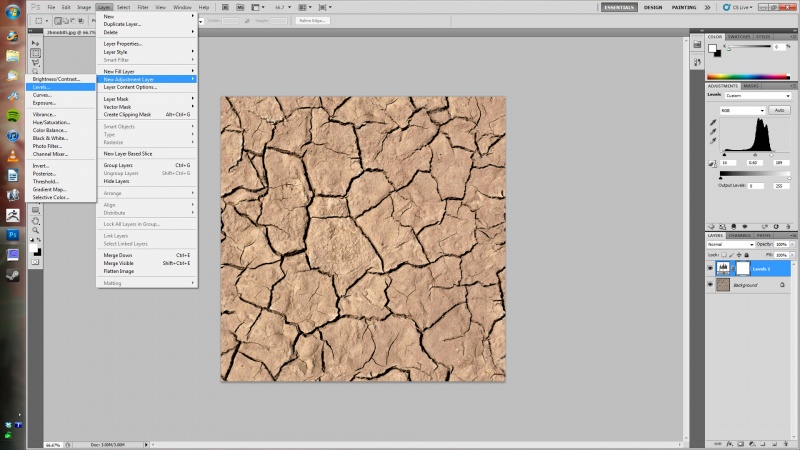
So how do you apply one of these ultra wonderful application layers? Easy. From your menu at the top, go to layer/new adjustment layer, and select which one you want to use. You've got a ton to choose from, but we'll choose levels since it's our most recent subject. You'll get a new layer, "level 1"
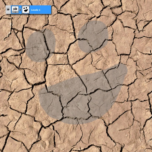
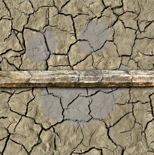
All of your adjustment layers will have an alpha mask applied to them right out the gate. I guess it's so it'll tempt you to do cool stuff like this...
...yup. If you don't want a small section of your texture leveled off, you can just mask it out. Handy. As. Aw. Hell. Naw.
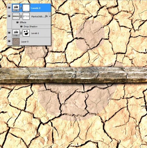
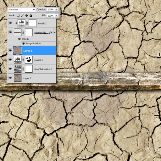
But what if you start adding in details culled from other textures, and you find you want to level it out using an adjustment layer without affecting the layers below it? That's an easy answer, too. I'll go ahead and add a plank in on top of the dirt texture. I'll mask it in using the steps covered in the previous tutorial, add a layer effect drop shadow to make it look snazzy (I'll cover this in depth in a later tutorial), then add a level adjustment layer above it.
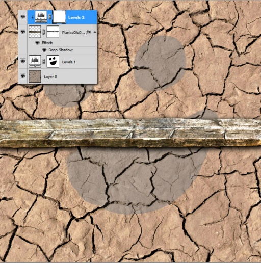
Well, that leveled out the board, but it screws up the color of the dirt. So, what do you do? Well, just hold down the alt key, and click between your plank layer and the adjustment layer. When you see your cursor turn into what looks like two little dark circles stacked on top of each other, then ![]() , it'll offset your second level layer, and show a little downpointing arrow along the left side of the tab. You've now made your first clipping mask, and that level layer is now applied exclusively to the plank layer, and won't affect anything else.
, it'll offset your second level layer, and show a little downpointing arrow along the left side of the tab. You've now made your first clipping mask, and that level layer is now applied exclusively to the plank layer, and won't affect anything else.
BRILLIANT!
(Little addendum here. This handy trick is useful for situations far beyond adjustment layers. Like you want to add detail on some certain thing, but nothing else. You can just clip it to your intended layer, and there you go. I greatly suggest experimenting with it)
And thus, your introduction to adjustment layers.
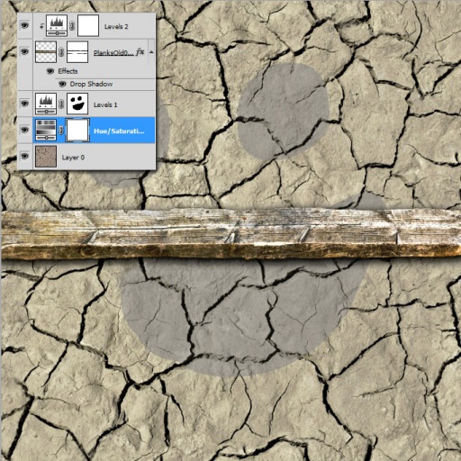
But we've still got more to do. Like remember when everyone got all gripey, and complained that the dirt was a little too red? No problem! We can use a multitude of approaches to fix that. Since we're already on the topic of adjustment layers, lets throw a hue and saturation one into the mix. Go back to layer/new adjustment layer, and add the hue and saturation layer above your dirt texture, but below the level layer. When you click on it, you'll find that it lives up to it's name, allowing you to adjust...wait for it...hue, saturation, and lightness. Don't play with lightness too much. It has a tendency to wash out details. You can make slight adjustments to taste on occasion, but overall brightness is better adjusted in your levels.
So now that you've got a more browish patch of dirt, you're finding that it isn't quite as vivid as was before. Oh well, you can fix that no problem. Just go back up to your level adjustment layer, and play with the middle slider until it looks good to you.
Wow. Those adjustment layers really are about damn handy, aren't they? Tweakable at any time, and doesn't make any permanent changes to your base texture.
Like I said before, this is only one method you can use to change texture coloring. This particular technique is the one I tend to use the most, though, so I figured it'd be best to focus on it first and foremost.
High Pass Overlay
But say you want to bring out and sharpen up your overall details. Make them pop a little more. You have two options to do this.
1. Sharpen.
Sharpen? Really? What are you? Some kind of cheesy stank noob? It's destructive, not very controllable, and the end results aren't always that good. What the hell were you thinking?
or...
2. High Pass Overlays
You're probably going to need an explanation. When you went to run the offset filter in the previous tutorial, you probably saw high pass in there amongst all the other filters. You probably didn't even pay much attention to it. That's a shame, because the high pass filter has a multitude of uses.
Basically what it does is tries to normalize the colors on a texture by bleeding out the contrast. It does this by making everything tend towards this sorta chromatic looking bluish-grey color. You can adjust it's strength. High up only makes subtle changes, lower just makes the texture look flat out weird. It's a hard to thing to explain. Something better experienced than told. Play around with it, and you'll see what I mean.
What it's good for by itself is taking fields of color, and normalizes them towards a more neutral color. For instance, you're doing a concrete texture, and you discover that one side of the wall is a darker grey than the other. You can normalize the two by running a high pass filter. Don't think of it as a one hit fix-all button, though. You'll have to play around and adjust quite a bit to get the most out of it. But it is useful.
But we're gonna be using it for another little trick. Bringing out details.
To do this, make a copy of your base texture by highlighting your layer, hitting CTRL+![]() on it, Ctrl+c to copy, and Ctrl+v to paste it above your highlighted layer. Go to your layer filters dropdown, and choose overlay.
on it, Ctrl+c to copy, and Ctrl+v to paste it above your highlighted layer. Go to your layer filters dropdown, and choose overlay.
Whoa. Holy crap! That looks kinda neat!
Yeah, the effect of doing this is sorta similar to leveling out your texture. It's doubling up the colors, and an oversaturation effect is the result. I don't use this much, because you don't have as much control over the end results. Sometimes though, you get something cool, which you can use if you feel like it. But we're gonna be doing a little something more.
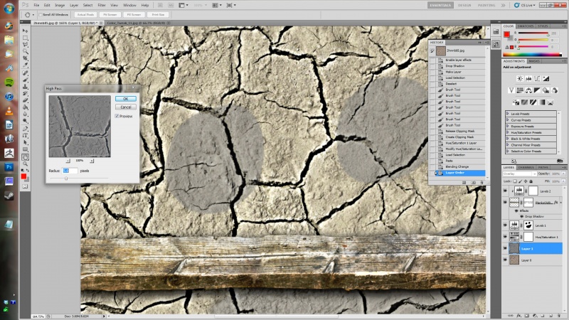
With your new overlayed layer selected, go to filters/other/highpass. You'll immediately notice the difference. The blacks and whites are being overlaid with the little details, and the slight gaussian-like blurring is popping them out, defining edges, giving everything a little more crispness. You generally want to stay along the far left side of the slider when adjusting your high pass, only adding just enough definition to pop out the little details. Anything more, and it starts looking garish. For the sake of example, though, I'm gonna go completely against instructions, and jump the radius up a bit more to show it off.
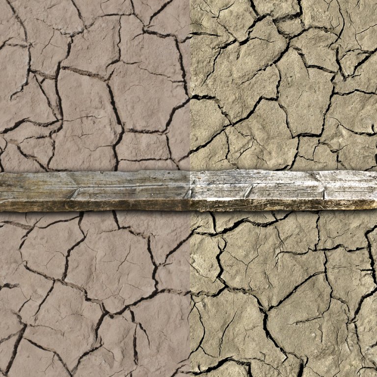
Do it as instructed, and there you go. A colored up, brighter, more defined texture. I went ahead and tweaked it out a bit to taste. Here's a nice before and after shot to show it all off (downsized slightly)
...and that should do it. A nice explanation on how to tweak, edit, and redefine the colors and details in your textures.
For our next tutorial, we'll be taking everything we've learned and applying it to our first big project: A rough, mossy stone wall.
