Blender: UVs & U Part 1: Difference between revisions
| Line 176: | Line 176: | ||
If you’ve had more than a passing interest in modelling, you’ve probably read a few tutorials where you unwrap a cube and lay it out across a UV sheet, getting end results that look something | If you’ve had more than a passing interest in modelling, you’ve probably read a few tutorials where you unwrap a cube and lay it out across a UV sheet, getting end results that look something like… | ||
Revision as of 13:17, 21 May 2012
The Basics of UVing
Introduction
UV mapping. The mere utterance of that phrase sends paroxysms of fearful shaking down the spines of the even most stout and brave of stalwart people. They’ll scream a bit, sometimes cry, then run straight for the hills. Really, it’s no wonder. Back in the day, even the most basic of tutorials read like dry dissertation on higher level mathematical concepts, making it sound less like a way to get a picture on a cube, and more like a grim reminder of why you failed calculus.
Despite its reputation, I can easily say that this is not the case. UV mapping is actually fairly easy once you wrap your head around it. It’s filled with a goodly bit of busywork, I’ll admit. Especially when you compare it to the “select surface, click on texture, get texture on surface” approach BSP editors take. You really can’t beat that as far as simplicity is concerned. But once you figure out the ins and outs and concepts, it’s not at all difficult.
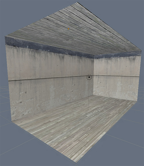
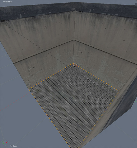
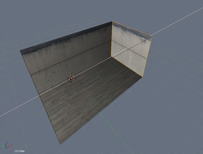
I’ll start out easing you into the wonderful world of UVing by covering texture application similar to what you’d use in Dark Radiant: a single tiling texture applied to a single surface. The end result being this lovely thing…
…where I make materials out of each texture, unwrap each wall on its own UV map, and apply the material to the wall. Sounds complicated, right? Well, it ain’t. A few excess clicks is about the worst of it.
Now lets get down to it! Gird your loins, folks. It’s time to UV map!
Setting Up Your Materials
Before we jump in, we’re going to need a few textures to work with. I’m not going to worry about making any super fancy custom textures for the sake of this most simple of tutorials. That’ll come later. Now all we need are a few tiling textures to get us started. I went ahead and picked out three from CGTextures. One for…
Save these wherever, then hop into Blender. Now it’s time to turn them into a bunch of materials to slap on your wall.
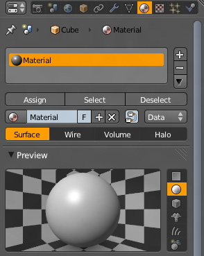
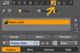
So how do you do this, you wonder? Semi-simply, of course! It’s so easy, it only takes a moderate amount of tutorialage to figure out how to do! To start with, you’re going to want to look over on your properties bar (the big vertical thingy on the right side of the interface FYI), and find this currently highlighted button…
This is your materials tab, where you very obviously define and set your materials. A material being anything from flat colors, to procedural textures, to videos, to bitmap. They are the paint you apply to your surfaces, and your settings within this and the next tab over determine the shape, the grain, the specularity of the material. You have an absolutely staggering amount of options at your disposal. Enough that it’s almost demoralizing at first glance.
“My God”, you think, “I have to deal with all of these”?
Nope! Unless you’re planning on going all fancy and making and baking out some procedural textures, all you have to worry about are the bitmaps. As far as TDM is concerned, the rest is completely nonexistent. You could make the default color purple, and jack the spec up 2000%, and all TDM will see are the image based textures you’ve applied to it.
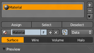
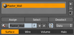
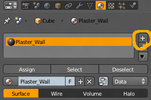
Okay, I’ve jabbered enough. Lets get something done here. Okay, you’re currently in your materials tab. You’ve probably noticed by now that it already has a material applied. The generically named “material” material. We’ll go ahead and use this one for our first texture. But first, lets rename it to something we can identify at first glance. This will be our “Plaster_Wall” material. Rename it by highlighting the material you want to change (you don’t have much choice here at the moment, so…), and clicking the little box located beneath the “Assign”, “Select”, and “Deselect” buttons.
Highlight it as shown in the image, rename it to Plaster_Wall, and hit enter. This changes the name of the selected material.
This’ll make it easier to keep track of once you start making maps and models that use multiple materials.
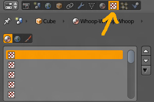
But what about actually applying a texture to this material? After all, we want to use an image we grabbed off of CGtextures, right? All it looks like at the moment is a shiny grey ball. Okay then, lets move on to the next step, which has you going alllllll the way over to the little checkerboard tab right next to it.
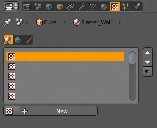
This is your textures tab, where you apply procedural effects, video clips, and bitmap images to your materials. In other words, this is where you’ll be applying your texture to your texture.
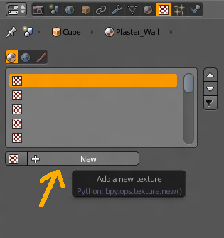
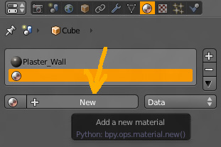
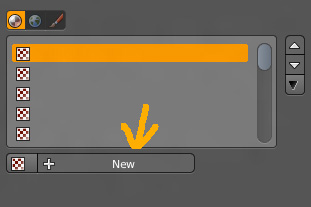
Now lets go ahead and lead the material to our texture. Do this by clicking new…
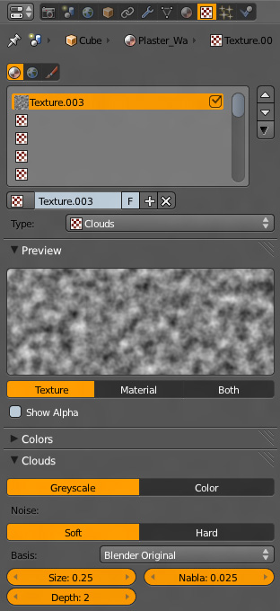
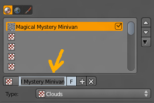
…(yeah, that arrow was probably unnecessary), which then makes a new texture for this material and brings up all the options for tweaking it. You should be seeing something like this…
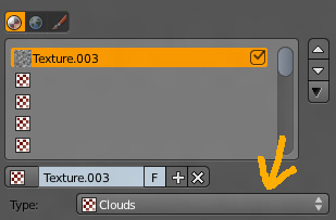
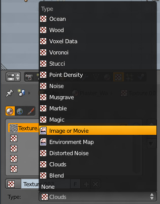
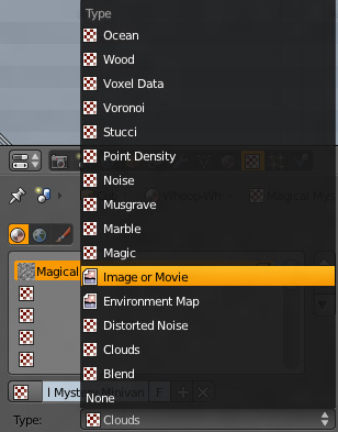
…holy crap, that’s a whole ton of weird stuff. What the hell am I gonna do with all this? Not much, really. All you want to do is add in your image, which you can do by clicking on the type dropdown menu…
…which brings up the various types of procedurals and other effects you can use for this texture. You want to select “Image or Movie”…
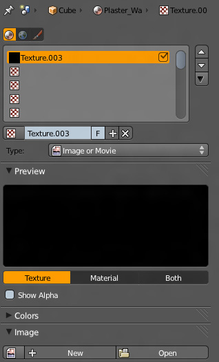
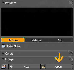
…which changes your preview shot to black, and brings up a whole new set of options. Don’t worry about the rest now, all you want to do is focus your attention on the “Image” dropdown tab.
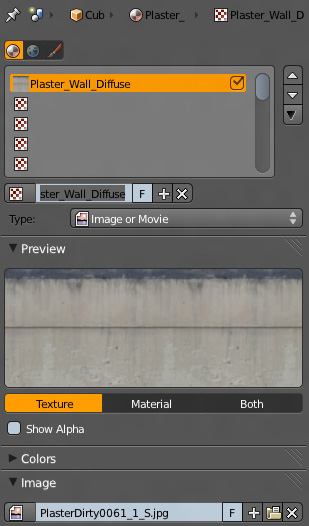
The rest is relatively easy. Hit “Open”, and lead Blender to your PlasterDirty0061_1 texture. The preview box will now show a stretched out version of your image. Congrats! You’ve just applied a texture to your material! It’s now ready to go.
If you want, you can go ahead and rename “Texture.001” to something like Plaster_Wall_Diffuse for future reference.
Alright! That’s one down! It might seem a little complicated now, but once you get used to it, it’s nothing more than a simple 10 second process. All you need is a little practice doing it, and you’ll have the process memorized in no time flat. Good thing you’ve still got two more to add, huh? Extra practice ahoy!
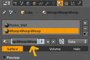
I’m not going to run you through detailed explanations for these next two. A quick step-by-step would be better here, both to hammer the process home, and for reference.
Bam! Sweet texture! Do it again for the floor/ceiling, and you’re good to go!
…cept for the fact you don’t have anything to apply them to. I guess since this is a UV tutorial, we should eventually cover that, right? I think now would be as good a time as any, so lets do that now...
Texturing The Cube
Setting Up The Cube
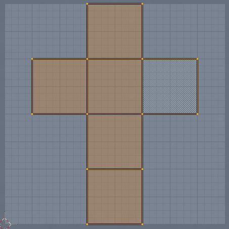
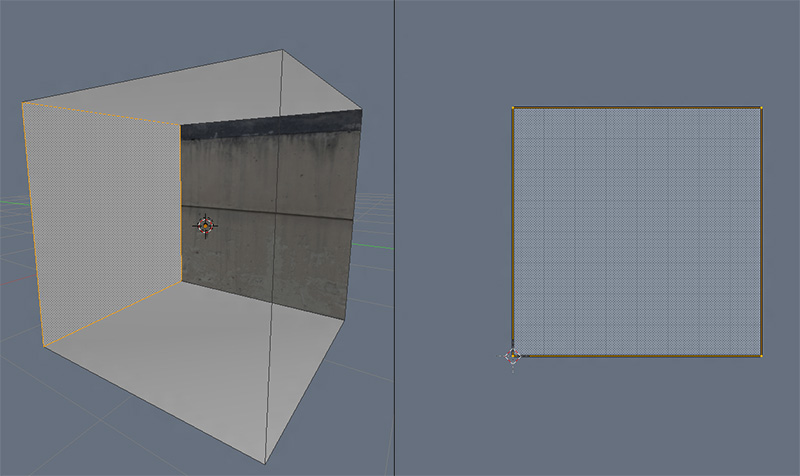
If you’ve had more than a passing interest in modelling, you’ve probably read a few tutorials where you unwrap a cube and lay it out across a UV sheet, getting end results that look something like…
We’re not going to be doing this.
Instead, I’m going to be doing something far simpler. Something that should hopefully make it a little easier for you to slide into UVing before going straight for edge seams and proper unwrapping techniques.
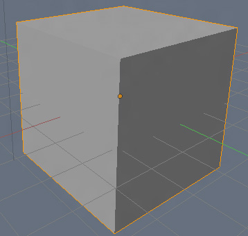
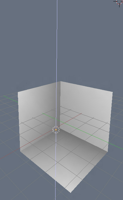
We’ll start with a cube. A plan, normal, straight from the mesh menu, not at all fancy cube.
It can be as large or as small as you want, as long as it’s an equal-on-all-sides cube. Once you’ve gone through the arduous process required to produce this cube, lets go ahead and set our viewport shading to “Texture”. Do this by going to the header along the bottom of the window, finding the little white box tab, clicking it, and choosing the appropriate selection.
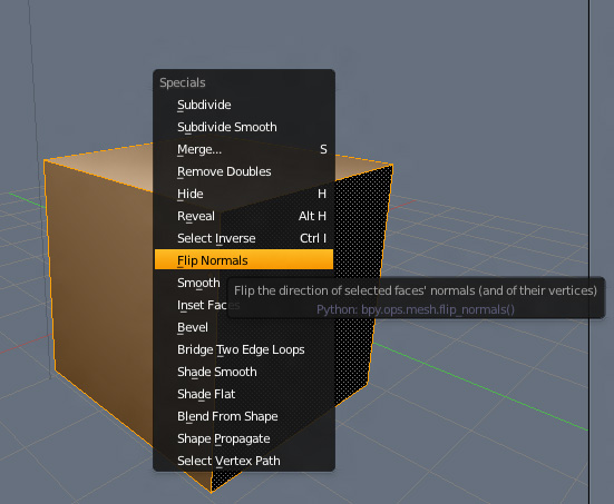
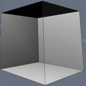
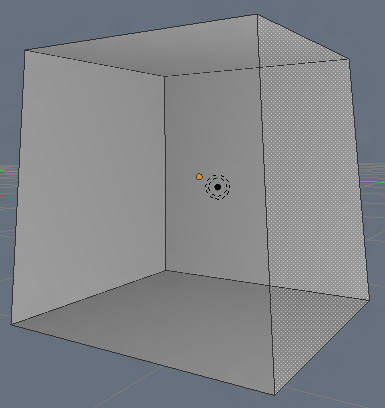
You should see your cube, but shaded according to the location of your lamp that’s always floating around in your scene by default. Since we’re going to want to make this a little room rather than something like a crate, we’re going to need to flip our normal. Do this by selecting the whole object by hitting A, then hit W to open your Specials Menu, and select “Flip Normals”.
Okay, little aside aside, you should now have a cube that looks something like…
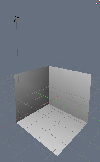
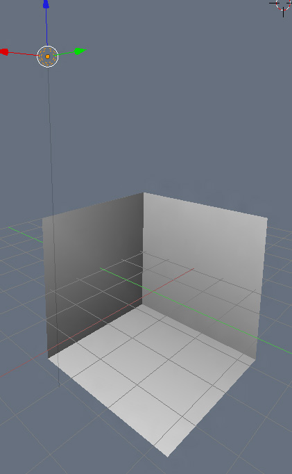
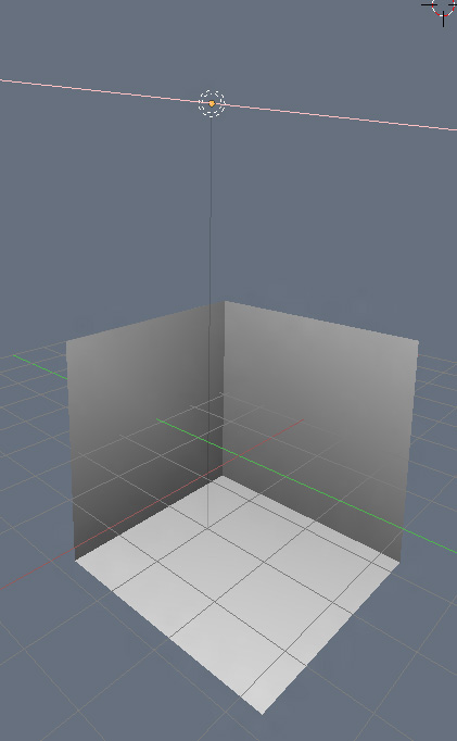
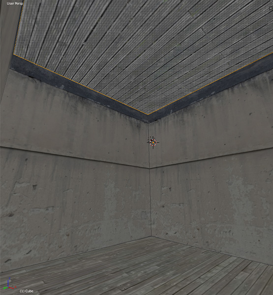
Notice how the ceiling is dark? That’s because it’s not catching the rays off our little lamp over there. Lets fix that by going into Object Mode with TAB, clicking on and highlighting the lamp, and moving it into position in the dead center of our room.
Your cube should now be evenly lit throughout…
Unnecessary? YES! For some reason, Blender doesn’t have fullbright shading while in Texture mode. But hey, it’s easy to fix, and you get some nice shading to boot. Could be worse.
Now, after much procrastinating and tweaking, we finally get to the much anticipated point of this tutorial. We’re now going to make some UVs.
And this time I mean it. We’re making UVs. Now.
UV Mapping The Cube
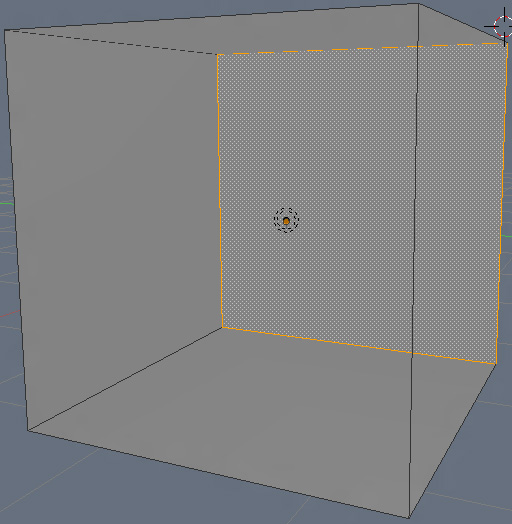
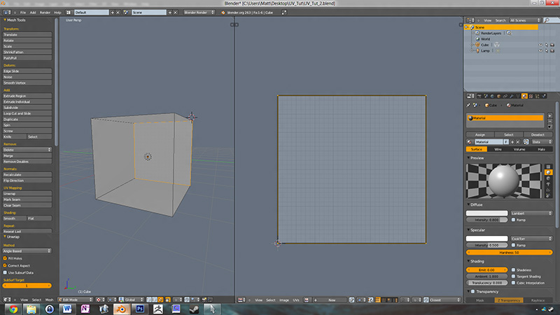
Despite (or maybe because of) the build-up to this point, you’re probably going to be surprised at how easy it turns out being. UV mapping simple flat shapes is literally a click. To demonstrate, we’re going to finally put a texture on this wall…
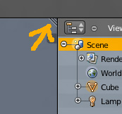
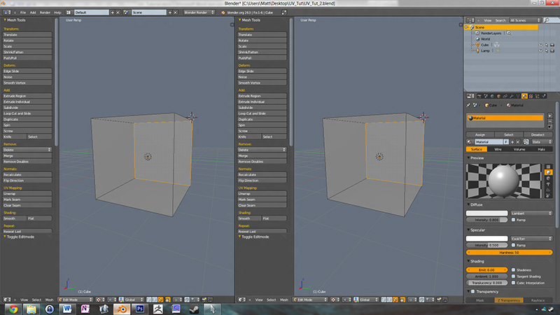
…but first, we need to open up our UV editor. To do this…see that little ridged corner bit at the top right of your window?
Mouse over to, grab it, and drag it out to the left. You’ll see that its split your viewport into two 3D editor windows.
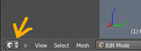
Lot of good that’s doing you, huh? Let’s change this to something a little more useful right. On your bottom header bar, next to “View”, “Select”, and “Mesh”, you’re gonna see a small cube icon.
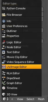
This your editor type selection, where you’ll change this window from the 3D editor, to the UV editor, to the video sequencer, to whatever else Blender is capable of. Every window you see in Blender is basically one of these. By grabbing those ridged corners, pulling out new windows, and changing the editor type, you can customize the Blender interface any way you please. Handy, huh? Let’s go ahead and change our newly pulled window to the UV Editor.
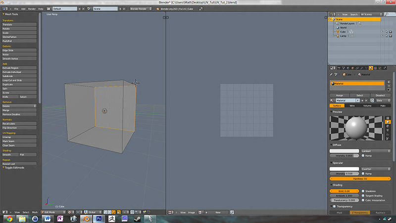
…which will net you this…
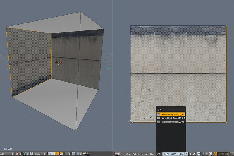
Now with your face still selected, hover the mouse over the window corresponding to the area that is now the UV editor, hit E (or alternately, U to bring up the Unwrap Menu, and choose “Unwrap”, and…
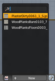
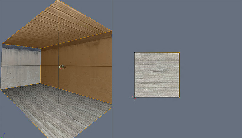
…you just unwrapped your wall. Yes. It is that easy. A square perfectly aligned within the confines of your UV space, all with the click of a button. Let’s go ahead and apply our plaster wall material to it by going down to the Link Images button located along the bottom of your UV Editor window…
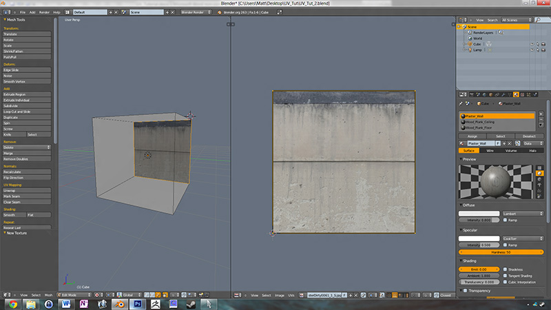
…opening it up and selecting your plaster wall texture…
…and your wall should now be textured. Just like that.
Before we move on, I’m going to cover one question that’s probably floating in your head at the moment…
“does unwrapping like that always produce a perfect square? Does it try to maximize the surface across the entire UV grid?
No. It’ll produce a 1:1 match of your selected surface, and scale it as large as it can within the confines of your UV without distorting the shape. Make sense? No? PICTURES!
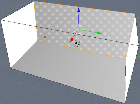
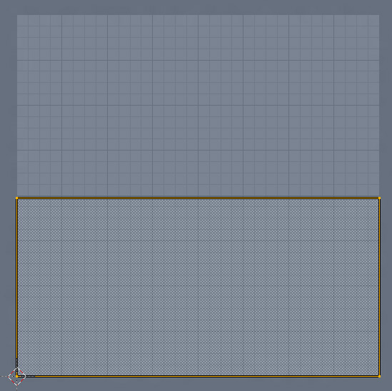
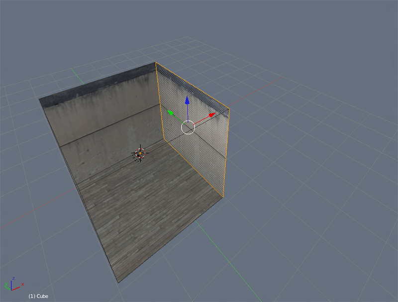
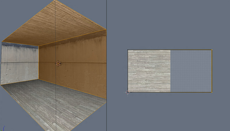
Here’s our room, but more rectangular. See the wall I’ve selected?
If I were to unwrap that, it wouldn’t produce a square, it’d produce a rectangle that matches the ratio of the selected surface, scaled within the bounds of the UV grid.
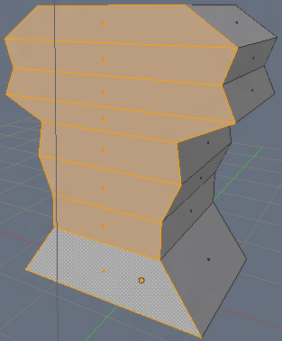
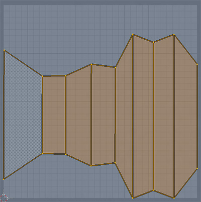
See? But what about more funky shapes? Like this thing here…
…what would it do?
Yup. Once again, a perfectly aspect ratio correct UV map of your selected surfaces, scaled within the confines of your UV grid…just flipped on its side. Sometimes it does that.
Since your cube had perfectly square walls, it produced a perfectly square UV. Starting to get it? I hope so. :P
The next question on your mind is likely “so what am I doing here exactly? Am I giving each one of these surfaces its own unique UV each time I unwrap them individually”? Nope. Think of it more as unwrapping your cube piecemeal. You’re not doing it all at once, and getting a whole bunch of square scattered about. You’re selecting parts of your cube model, unwrapping them, and dealing with them one at a time.
This is one of the things that surprised me when I first started learning how to UV. I always thought you had to do the whole thing at once, which made unwrapping some models more difficult than they needed to be. You can unwrap and arrange individual parts as you go along.
…but I think I’m getting a little ahead of myself here. Let’s return to the task at hand. Go ahead and select a face and unwrap it.
Then drop down to your image linker down at the bottom of the UV Editor window, and select your plaster wall.
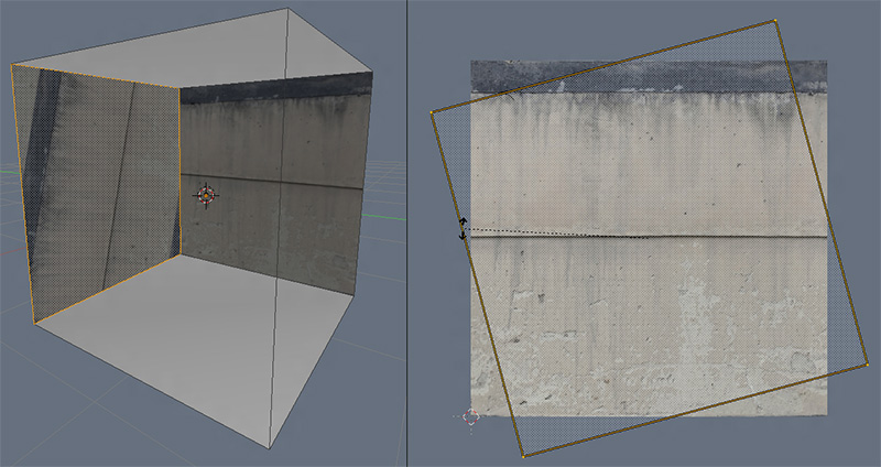
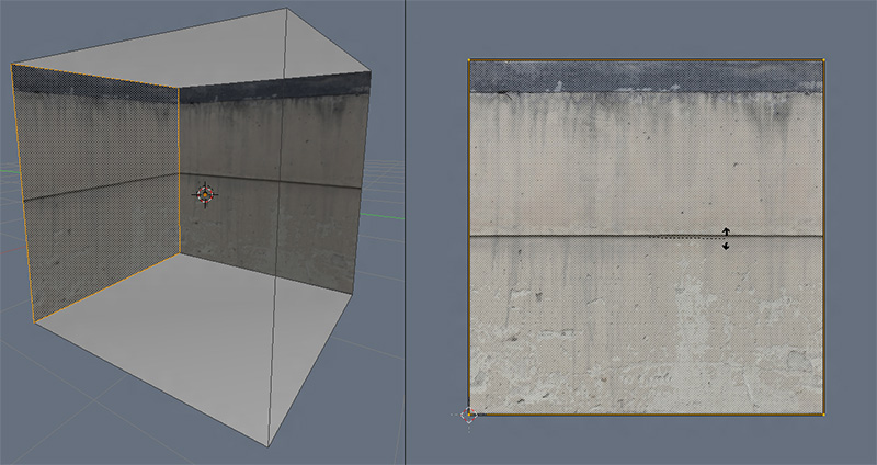
…whoa. It came in upside down. Just like our funky shape example flipping on its side up above, that happens sometimes. You can fix it easily, though. Select all the verts that correspond to your shape by hitting A while in the UV Editor, and hit R to rotate, making sure to hold down CTRL to constrain it (so it snaps into place perfectly…you don’t want to have to spend 15 minutes making sure you’ve got it all aligned right).
Repeat the process twice more. Rotating your UVs into place when needed (don’t forget to hold down CTRL when rotating).
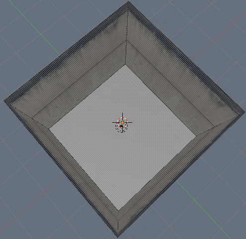
Look at that! You’ve got walls! Congratulations guy/gal/person!
But what about the floors? I think you should know what to do by now. We’ll start with the floor. Select the face, move over to the UV Editor, hit E (or U and select “Unwrap”), then drop down to the image linker, and choose your image…
…OH CRAP! THAT ISN’T THE TEXTURE I WANTED FOR MY FLOOR! I’VE SCREWED UP MY MODEL FOR LIFE, AND HATE MYSELF FOREVER!
No you haven’t, you overreacting histrionic dork-goob. Just select the floor face again, go back to the image linker, and select the other floor texture.
OH THANK GOD! I WAS SO SCARED, BUT YOU SAVED ME FROM A POTENTIALLY HORRIFYING SITUATION!
…you’re quite welcome. Now shut up and do the ceiling. Remember: select face - unwrap with E or U and select “Unwrap”) while the mouse is hovering in the UV Editor - image linker.
Take a bit of time to sit aside for reflection. Come to realize you’ve just UVed your first simple room. This is your moment. I’ll leave you to it.
Done? Okay. Good. We’ve still got a bit to do before I consider this tutorial finished. Next up? We’re gonna make our room rectangular!
I hope to GAWD you know how to select a face and transform a cube into a rectangle. If you don’t, I’m not teaching you. Sorry. I’m shunning you. But for those of you who do, go ahead and select a face, then use your transform tool to stretch it out into a rectangle. Make it roughly double the length of your current room.
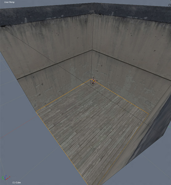
By doing this, you probably noticed it stretched out the textures on your floor, ceiling, and walls. It’s no longer nearly as nice as it once was.
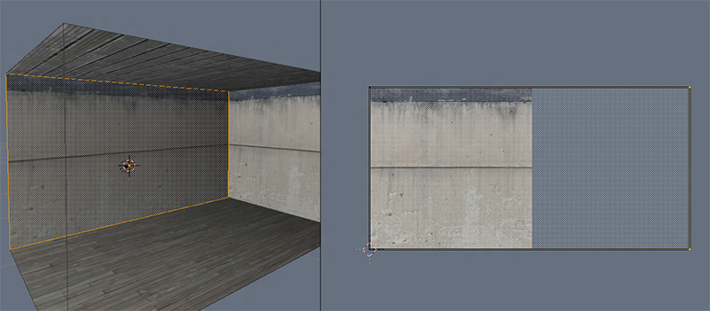
Why did it do that? Because it didn’t stretch out your UVs accordingly. As of right now, you have a square texture with a square UV on top of it mapped to a long, rectangular surface. You’re basically squishing your long surfaces into that square, and the editor is stretching out the pixels because that’s how they’re mapped to the surface. Like you’ve got a piece of silly putty with a picture on it, and you’re stretching out the putty, watching the picture on it distort.
Make sense? Yeah…it’s confusing, and difficult to explain. This is the one thing that trips everyone up when they’re first getting into UVing.
See, you can think of UVing as cutting up an object and flattening it out so you can draw on it, putting a texture on a piece of putty, or, as Nosslak aptly suggested to me, unwrapping a papercraft model. All these are pretty good explanations for the various processes of UVing, or explaining problems that might arise while doing so, but they’re not actually what UVing is at its most dry and basic. And what UVing is…is pixel mapping. By moving around all the vertices and edges and faces that make up your UV map, you’re telling the editor where it needs to put the pixels on your surface. If things don’t match up 100%, like you’ve got a rectangular surface mapped to a square UV, it’s gonna stretch and distort the pixels of the underlying image to fit them on your surface. Once you grasp this, you’ve figured out the whole thing 100%.
In short, your UV map is the symbolic representative of your surface as projected upon an image. If it's not perfect, the resulting textured surface won't be.
And what is the sound of one hand clapping?
Okay. I’m sure my longwinded explanation just confused everyone even more, and I managed to do it while being condescending and preachy all at once. Sorry. That’s just me being me, brah. But anyway, this is a problem that’s easily fixed.
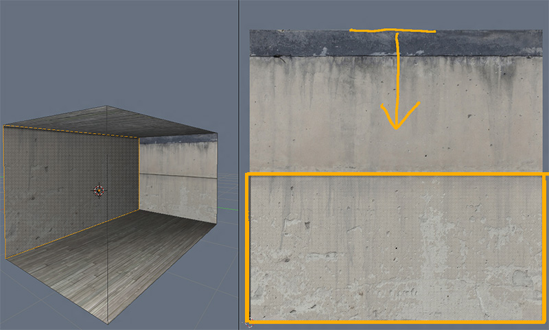
We’ve established that your problem arises because you’ve got a (once again) rectangular surface mapped to a square UV. So what do you do? Take the top edge of your UV and squish it down a bit?
…well, it’s no longer stretched, I guess. But it doesn’t exactly fit in with the rest of the wall now, and it’s kinda zoomed in. The little chunks in your plaster wall are now big ole chunks all zoomed in. So what else can you do?
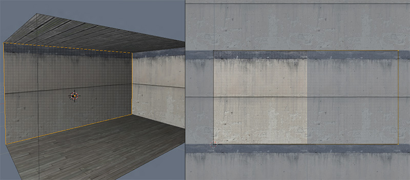
Easy. You’re going to push one edge off the UV grid.
Doesn’t make sense at all, right? Well, it won’t until you realize that the space off your UV grid is actually your texture being tiled infinitely. Think of it like this…
You can stretch it out to squish it, scale it up to get more and more iterations. All kinds of stuff. It’s like how you can change the scale, the rotation, and whatnot in Dark Radiant, but instead of doing it by changing a few numbers, you’re doing it all by hand in a more freeform fashion.
Now that you know what’s going on, lets go ahead and get the rest looking good. Stretch your next wall, your floor, and your ceiling to the right just as you did previously. If you want to make it a little easier on you, while you’ve got transform active, hit the x to constrain it to X, so it’ll just go left and right in a straight line.
In fact, you could make it easier on you but doing a SHIFT select on the surfaces you want to change, which makes all their UVs active in the editor…
…then do a marquee select on the two rightmost vertices by hitting B then ![]() + Mouse-Drag to select them all (just clicking only selects the topmost vertex), and dragging them all to the right.
+ Mouse-Drag to select them all (just clicking only selects the topmost vertex), and dragging them all to the right.
…which looks pretty cool, because you get to see all your surfaces getting squished all at once. Yeah, I’m easily amused. It’s a good life.
Conclusion
That should do it for part one. It is rather simple, and doesn’t cover the finer points of UV mapping, but hopefully it does a decent job of explaining the underlying mechanics. In the next tutorial, we’ll be making a basic texture sheet using all the elements we want to put in our room, and overlaying our UVs on top of them.
Hoped you enjoyed it.

