Photoshop 3: Stone Wall Phase 1: Difference between revisions
mNo edit summary |
|||
| Line 1: | Line 1: | ||
[[file:Title_Card.jpg]] | [[file:Title_Card.jpg]] | ||
{{photoshop-tutorials}} | |||
==Prep Work== | ==Prep Work== | ||
| Line 128: | Line 129: | ||
Steel yourself for it. At the very least, get a good snack and a bottle of water. It will be, by and far, the longest part of part of the series. | Steel yourself for it. At the very least, get a good snack and a bottle of water. It will be, by and far, the longest part of part of the series. | ||
{{ | {{photoshop-tutorials-footer}} | ||
Latest revision as of 07:19, 4 April 2012
Photoshop tutorial series:
Other photoshop tutorials:
Prep Work
On occasion, I'll be taking a few roundabout, and sometimes unecessary steps in some parts of this tutorial. This'll make some steps a little more complicated than they should be, but it'll also help you learn a few extra tricks, and show you a few ways to fix some mistakes that might arise during your own texture making endeavors. You'll see what I mean below.
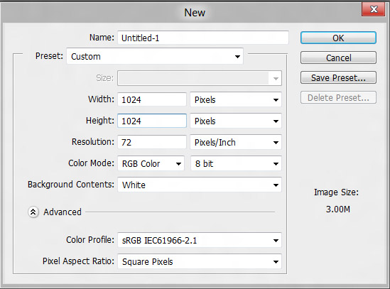
Okay. Lets get this started! Go to File/New (or if you prefer keyboard shortcuts, CTRL+n, and make a 1024x1024 canvas with a white background.
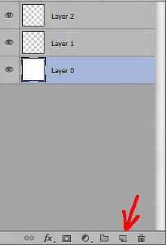
Once you're in your new image, double ![]() your background layer to convert it a properly editable Layer 0. Now, and add two layers above it using the Add Layer button at the bottom of the layers window.
your background layer to convert it a properly editable Layer 0. Now, and add two layers above it using the Add Layer button at the bottom of the layers window.
You're gonna do absolutely nothing with Layer 0. It's only purpose is to serve as your white backdrop. Layer 1 will be your horizontal lines. Layer 2, your vertical. At first glance, this might seem like I'm going a little overboard, considering you're not going to be doing much other than drawing out a glorified grid. There's a reason for that. Say you just finished up, and find you want to move some of your future bricks around. Instead of having to erase lines and redraw them elsewhere, you can just marquee select a vertical line, and nudge it into a new position with the move tool. This is obviously a helluva lot faster, and considerably more convenient than having to go through, erase, redraw, ect.
Drawing Your Alpha
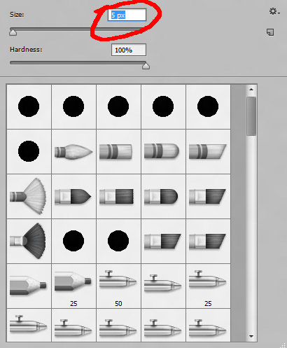
Now lets get to making our alpha mask! Select Layer 1, ![]() on the brush tool, and select the pencil tool. From the brush selection menu, find the size slider, and set it to 5px.
on the brush tool, and select the pencil tool. From the brush selection menu, find the size slider, and set it to 5px.
You can change the size either by moving the slider itself, or just selecting the text in the box like I did, and hitting 5. Don't worry about typing "px" after the number. PS will add that in when you're done.
And yes, it's kinda thin. The reason we're making it so is because we're going to eventually rough up the edges. For that reason, I don't want to have any huge gaps between the bricks.
So with your pencil tool set up and activated, pick where you want your first horizontal line to be, hold SHIFT, and drag your mouse to the right. This locks down any excess mouse movements. You can only draw a line on the Y axis. When you're done, release SHIFT, and repeat the steps above for the next line.
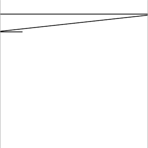
Wait...what's this?
The fuuhhhh? This is a nice feature/bug with Photoshop. It existed in CS3, and it's still there in CS5. For some reason, when you're doing a shift-click draw, and you move off the canvas, PS still considers it active for some incredibly dumb reason, even if you've already released the shift key and pressed it again. It'll will draw a line from the last point drawn, to the first point on the new line you're starting. If it happens (and it will), then hit CTRL+z to undo it, and start the line again. Annoying? Oh yes. But not too terribly difficult to fix.
With that out of the way, go ahead and draw out all your horizontal lines. Space them out as far apart as you want. For the top and bottom border lines, do a marquee select around one, copy with CTRL+c, CTRL+v to paste it to a new layer, and move it up to the top by selecting the move tool, holding SHIFT, and pressing the up arrow key. It's 5 pixels thick, so when you get it aligned to the edge, hit up 3 times sans shift to push it beyond the canvas 3 pixels. Do the same for the bottommost line, but only push it in 2px. That way it's uniform in size with the rest of the lines. This way when it's tiled, you won't have lines thicker than the rest.
Once you're done positioning your top and bottom edges, collapse all your horizontal edge layers back together into one by selecting the topmost layer, and hitting CTRL+e once or twice. Everything should be back to normal when you're done, with a layer 2, a layer 1, and a layer 0 on your layers tab. One little thing you need to keep in mind is that just because you moved your lines off the canvas doesn't mean that those extra edges are now gone. They're still sitting there, waiting to screw up your eventual offset. I'll add in an extra step later to show you how to fix that.
Alright. Now on to the vertical lines. Select Layer 2, activate your pencil tool, hit SHIFT, and drag your mouse down. Lets do one line that goes completely top to bottom though. This will be our brick edges that'll sit flush with the left and right sides of the texture. Take the original, select the move tool, and hit SHIFT-left arrow to move til it's flush the edge, use the arrow keys by themselves to fine tune it. Once it's flush, hit the left arrow three times to push it in three pixels. Do the same for the right, but this time only push it beyond the canvas two pixels. Same as above.
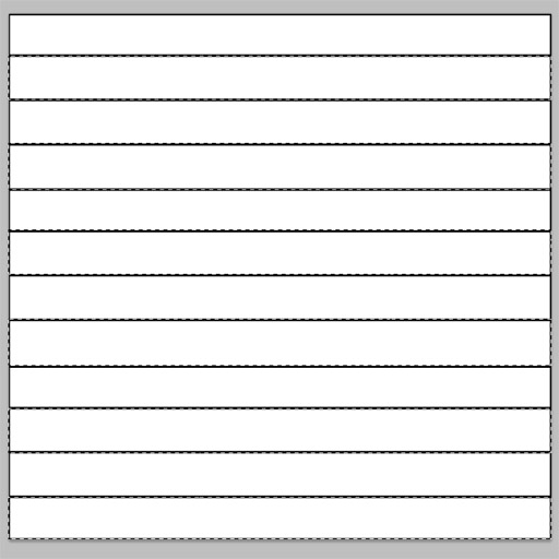
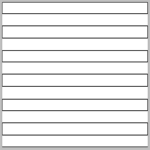
Once that's done, activate your marquee tool, and drag it across the second row of bricks. We want it to stagger, so every other row will have the flush brick lines on them. Sorta like this....
You can either SHIFT marquee select each row like I did, or draw a marquee box, delete, and draw again one at a time if you so prefer. If you need to fine tune your select a bit, then hold ALT to activate a subtraction marquee , and draw out your box to shave a few pixels off your selection. Once you're done, your results should look like this...
Now, just start drawing lines between horizontal lines to make your bricks. You can make them uniform, or stagger them off a bit. I'm gonna stagger mine, since I want a rough, uneven wall.
Try to keep in mind any patterns that might arise. Like don't put too many small bricks to one side, or group too many in the center. Try to keep it somewhat generic.
If you really want to make life easy on you, then just draw one line, draw a marquee around it, copy it to a new layer, and use your move tool in conjunction with your arrow keys to move it into place. When you're done placing one, draw another marquee, copy/paste it into yet another new layer, and do the same. When you're done with one full row, collapse them down onto Layer 2, and repeat the process for the next row.
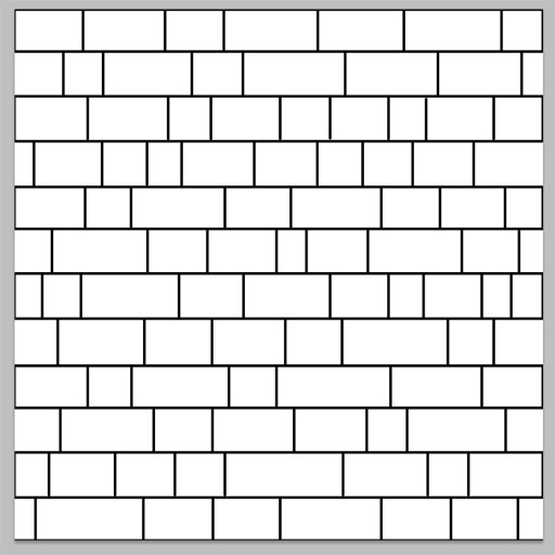
Remember, if you're drawing them out and get the cross connecting lines, then do the same as you did before. CTRL+z to undo, and redraw again. If you decided to go with uneven bricks, then your end results should look something like...
If you're satisified with the results, then collapse all the layers together down to Layer 0, draw a marquee around the entire thing, either by dragging, or hitting CTRL+![]() on your layer tab, hit CTRL+c to copy, and CTRL+v to paste it into a new layer. Now you're probably wondering why the hell I did that. Seems like a huge waste of time, right? Well, remember when I said that just because you drag something off beyond the edges of the canvas doesn't mean it's gone? This is the reason why I did that. While pushing your lines beyond the edges of your canvas, you now them sitting off in the void. Try to do an offset, and they'll pop right up, ruining your day. By marquee selecting the canvas, and copying it to a new layer, you're copying only what's directly on the canvas. Everything else off the edges has been left in the layer below it.
on your layer tab, hit CTRL+c to copy, and CTRL+v to paste it into a new layer. Now you're probably wondering why the hell I did that. Seems like a huge waste of time, right? Well, remember when I said that just because you drag something off beyond the edges of the canvas doesn't mean it's gone? This is the reason why I did that. While pushing your lines beyond the edges of your canvas, you now them sitting off in the void. Try to do an offset, and they'll pop right up, ruining your day. By marquee selecting the canvas, and copying it to a new layer, you're copying only what's directly on the canvas. Everything else off the edges has been left in the layer below it.
Confusing? Eh...maybe a little bit at first. Stuff like this will become second nature once you get a little more used to Photoshop, though.
So now that you've copy pasted it, offset it by 512 on X and Y to see if it looks okay. If it does, run the offset tool again to set it back to normal, delete layer 0, and rename Layer 1 by double![]() ing the text, and name it to something like “Base Alpha”.
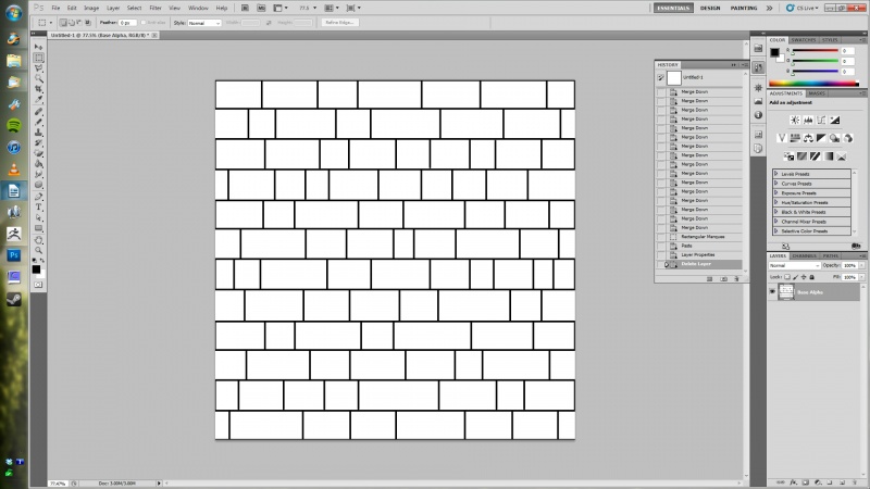
Your Photoshop window should look something like...
ing the text, and name it to something like “Base Alpha”.
Your Photoshop window should look something like...
Alright! Now we've got a plain, ugly grid!
...woohoo.
Now lets make it an alpha mask sublayer!
Setting Up Your Alpha Submask
One thing you're going to discover is that you can't paste anything directly into your alpha mask sublayer from the layers tab. You can merge other alpha masks together when you collpase them, but no pasting. Nup! That'd be too easy. So what do you if you made what you want to eventually become an alpha mask on a regular layer? Are you screwed? Did I just totally and completely waste your time?
...Arguably, yeah. I love making things difficult, get some sick thrill out of it for some reason. But you're not screwed. Oh no. I'm not that mean. You can, in fact, paste anything into a sublayer. You just have to do it in a stupid, roundabout way.
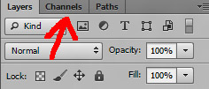
Select your Base Alpha image either by dragging a marquee around it, or doing the CTRL![]() on the tab. Once this is done, hit CTRL+c to copy it, make a new layer, apply a new mask, and go to the channels tab.
on the tab. Once this is done, hit CTRL+c to copy it, make a new layer, apply a new mask, and go to the channels tab.
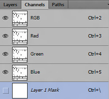
See that channel at the very bottom labled “Layer 1 Mask”? That is, appropriately enough, your submask. It's what you're gonna be pasting your image into.
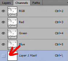
To do this, first activate the tab by clicking the little square here to make it active...
...then paste your alpha base into the channel with a CTRL+v. You should now see it sitting inside your mask layer. After you're done, make sure turn it off by deselecting the box. If you don't, you'll always see this light red overlay marking the transparent areas of your texture. It's doubtful anyone will need that. When you go back to your layers tab, you'll see your Alpha Base sitting right where it should be.
It's roundabout and annoying, yes. But that's how you do it. I'm sure there's some very good reason for doing things this roundabout way, but hell if I know what they are. At least you now know how to do it.
Closing
And that's it! If you've followed me up to this point, then you are now prepped up and ready to go for Part 2 of our hugely awesome Rough Stone Wall Tutorial. In the next part, I'll cover roughing up your stones, adding shadows, and applying the texturing.
Steel yourself for it. At the very least, get a good snack and a bottle of water. It will be, by and far, the longest part of part of the series.
Photoshop tutorial series:
Tiling with alpha masks • Tweaking with adjustment layers • Stonewall phase 1 • Stonewall phase 2
Other photoshop tutorials:
The Toolbar explained

