Photoshop 4: Stone Wall Phase 2: Difference between revisions
Created page with "file:Title_Card.jpg ==Texturing The Stone Wall== Alright! Now that we've got the tedious part out of the way, it's time to move on, and do something even more tedious! In..." |
m add sidebar and footer |
||
| (One intermediate revision by one other user not shown) | |||
| Line 1: | Line 1: | ||
[[file:Title_Card.jpg]] | [[file:Title_Card.jpg]] | ||
{{photoshop-tutorials}} | |||
==Texturing The Stone Wall== | ==Texturing The Stone Wall== | ||
| Line 70: | Line 71: | ||
Alright, now that you've got your brick selected, hit {{key-ctrl}} | Alright, now that you've got your brick selected, hit {{key-ctrl}}+{{key|t}}. This is the shortcut to your Free Transform tool. You can also find it under File/Free Transform. | ||
| Line 109: | Line 110: | ||
And speaking of offsets, make sure you don't forget the bricks along the outer edges. Do a 512x512 offset, and repeat the process for the bricks that are now in the center of your image. Once you're done, run offset again to reset your image back to it's default orientation. | And speaking of offsets, make sure you don't forget the bricks along the outer edges. Do a 512x512 offset, and repeat the process for the bricks that are now in the center of your image. Once you're done, run offset again to reset your image back to it's default orientation. | ||
So here we are. Our bricks are carved up and knocked out of alignment. Things are looking nice and haphazard. Before we get into anything else though, lets see how it tiles. | So here we are. Our bricks are carved up and knocked out of alignment. Things are looking nice and haphazard. Before we get into anything else though, lets see how it tiles. | ||
===Tile Quality Check=== | ===Tile Quality Check=== | ||
| Line 320: | Line 320: | ||
And that, ladies and gents, is the major brunt of our Rough Stone Wall Tutorial. The next phase will cover adding moss in between the stones, cracks to our bricks, and other miscellaneous detailing. Compared to this, it'll be a veritable cakewalk. | And that, ladies and gents, is the major brunt of our Rough Stone Wall Tutorial. The next phase will cover adding moss in between the stones, cracks to our bricks, and other miscellaneous detailing. Compared to this, it'll be a veritable cakewalk. | ||
{{ | {{Photoshop-tutorials-footer}} | ||
Latest revision as of 17:48, 27 March 2012
Photoshop tutorial series:
Other photoshop tutorials:
Texturing The Stone Wall
Alright! Now that we've got the tedious part out of the way, it's time to move on, and do something even more tedious! In this next step, we're going to make our stones look more like proper, weatherworn stones, rather than a halfassed piece of modern art.
Roughing Up The Stone Bricks
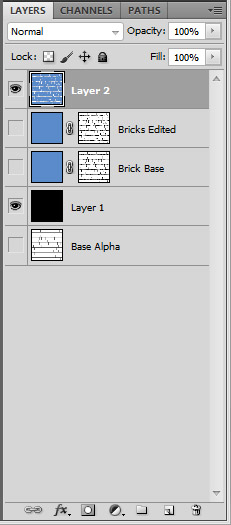
Start out by filling your new alpha masked layer with any color you want. Choose something that's comfortable to look at, because you're gonna be staring at this one screen for quite awhile. Once you've got your color, double-![]() the text on your layer, and name it something easy to reference. I went with “Brick Base”. Now, disable "Base Alpha". It's only there for reference, or if you need to paste it into your alpha channel again because you severely screwed something up during this next phase. After you do that, create a layer underneath Brick Base, and fill it with black. This is so you can have some contrast while you're painting, to see what you're doing. You'll more than likely be deleting it after you're done.
the text on your layer, and name it something easy to reference. I went with “Brick Base”. Now, disable "Base Alpha". It's only there for reference, or if you need to paste it into your alpha channel again because you severely screwed something up during this next phase. After you do that, create a layer underneath Brick Base, and fill it with black. This is so you can have some contrast while you're painting, to see what you're doing. You'll more than likely be deleting it after you're done.
Now things get interesting. Activate your brush tool and pick a brush. Any brush. Preferrably something with a little bit of noise to it, but without too much black, so you have a fairly clean transition. You don't want too much haze along the edges. Now start painting on your alpha. Round out your corners, roughen up the edges...go to town.
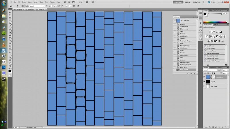
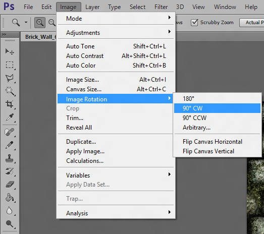
As you can see, I rotated the canvas 90 degrees counterclockwise, because I find it easier to paint up and down than I do left and right. If you find yourself wanting to do the same, then go to image/image rotation from the dropdown menu, and select whichever option you prefer.
Zoom in if you need to (shortcut key is z for reference), hit X to switch between black and white to fill in or subtract details depending on taste, hold down SHIFT if you find yourself wanting to paint in a straight line, use your ] [ bracket keys to resize your brush, and hack away. If you have some trouble reaching the lower bits, or the very edges, then use an offset filter. You're gonna want to use that to make sure it tiles anyway.
It's gonna be a little bit til you're done, so be patient. I'd like to have step by step shots for this part of the tutorial, but it's all to taste here. Just keep painting until you're happy.
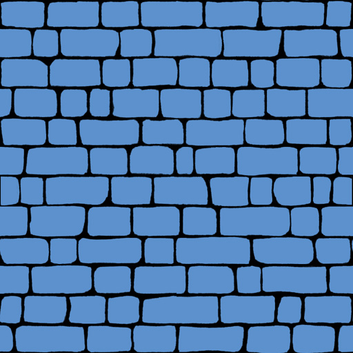
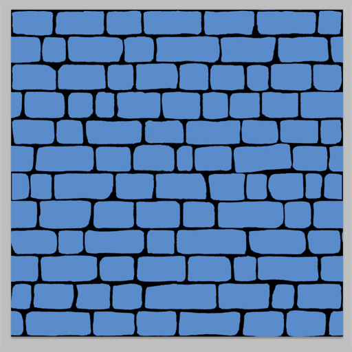
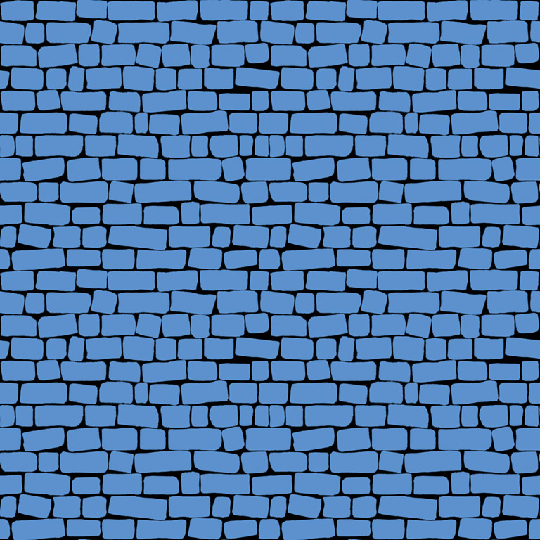
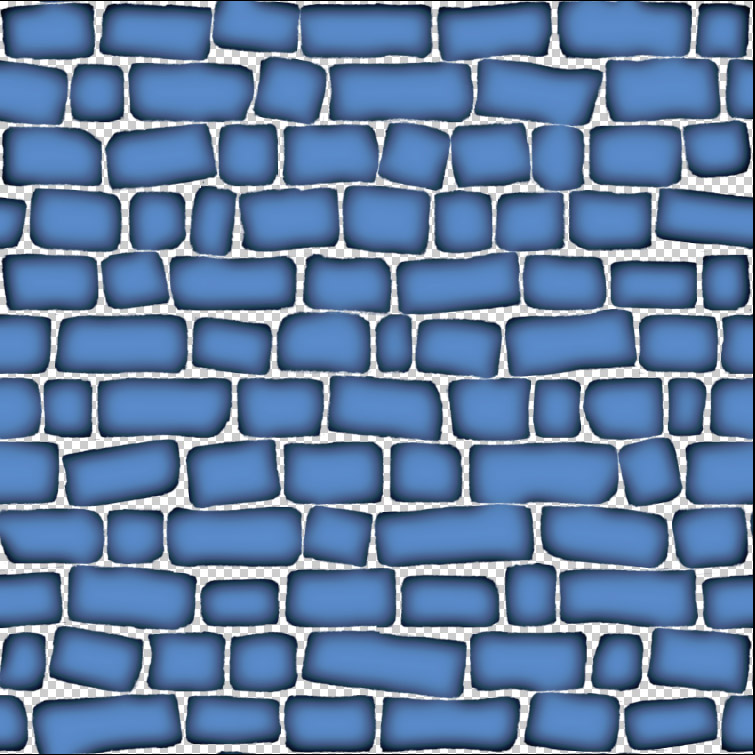
And so time passes. Seasons change. The years march on. If you stuck with it, then you've probably just spent anywhere between 1 to 3 hours of your life making fake rocks. By this point, you should have whatever color you chose permanently burned into your retinas. Maybe even have a cluster headache as an added bonus. That's the price you pay for dedication, people! You man up, and DEAL with it. Also, you should have an alpha that looks something like this...
Not too shabby. But say you want to do a little more. Maybe scale out a few of the rocks, or rotate them to give it more of an uneven look. That's no problem. It's easily done with marquees, load selections, and the oh so powerful free transform tool. Here's what you do...
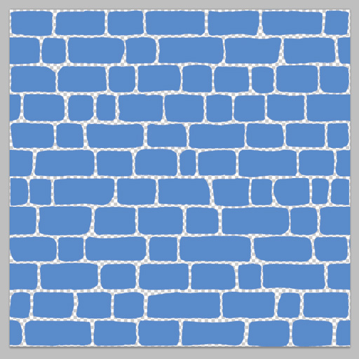
First, lets get the these bricks on their own layer. Rightclick on Brick Base, and you'll see the option “Duplicate Layer”. Do that, then make another blank layer right below it. Collapse your duplicate layer into that, and you'll have your bricks, nice and separated. Like so...
Everything that was black in the alpha is now nonexistant in your new layer. As of this moment, you now have a bunch of shapes freefloating in a void. It's no longer one solid image.
The reason you want a duplicate layer is because, from here on out, your brick base is your safety net/quick selection mask. If you mess anything up, you'll always have your original to go back to.
Now, lets select your brick.
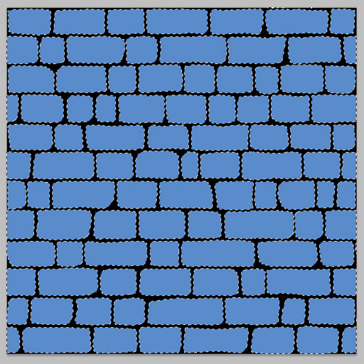
First, hold down CTRL, and click your alpha submask. You should get something like this...
Notice how it selects your bricks perfectly? That's because, as far as Photoshop is concerned, a black mask on an alpha doesn't exist. It'll ignore the black, and select everything else. Very handy.
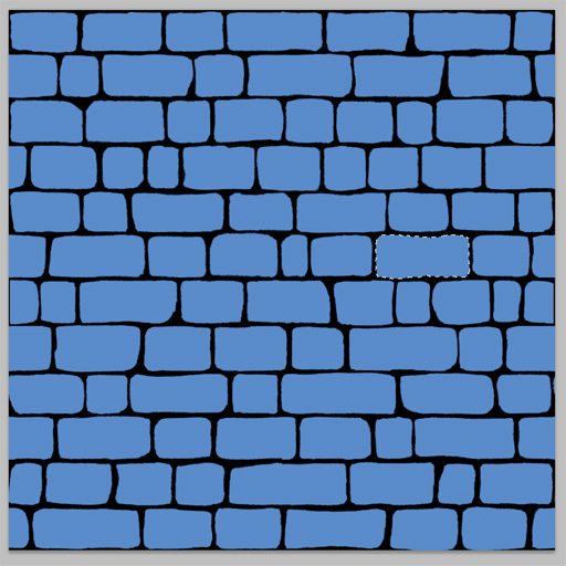
Now, pick a brick to scale and/or rotate. Me? I'm gonna startoff by picking one in the middle right of the texture. Holding down ALT, use your marquee rectangle to deselect everything surrounding your intended brick.
Oooh...like magic. But you have to do it by hand. And it isn't quite automatic, so I guess it isn't like magic at all. But whatever. It's easy. Just roll with it.
Using The Free Transform Tool
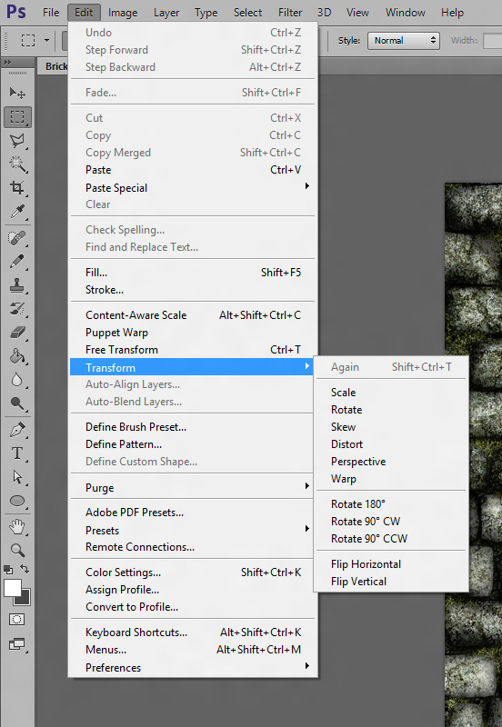
Alright, now that you've got your brick selected, hit CTRL+t. This is the shortcut to your Free Transform tool. You can also find it under File/Free Transform.
The transform menu I've highlighted is for your more specific tools. Free Transform being a mix of scale, rotate, and distort. I won't cover these specifically during the course of this tutorial, but they are worth playing around with to see what they do. At some point, you will find a good use for these.
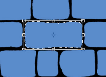
Now, when you active your Free Transform (once again, by hitting CTRL+t), you'll see a box appear around your selection, like so...
See those boxes along the edges and corners? Those are your manipulation points. Hovering the mouse directly over one of these points will change the cursor to show you which direction you can scale the selected object in. If it's pointing up and down, you can stretch it up and down, and ect. Grabbing it from a corner will scale it in and out from that corner non-uniformly. Holding down SHIFT while manipulating one of those corners will force the object to scale ratio correct (in other words, it scales linear without distorting). Moving the mouse cursor outside the boxes changes it to the rotate cursor. You can use this for very obviously rotating the object around. Grabbing the object inside the box allows you to move it around and reposition it, and you can nudge it with the arrow keys, much like the move tool. That little crosshair in the center? That's your pivot point. Move it and rotate your selected object, and it'll pivot from that corner. If you want to move it back to the center, just grab it and drag it to the center. It'll snap itself to the dead center whenever it gets close enough. This is very much a handy little thing, and you will use it quite a bit.
What I want to do is rotate my brick a little ways to break up some of the monotony. I'll just grab a corner, and rotate it slightly. I end up with this...
My stone, slightly rotated. Woohoo! Now lets do the rest!
Now you're probably thinking "I don't want to have to go through the same steps above again and again just to rotate and/or scale a few bricks. That's a pain in the ass". And you know what? You're right. It would be. Good thing there's a simpler way to grab your shapes, huh?
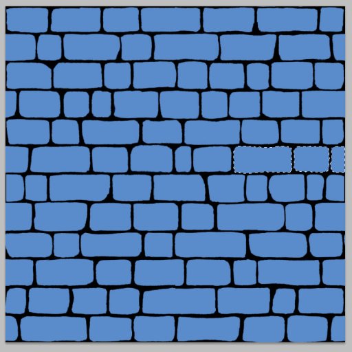
Okay, find a brick you want to rotate, drag a marquee around it, being careful not to grab a few pixels off a brick above or next to it (if you do, just tailor your selection with add marquees SHIFT drag ![]() and subtract marquees ALT drag
and subtract marquees ALT drag![]() ). Once you're done, turn on Free Transform with CTRL+t. Grab one of your manipulator handles, and move it oh so very slightly. You'll notice the marquee will instantly snap around your brick. Since there's no pixel data surrounding it, the marquee tool automatically conforms to the nearest group of pixels inside the selection when you go to move or edit it.
). Once you're done, turn on Free Transform with CTRL+t. Grab one of your manipulator handles, and move it oh so very slightly. You'll notice the marquee will instantly snap around your brick. Since there's no pixel data surrounding it, the marquee tool automatically conforms to the nearest group of pixels inside the selection when you go to move or edit it.
Now go to town on the thing. Go in, select your bricks, do add and subtract marquees to finetune your selections, and Free Transform like a straight up mofo. If you accidentally catch any extra edges on another brick, and don't discover it until after you've done your transform, just use the eraser tool to rub it out. It'll probably just be a few stray pixels anyway.
After a couple of minutes, this is my preoffset results....
Ladies and gentlemen, we've just about got ourselves the start of a nice, rough stone wall.
And speaking of offsets, make sure you don't forget the bricks along the outer edges. Do a 512x512 offset, and repeat the process for the bricks that are now in the center of your image. Once you're done, run offset again to reset your image back to it's default orientation.
So here we are. Our bricks are carved up and knocked out of alignment. Things are looking nice and haphazard. Before we get into anything else though, lets see how it tiles.
Tile Quality Check
Since our brick wall is currently nothing more than simple shapes, now would be the best time to see if there are any unaligned edges or other little kinks in the texture that need fixing. Any problem you find now can be remedied with just a couple of brush strokes.
To do this, I'm gonna show you all a neat trick you'll probably find yourself using on occasion. Normally, if you want to test tile your texture, you'll save it out to a .jpg or .tga file, open it, make a new document that's double the XY res of your base texture (2048x2048 in this instance..I know...derp), do a marquee select and copy of your texture, and paste it in 2x2 into the new document. What I'm about to show you allows you to skip a couple of steps.
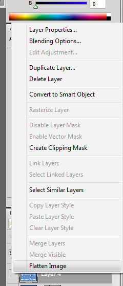
So you've got your current layer stack. Open it up so you've got your bricks overlayed on a black background. Once you've got that set up, rightclick in an empty area in any one of your layer tabs. At the very bottom of the popup menu, you'll see “flatten image”
Select that, and you'll see a little popup box appear asking you to discard hidden layers. Hit OK, and you'll see your layer stack has now crunched down to one background layer. Drag a marquee around it, hit CTRL+c to copy it, then go to the history tab, and undo the flatten by selecting the action just prior to the flatten command.
FOR THE LOVE OF GOD DON'T FORGET TO DO THAT LAST PART
Now, with your texture stored on your clipboard, open a new document, and make it 2048x2048. Hit CTRL+v to paste, align it to one of your corners, and do it 3 more times. There you go. A nice preview of your tiled texture.
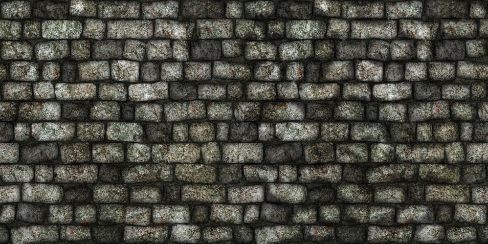
It turns out mine tiles pretty decently. No immediately noticeable patterns. The only thing I don't like is that one little split brick aligned to the middle of my vertical seam. To fix that, I'll just offset, and paint in some blue on my edited brick layer back in the original document.
...but what if you want to cover it back to an alpha map and edit it there? That's easy. Just CTRL+![]() the picture in your layer tab to get a nice, specific marquee selection of all your bricks, and hit the add layer mask button. It'll take your selection, and convert it to an alpha. Then you can just go back and fill the image with a single color to get back to standard with our as-usual alpha layers.
the picture in your layer tab to get a nice, specific marquee selection of all your bricks, and hit the add layer mask button. It'll take your selection, and convert it to an alpha. Then you can just go back and fill the image with a single color to get back to standard with our as-usual alpha layers.
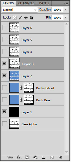
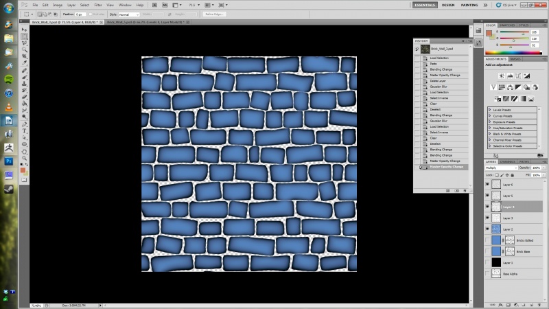
I ended up doing this AND keeping my standalone selection layer. So now I have my old Brick Base alpha, a new alpha labeled Bricks Edited, and my standalone floating bricks. Seems a little redundant, right? Well...it is. But I always like having my alphas handy for those just in case moments. Plus you can use either one of those alphas again for a variety of other projects later. Keeping them around is a good habit to get into.
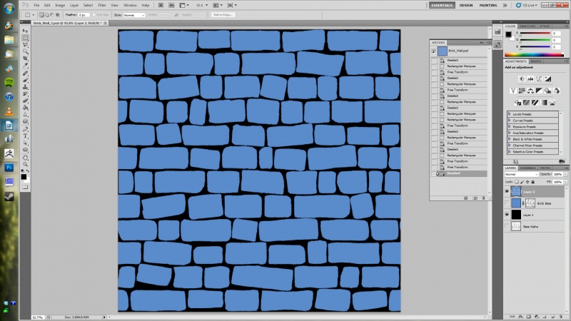
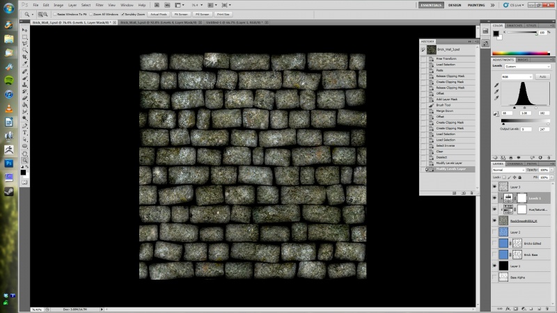
For reference, here's my current layer stack
...now that we've got all this boring checking and cleaning up out of the way, lets get back down to business.
Adding Shadows
We're gonna start this off by making shadows to round out our bricks.
But first, a disclaimer.
There are multiple ways to make shadows. None of them are a one size fits all solution. What I'm about to show you below obviously won't work in all situations, and will sometimes require you to do different things with the same technique to compensate for the color of the texture you're working with. It's all about experimenting, seeing what works, and what doesn't. That said, the technique I'm about to show you is a good foundation for making shadows quickly, and even work as a good foundation for a heightmap (which we'll get into later), and thus a normalmap, so you'll be armed with at least a little bit of knowledge to work off of when you finally launch off on your own texture making endeavors.
Okay, enough disclaimerage. Lets do this.
Start this off by drawing a marquee around our Bricks Edited alpha, and pasting it above our separated bricks layer 4 times. These will be your shadow layer foundations. Go ahead and hide the top three layers for now.
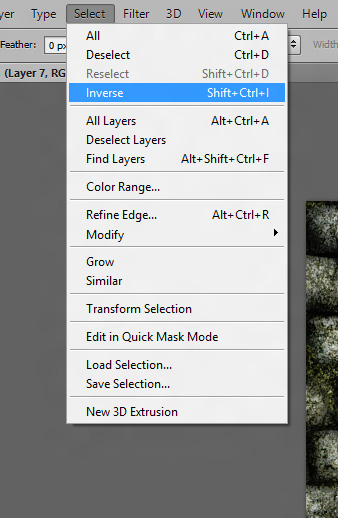
With your first copy selected, go to filter/blur/gaussian blur, and give it a blur radius of about 4.5. Go to your layer blending dropdown menu and select multiply (which, by the way, is pretty much the main go-to effect for adding in shadows). Now, CTRL+![]() your Bricks Edited alpha mask to marquee your bricks, go to select/inverse, select your bottommost shadow layer, and delete the blurring around the bricks (we're gonna worry about the mortar later). You should have a brick with a nice little shadowed lip, like so...
your Bricks Edited alpha mask to marquee your bricks, go to select/inverse, select your bottommost shadow layer, and delete the blurring around the bricks (we're gonna worry about the mortar later). You should have a brick with a nice little shadowed lip, like so...
If you want less rounded, flatter bricks, then you could say we're pretty much done by this point. You could use what we're about to do, but with much smaller gaussian blur steps to draw out and strengthen the edges so they show up against your future texturing. But we want more rounded bricks in this tutorial, which'll require me to go a little more extreme.
Now lets go to shadow stage two. Unhide your second shadow later, and do the same thing. But this time, lets use a gaussian radius of 7.0. Apply the multiply effect, and check it out.
By this point, you should see what we're doing here. With each gaussian layer, we're defining the slope of the edge of our brick, and its corresponding gradient shadow. Each step adds a little more curvature to our shadow, and strengthens the layer below. We have our steep angled edge on the bottom layer, and we've just made our first shallower edge on the next. The ones above it will be even more shallow, and thus use a higher gaussian radius.
To use a visual example, it's like we're doing this...
...where each color represents one of your shadow layers. Keep this technique in mind, because we'll be doing something very similar when we go to make our normalmap later.
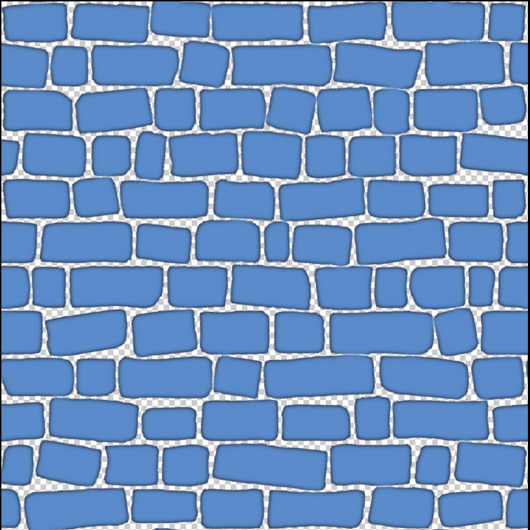
Now that I've done hopefully more than a halfassed job of explaining what's going on, lets finish this bastard up. Do your other two shadow layers exactly like the previous two, but with a higher radius on your gaussian blur. Lets go with 13 for your 3rd shadow layer, and 25 for your last. Your end results should look something like this...
...eh. It's alright. But alright just ain't good enough for my standards :crosses arms: Lets fix that.
First off, shadow layer 4 might be a little overkill. Lets get rid of it. In its place, lets duplicate shadow layer 3 (![]() on the layer tab and choose duplicate layer). Once you've done that, set it to multiply, and lower the opacity a bit. That'll strengthen the shadows on the layer below it, and lowering the opacity will keep it from being too overbearing.
on the layer tab and choose duplicate layer). Once you've done that, set it to multiply, and lower the opacity a bit. That'll strengthen the shadows on the layer below it, and lowering the opacity will keep it from being too overbearing.
Looking better already? Yup. But it still needs more. Lets go to shadow layer 2 and lower the layer opacity there. Adjust to taste...and...yup. Even better than the better before. I still think the edges are a little too dark though. Well, okay then. Lower the opacity on shadow layer 1 by about 50%. Okay...
Now it looks a goodly bit better. You've got a nice gradient across most of the bricks, and it's not too overbearingly dark. It still needs a lot more work, but we're gonna save that for a later step. For now, lets collapse all shadows down to a single layer by selecting the topmost shadow layer, and using CTRL+e until they're all combined into one layer. I know this goes against my usual nondestructive philosophy of Photoshopping, but making a new shadow layer is easy now that you know how to do it, and we'll want our shadows in a single layer when we go to edit it later. Just make sure you're happy with the outcome before you proceed with this step.
So now that you've got all your shadow layers into one image, lets do one more little step before we head to the next bit. Right click on your shadow layer, and duplicate it. Run the gaussian blur filter over the duplicate, set to around 7 radius or so, and add a multiply effect. Play with the opacity a bit, and strengthen up your shadow base. Just enough to make it stand out a little more, without being too strong. When you're happy, collapse it down yet again
We've finally got enough detail to finally get around to making our stone wall look like a stone wall, instead of deformed blue circus peanuts floating uniformly in the dead of space.
Texturing Our Texture
So lets hit up CGTextures! About damn time, right?
We're gonna pick three sources starting out. One for our stone base, and one for cracks and surface modulation on said stone base, and one for our grouting. Remember, you're not looking for another stone wall texture. You're looking for textures that will look good as surface materials on your stone wall.
I usually get most of my bare stone materials from either rocks/smooth or concrete/bare, depending on what I'm working on. Since I want it to go for a more natural look, rocks/smooth would be the better choice here.
For a cracked material...hmm...rocks/layered has a decent selection of cracked and uneven stone.
This is an old wall, so we want our mortar to be rough and pebbly. Concrete/Rough is a good category for that.
Go ahead and grab the medium sized textures, and lets get started.
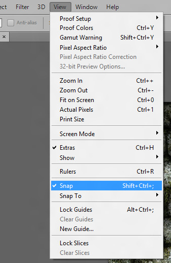
Open up your new textures in PS, drag a marquee around them, hit CTRL+c to copy, move over to your stone wall document, and CTRL+v to paste it into it's own layer. Position it above your floating bricks, but below your shadows. Hit CTRL+t to turn on free transform, and scale it so that it fits the confines of your canvas. It'll snap to the edges, so aligning it is easy to do. Yeah, it'll distort a little bit, but since this particular texture doesn't have any standout details, you can get away with it. FYI, if you ever want to turn that snap off...and there will be situations when you do...then go to view from the dropdown menu, and uncheck snap.
From here on out, tile it using the method I covered in Photoshop 1, and add your usual levels and hue/saturation adjustment layers. If you find the shadows to be a little too dark, then adjust them using the opacity slider. Knocking it down to 90% was enough to make it blend smoothly on my texture. Now, CTRL![]() your Bricks Edited alpha, invert your marquee by going to select/inverse...
your Bricks Edited alpha, invert your marquee by going to select/inverse...
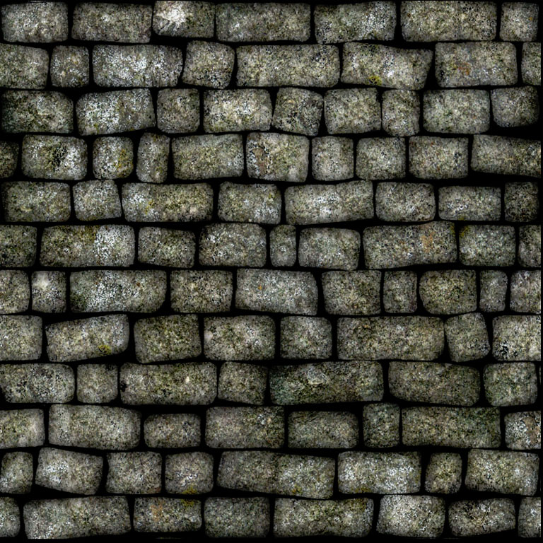
...and delete the spaces between your bricks by selecting the layer and hitting, appropriately enough, delete. Your texture should now look something like this...
Do the same for your detail cracks layer. Make it tileable, delete the spaces between the bricks by CTRL![]() your alpha, invert your selection, add your two standard adjustment layers, tweak those, and give it an “overlay” layer effect (though feel free to play with all the various effects to see what they do. You'll learn a bit, and might find one that ends up producing results you like better). Adjust the opacity to taste, and see what you think. Your texture should look something like this...
your alpha, invert your selection, add your two standard adjustment layers, tweak those, and give it an “overlay” layer effect (though feel free to play with all the various effects to see what they do. You'll learn a bit, and might find one that ends up producing results you like better). Adjust the opacity to taste, and see what you think. Your texture should look something like this...
Go ahead and throw in another hue/saturation adjustment on top of all your textures, but just below your shadow layer. This way, you'll have access to yet another layer of fine tuning.
Next....the mortar. Remember way way way back, when I said that you'd end up deleting that black fill? Well, I changed my mind. We're gonna be using it, but only to darken up the spaces between the cracks, make it look more shadowed in, and deeper set.
We're gonna take some slightly different steps here, since I want to keep our pebbles nice and small. Take your texture, drop it in, but transform it so it's a much smaller texture. Use the SHIFT-corner drag to keep it aspect correct. We're doing this so we'll have some nice, small pebbles. You won't have to spend too much time with this one, since the details are only barely seen. Instead, just run a quick high pass filter over it to even out the colors, and start lining them up. If you have too many jarring transitions, then do a couple of quick jabs with the clone tool. The only thing you want to be careful of is keeping all your bits and pieces inside the canvas. That way you won't mess up the offset tool if you ever need to use it. For me, it took about 6 tiles, and a couple of passes with the clone tool to make it look good.
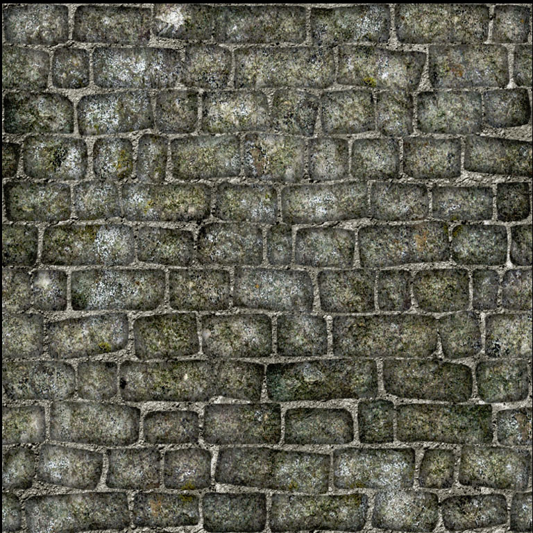
Do your adjustment layers. Since it'll be pretty desaturated after your high pass filter, go ahead and click the colorize box to bring in some overall color to the thing. Your end results should look like this...
...not exactly what I'd call pretty. I'd say it's about time we add some shadows in between the bricks.
Once again, draw a marquee around your Bricks Edited alpha, and copy it just below your shadow layer. The process is almost exactly the same as we did before, except we'll invert the colors by going to image/adjustments/invert (or hit CTRL+I). Now, run the gaussian blur filter with a low radius, about 2-2.5 will do. CTRL![]() your alpha, and delete the bricks. Apply a multiply effect, and see how it looks. Hmm, not really noticeable. Lets duplicate our new shadow layer a couple of times, apply a small gaussian to each of them, and play with the opacity to see what we can get. We want it to look shadowed, but only just so it blends in naturally with the mortar between the bricks. Nothing too garish.
your alpha, and delete the bricks. Apply a multiply effect, and see how it looks. Hmm, not really noticeable. Lets duplicate our new shadow layer a couple of times, apply a small gaussian to each of them, and play with the opacity to see what we can get. We want it to look shadowed, but only just so it blends in naturally with the mortar between the bricks. Nothing too garish.
...still ugly, but we're getting there. The shadow effect is a little too subtle still, but we'll leave it as is. At the very least, it'll give us a nice small transitional effect. I think the biggest problem is our mortar texture is way too bright, and looks like it's lit so it's almost flush with the bricks. We'll need to adjust some color settings.
Lets go down to our old black layer. Turn it on, and give it an opacity of about 70%. Ahhh. Much better. That, along with our new shadow layer, makes your bricks stand out much more nicely with the mortar. Go ahead and duplicate your new shadow layer one more time, play with the opacity a little more to strengthen it up a bit, and adjust the levels and colors on your mortar texture adjustment layers until you're happy with the results.
Once you're satisfied, go ahead and collapse your two shadow layers together.
But I think there's one more thing we can do before we call it a day on the bricks. Right now, it looks like all our bricks are too uniform. This is an old brick wall, and having some unevenness will make it look that much more interesting, and add some nice variety.
This'll be incredibly easy to do. Start by making a new layer just below the shadows, and filling it with black. Make an alpha mask, and, once again, fill it with black. Set the layer to 50% opacity.
Now there's a couple of ways you can go through fill in your bricks. One would be to go to your floating brick layer, doing a marquee, do a quick nudge move so the marquee conforms to the brick itself, then paintbucket in the resulting selection on your newly formed recessed bricks layer with white. Doing will give you more exacting results, but will take forever to do. So instead of going through all that, we're just going to paint our darker bricks in.
Find a soft edged circular brush, any one of the default PS brushes will do nicely here, and start painting away. Try to trace inside the brick, but don't fret too much if you accidentally overshoot an edge. It won't be that noticeable against the darker mortar background.
Try to keep an even spread throughout, don't forget your edges, and play with your opacity to make them darker or lighter to taste. You can even use shades of grey to get even more variance in there. Eventually, you'll get something like this...
Lastly, we're gonna tweak our shadows so all our bricks aren't perfectly even and rounded. Just like everything else, they need to be roughed up a little bit.
To start off, lets unround some of our bricks. This is easy to do. Make an alpha submask on your shadow layer, and select a very, very soft round brush. One that's more transparent and grey than black. Now, just paint out some of your shadowing. Try to keep some corners rounded, and flatten others on the same brick. Make it look uneven. The effect is subtle, but it does help to break things up a bit.
Now lets get into something that stands out a little more. Make a new layer above your shadow layer, fill it with black, make an alpha, and fill it with black as well. Set the filter to multiply, and give it an opacity of about 55-70%. Now, just like with the last step, select a brush with a good bit of transparency in it. Lots of soft greys, and transitions. From here, start painting white into your alpha mask, hitting x to go back through and soften some of your edges. Paint in your corners, little dips in the center of your bricks, soft indentations along the edges. Make the rocks even more rough and uneven. Don't go too overboard, and play with your opacity a bit to see how it looks. Here's a side by side shot of my texture.
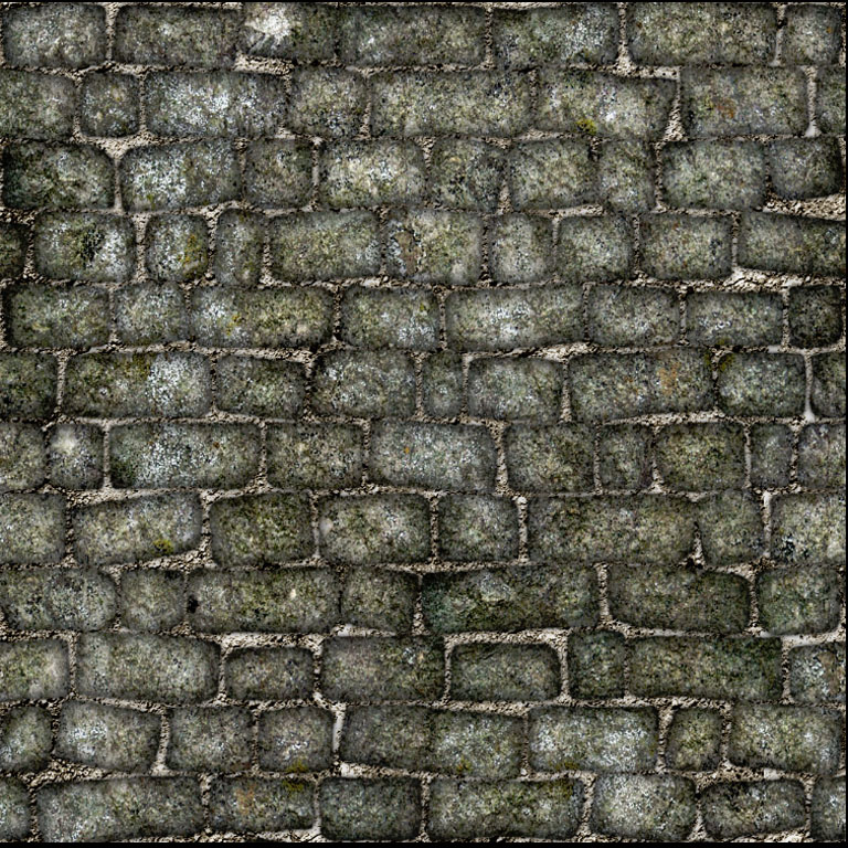
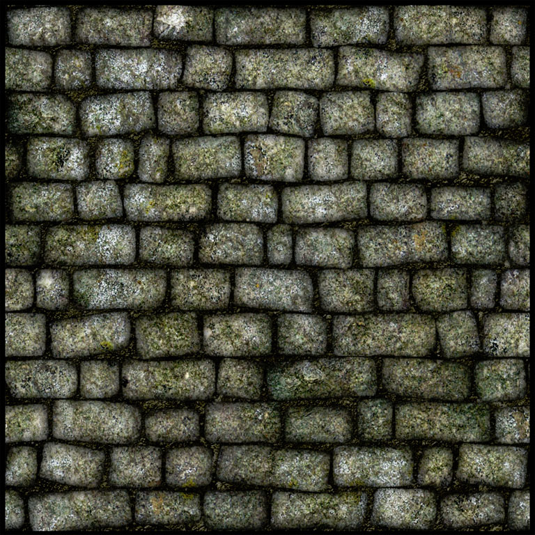
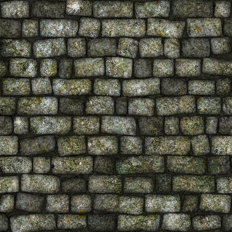
Left is the old, and right is the edited results. As you can see, my new shadowed bricks look a little more rounded and rough. It might take you a bit to get the hang of, but keep play around with it. You'll eventually get used to it.
Once all this is done, go in for some final tweaks. Play with your shadow opacity, all the various levels and colors of your textures, your colored bricks. Tweak until you think the thing looks good overall.
Closing
And that, ladies and gents, is the major brunt of our Rough Stone Wall Tutorial. The next phase will cover adding moss in between the stones, cracks to our bricks, and other miscellaneous detailing. Compared to this, it'll be a veritable cakewalk.
Photoshop tutorial series:
Tiling with alpha masks • Tweaking with adjustment layers • Stonewall phase 1 • Stonewall phase 2
Other photoshop tutorials:
The Toolbar explained

