Text Decals for Signs etc.: Difference between revisions
More work on example section |
|||
| (7 intermediate revisions by one other user not shown) | |||
| Line 7: | Line 7: | ||
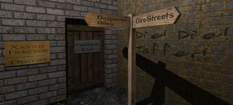
<center>[[Image:text_decals.jpg]]</center><br><br> | <center>[[Image:text_decals.jpg]]</center><br><br> | ||
Dark Mod (from 1.03 onward) provides convenient prefab assets; or alternatively, see [[#Customising and Making your Own]] below. | Dark Mod (from 1.03 onward) provides convenient prefab assets; or alternatively, see [[#Customising and Making your Own]] below. | ||
For other types of in-game text see [[Text]] | For other types of in-game text see [[Text]] | ||
| Line 36: | Line 36: | ||
You can offset the Entity GUI with respect to the underlying sign to adjust left and top margins, including to fake centering. | You can offset the Entity GUI with respect to the underlying sign to adjust left and top margins, including to fake centering. | ||
===An Example=== | |||
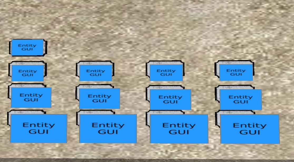
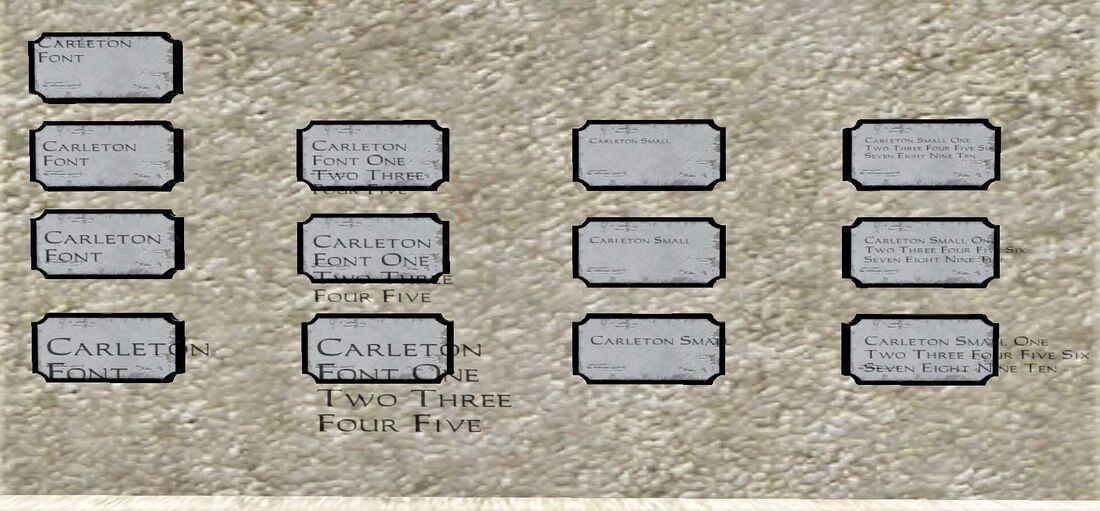
To demonstrate some of this (except use of extra spaces in the text), here's a series of signs on a wall, all of which have: | To demonstrate some of this (except use of extra spaces in the text), here's a series of signs on a wall, all of which have: | ||
* the same empty wall plaque | * the same empty wall plaque | ||
* an Entity GUI with 1:2 ratio (so the aspect ratio of the font characters is kept constant) | * an Entity GUI with 1:2 ratio (so the aspect ratio of the font characters is kept constant for demonstration purposes) | ||
* use of a common font family | * use of a common font family, Carleton | ||
The | |||
[ | The photos shows the series in DR (top) and in-game (bottom). Each row of signs has the same Entity GUI size and placement. Each column of signs has the same text string and choice of font size. The top left sign is an plaque-centered placement of a 16x32 "Carleton" Entity GUI. This typically results in poor placement, so all the other signs have the upper-left corner of the Entity GUI down and slightly to the right. Going down the first column, as the Entity GUI becomes larger (20x40 in the 3rd row, 28x56 in the 4th row), the font enlarges proportionately to the Entity GUI size, so wordwrap is the same in all cases. In the second column, the gui_parm1 text counts up to ten, but some of it is not rendered due to the Entity GUI boundary. Again, this line clipping is the same in all cases. The third and fourth columns repeat all that, but with the "Carleton Small" font. This allows both more words per line, and more lines. The specifics of those will vary with font family chosen. | ||
<center>[[File:Example sign Entity GUIs in DR.jpg]]</center><br> | |||
<center>[[File:Example_sign_Entity_GUIs_in-game.jpg| 1100px]]</center> | |||
{{infobox|Tip 1: Rather than relying on wordwrap for multi-lining, you can create multiple overlapping, offset Entity GUIs, one per desired line, and adjust them independently. This technique also allows different lines to have different fonts and/or scalings.}} | |||
{{infobox|Tip 2: Want to have text horizontally centered rather than left-justified? You'll have to do this manually. For a single line of text, either slide the Entity GUI sideways or add leading spaces or both. But for multi-lines, word wrap will ignore excess spaces between words, so spacing can't be used for centering after line 1. Instead, use the Tip 1 method.}} | |||
== Signs with Illuminated Colored Letters == | |||
by Geep 2021 | |||
Within the GUI text, you can add Caret Control Codes (see [[Xdata file format]]) around particular words or phrases to give you the look of ''backlit'' letters in bright primary colors, perhaps to indicate wizardry afoot, evoke carnival, or provide eye-catching text for a custom in-game control. | |||
^0 default | |||
^1 bright red | |||
^2 bright green | |||
^3 bright yellow | |||
^4 bright blue | |||
^5 bright cyan | |||
^6 bright magenta (pink) | |||
^7 bright white | |||
^8 light grey | |||
^9 black | |||
Example: "This is default black. ^1This is bright red." | |||
The scope of a code terminates at the end of the line as formatted in the game, at which point it defaults back to the gui default color. So get your word wrapping in shape first, then apply codes. Or bracket around each word if you want it to work no matter the word wrap, e.g.: | |||
"This is default black. ^1This^0 ^1is^0 ^1bright^0 ^1red.^0 Back to black." | |||
==Customising and Making your Own== | ==Customising and Making your Own== | ||
Here are the steps make your own text decals or customise the ones provided (say, to use a different font size by changing the gui's "textscale" value). | Here are the steps to make your own text decals or customise the ones provided (say, to use a different font size by changing the gui's "textscale" value). | ||
===The Decal=== | ===The Decal=== | ||
* Create a patch and give it the texture: textures/darkmod/decals/signs/decal_gui . This is only available | * Create a patch and give it the texture: textures/darkmod/decals/signs/decal_gui . This is only available from Dark Mod update 1.03 onward but if you want it earlier this is what to do: | ||
** Use textures/common/entityGui instead if it doesn't matter if the decal is solid. | ** Use textures/common/entityGui instead if it doesn't matter if the decal is solid. | ||
** Create the custom texture listed below at [[# | ** Create the custom texture listed below at [[#The Texture]] | ||
* In Surface Inspector, use these in order: natural, fit, flip horizontal, rotate left 180 degrees. | * In Surface Inspector, use these in order: natural, fit, flip horizontal, rotate left 180 degrees. | ||
* You should now see a single occurrence of the words Entity GUI on the patch and the words should be upright and not mirrored. If not, adjust, rotate, until they do. | * You should now see a single occurrence of the words Entity GUI on the patch and the words should be upright and not mirrored. If not, adjust, rotate, until they do. | ||
* Note that the text size will be affected by the size of the patch | * Note that the text size will be affected by the size of the patch | ||
* Convert the patch to a func_static entity | * Convert the patch to a func_static entity | ||
* Give it the | * Give it the spawnargs: | ||
* | ** '''gui''' with the path and name of your gui (see [[#The GUI]] below) as its value. | ||
** '''gui_parm1''' with your own text as its value. | |||
| Line 108: | Line 139: | ||
qer_editorimage textures/editor/entityGui.tga | qer_editorimage textures/editor/entityGui.tga | ||
DECAL_MACRO | DECAL_MACRO | ||
nonsolid | nonsolid | ||
noimpact | noimpact | ||
guiSurf entity | guiSurf entity | ||
} | } | ||
where DECAL_MACRO defines these additional keywords for you: | |||
polygonOffset 1 | |||
discrete | |||
sort decal | |||
noShadows | |||
== See also == | == See also == | ||
| Line 121: | Line 155: | ||
* [[I18N|Internationalization]] | * [[I18N|Internationalization]] | ||
{{ | {{GUI}} | ||
Latest revision as of 13:23, 22 April 2024
From Fidcal's 2010 Posting. Updated by Geep, 2020.
Introduction
This article describes how to add non-graphic simple text to signs, signposts, walls, etc. using gui decals. In this image you can see some examples. This method only provides the application of the text itself (ie, does not include the signs, signposts, and so on). For the latter, one starting point is the model collection under darkmod/decorative/signs (avoiding any sign that has an embedded GUI).

Dark Mod (from 1.03 onward) provides convenient prefab assets; or alternatively, see #Customising and Making your Own below.
For other types of in-game text see Text
Ready-made Prefabs
This is by far the easiest method. You simply insert a prefab and change the default text and size to what you want:
- This is described for the Dark Radiant editor.
- For general use all you need do is to find or make your blank wall, sign, etc.
- RMB in grid view, select "insert prefab", and navigate to readables/sign_text_decals/.
- Select a prefab with a desired font (eg, sign_text_carleton.pfb) and one of two sizes (with or without "_small" suffix).
- Of the Dark Mod fonts shown in Fonts Screenshots, two-thirds are available as prefabs; for others, see #Customising and Making your Own below.
- You now have a working text decal, seen in DR as a blue rectangular "Entity GUI".
- To set your text, change the spawnarg value gui_parm1 in Entity Inspector to whatever you want.
- The defaults are all black text with 66% transparency so they blend well onto most surfaces but see #Customising and Making your Own below for how to change this.
Text Size, Text Composition, and Multi-line Text
by Geep, 2020
To change the size of the text, just resize the patch. To do this, first press the TAB key. Remember to press TAB again to get back.
Since you can't see the rendered text content results directly in DR, you will have to iterate to get what you want. The gui_parm1 value takes a single line of text (with no enveloping quotes). It is without a way to indicate line breaks; "\n" will not do it. The examples shown here rely entirely upon word-wrapping for multi-line text. In practice, that means inserting spaces to force wordwrap (or see Tip below).
Often, you need to resize the Entity GUI patch to cover a larger area than the visible sign; the patch size and aspect ratio will affect font size and aspect ratio, but not wordwrap and number of visible lines. The decal patch is non-solid and invisible - except for the text itself - so can overlap any visible surface with no problem.
You can offset the Entity GUI with respect to the underlying sign to adjust left and top margins, including to fake centering.
An Example
To demonstrate some of this (except use of extra spaces in the text), here's a series of signs on a wall, all of which have:
- the same empty wall plaque
- an Entity GUI with 1:2 ratio (so the aspect ratio of the font characters is kept constant for demonstration purposes)
- use of a common font family, Carleton
The photos shows the series in DR (top) and in-game (bottom). Each row of signs has the same Entity GUI size and placement. Each column of signs has the same text string and choice of font size. The top left sign is an plaque-centered placement of a 16x32 "Carleton" Entity GUI. This typically results in poor placement, so all the other signs have the upper-left corner of the Entity GUI down and slightly to the right. Going down the first column, as the Entity GUI becomes larger (20x40 in the 3rd row, 28x56 in the 4th row), the font enlarges proportionately to the Entity GUI size, so wordwrap is the same in all cases. In the second column, the gui_parm1 text counts up to ten, but some of it is not rendered due to the Entity GUI boundary. Again, this line clipping is the same in all cases. The third and fourth columns repeat all that, but with the "Carleton Small" font. This allows both more words per line, and more lines. The specifics of those will vary with font family chosen.


Signs with Illuminated Colored Letters
by Geep 2021
Within the GUI text, you can add Caret Control Codes (see Xdata file format) around particular words or phrases to give you the look of backlit letters in bright primary colors, perhaps to indicate wizardry afoot, evoke carnival, or provide eye-catching text for a custom in-game control.
   ^0 default
   ^1 bright red
   ^2 bright green
   ^3 bright yellow
   ^4 bright blue
   ^5 bright cyan
   ^6 bright magenta (pink)
   ^7 bright white
   ^8 light grey
   ^9 black
Example: "This is default black. ^1This is bright red."
The scope of a code terminates at the end of the line as formatted in the game, at which point it defaults back to the gui default color. So get your word wrapping in shape first, then apply codes. Or bracket around each word if you want it to work no matter the word wrap, e.g.:
"This is default black. ^1This^0 ^1is^0 ^1bright^0 ^1red.^0 Back to black."
Customising and Making your Own
Here are the steps to make your own text decals or customise the ones provided (say, to use a different font size by changing the gui's "textscale" value).
The Decal
- Create a patch and give it the texture: textures/darkmod/decals/signs/decal_gui . This is only available from Dark Mod update 1.03 onward but if you want it earlier this is what to do:
- Use textures/common/entityGui instead if it doesn't matter if the decal is solid.
- Create the custom texture listed below at #The Texture
- In Surface Inspector, use these in order: natural, fit, flip horizontal, rotate left 180 degrees.
- You should now see a single occurrence of the words Entity GUI on the patch and the words should be upright and not mirrored. If not, adjust, rotate, until they do.
- Note that the text size will be affected by the size of the patch
- Convert the patch to a func_static entity
- Give it the spawnargs:
- gui with the path and name of your gui (see #The GUI below) as its value.
- gui_parm1 with your own text as its value.
The GUI
This is the gui file that defines the font. If you have Dark Mod update 1.03 you can modify an existing one. Alternatively, just copy and paste the one below into a text file and save it with your map in a guis folder as eg, my_stone_text.gui. You will need to add that path and name to the gui spawnarg of the decal entity above, eg, gui guis/my_stone_text.gui
windowDef Desktop
{
	rect 0, 0, 640, 480
	backcolor 0, 0, 0, 0

	windowDef SignText
	{
		rect 0, 0, 640,480
		backcolor 0, 0, 0, 0
		text	"gui::gui_parm1"
		font "fonts/stone"
		textscale 2
		forecolor 0, 0, 0, 0.8
		visible 1
	}
}
In the above definition, these are some of the things you can change:
- Set your font in the font line as shown, it must be in quotation marks as above eg "fonts/stone". And to change the font just replace the word stone with the new font name - font choices are shown in Fonts Screenshots. Eg in my case Carleton - "fonts/carleton"
- Change the font size in textscale. Fractions can be used, eg, 1.5 but remember, resizing the patch or texture scale in Dark Radiant also changes the font size.
- Change the colour and transparency of the text in the forecolor line. Because of the way Doom 3 blends imagery, for all practical purposes this is limited to very dark colours because they do not react to local game lighting. If you choose lighter colours then they will glow in the dark. (it might be possible to match a colour to a static light situation.) The forecolor values are:
- red, green, blue, transparency; each in the range 0 to 1.
- For colours, 0 to 1 is zero to full intensity; for transparency it is invisible (0) to fully opaque (1)
- For example:
- 0.9, 0.9, 0, 1 would be high red, high green, no blue, and fully opaque. Red and green light make yellow so this would give glowing yellow text that would not blend well with its background.
- 0.1, 0, 0, 0.66 This is more practical and would give a dark red that blends well onto its background with 66% opacity.
- A background colour can be set with the backcolor line exactly the same as for forecolor but is probably of limited use for our purposes. 0.9, 0.9, 0, 1 would have the text on a solid bright yellow background that glows in the dark. 0, 0.1,0, 0.33 would give a faint green background of 33% opacity.
The Texture
This is the non-solid decal gui texture. Copy and paste it into a text file and save it with your map in a materials folder as eg, mymap.mtr. You will need to reload shaders if you already have Dark Radiant running before you can select it.
textures/mymap/decals/signs/decal_gui
{
	qer_editorimage	textures/editor/entityGui.tga
	DECAL_MACRO
	nonsolid
	noimpact
	guiSurf	entity
}
where DECAL_MACRO defines these additional keywords for you:
	polygonOffset 1
	discrete
	sort decal
 	noShadows